
Modern Tropical Font Duo: a clean sans and inky script for branding
Design style
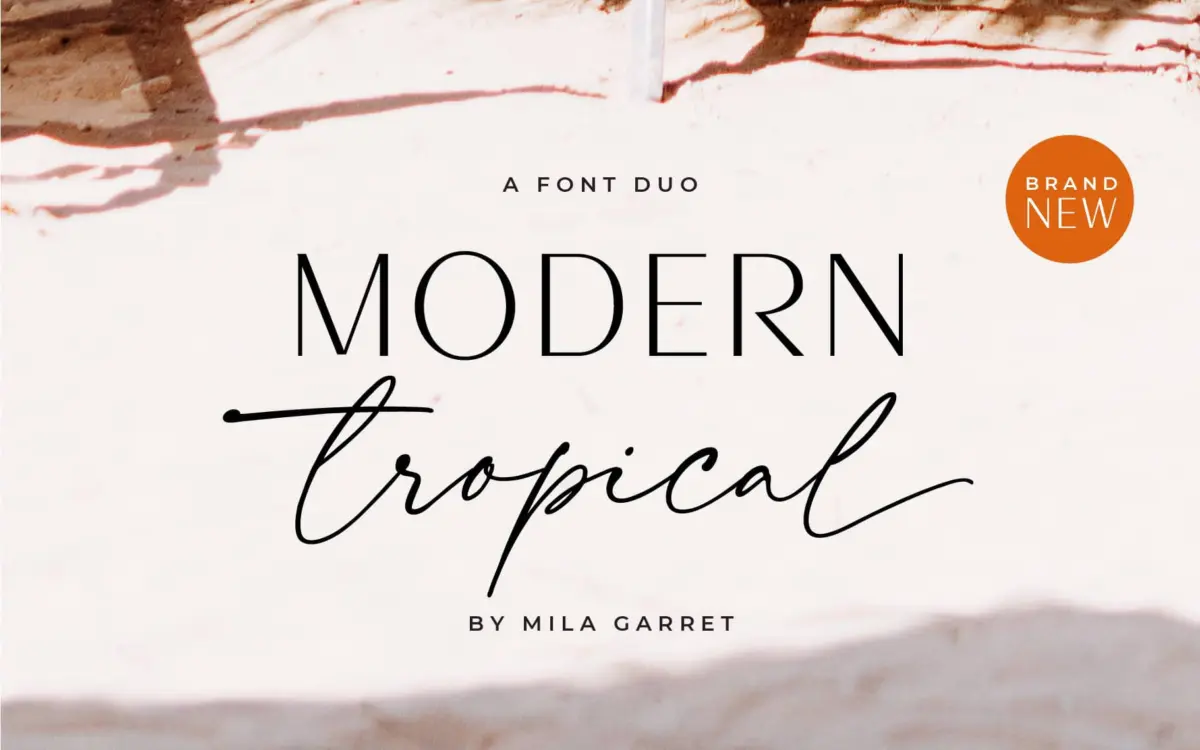
This is a two-piece kit built around a simple pairing logic: a plain-spoken sans serif to carry information, and a looser handwritten script to carry personality. The sans is stripped back — even stroke weight, minimal contrast, open counters, nothing fussy about it. It reads as neutral by design, the kind of letterform that gets out of the way rather than asserting a mood. The script does the opposite job. It leans casual and inky, with visible variation in stroke weight and a handwritten looseness to the connections between letters, more scrawled note than formal copperplate.
The pairing works because the two halves don’t compete. The sans is quiet enough that the script gets to be the expressive element, and the script doesn’t try to be legible at length, which frees it up to be loose and gestural. Neither one is a particularly bold design statement on its own — the sans in particular is close to generic, and would be unremarkable without the script alongside it for contrast.
Character set and features
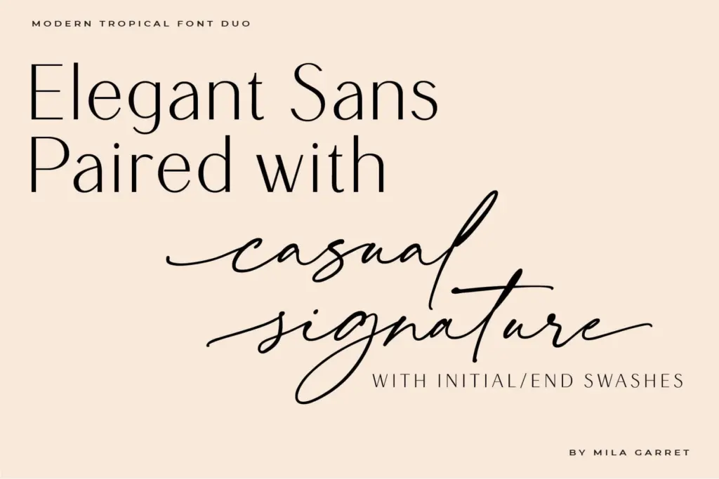
The script’s handwritten quality depends on the joins between letters, and here it delivers what a script needs: connecting strokes that feel drawn rather than mechanically generated, with enough irregularity to avoid looking stamped out. Ligatures are part of the package, which matters for a script like this — without them, awkward letter combinations tend to break the illusion of continuous handwriting, and with them the word shapes stay fluid.
The sans, by contrast, is deliberately unfussy. It’s built to sit underneath the script as a supporting voice — tagline, subhead, small print — rather than to carry a headline itself. That’s a sensible division of labour, but it does mean the sans has little to offer if you’re looking for a standalone display sans with character. Judge each half by its job: the script for personality, the sans for legibility, and neither one for surprise.
Use cases
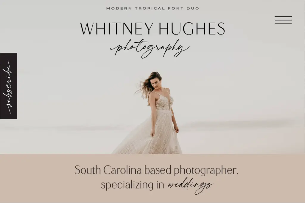
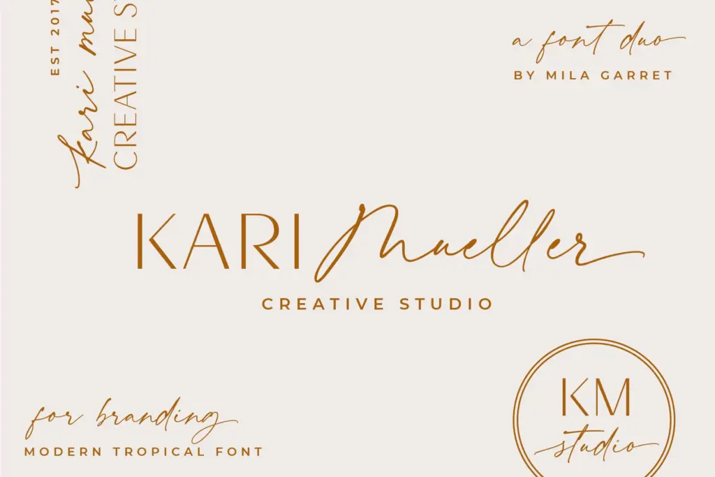
The obvious home for this duo is logotype work where a brand wants a handwritten mark paired with a clean wordmark underneath — cafés, boutiques, wellness brands, anything reaching for casual-but-considered rather than corporate. It also suits wedding stationery, where a script headline and a sans body line is a familiar, dependable formula, and social quote graphics, where the script gives an image its focal point and the sans handles the caption.
Where it’s less suited: anything requiring the script to run at body-text sizes or across long passages — it’s a display face, and asking it to do paragraph duty will cost you legibility. And if a brand needs a sans with real personality of its own, this one is too neutral to carry that weight alone. Treat it as a pairing tool rather than two independent typefaces, and it does the job it was built for.
What we liked, and what we didn’t
Strengths
- Ligatures keep the script's letter joins looking handwritten rather than mechanical
- The sans is genuinely neutral, so it won't clash with the script in lockups
- Ready-made pairing removes the guesswork of matching a script to a sans
Trade-offs
- The sans is too generic to work as a standalone display face
- Script is a display tool only — not built for body text or long passages
A serviceable pairing rather than a standout design: the script has genuine handwritten character while the sans stays deliberately plain to support it. Good for logos, wedding stationery and social graphics where a casual script needs a quiet partner, less useful anywhere the sans has to carry a project on its own.
Verdict

Tantype reviews typefaces in depth — every font is tested in real branding, editorial and screen layouts before a word gets written. 555+ fonts reviewed and counting.