
Joyride Extended: a variable-width sans built for punchy display type
Design style
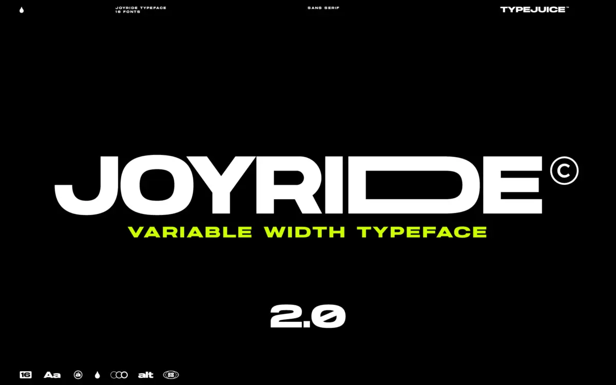
Joyride is a geometric sans that leans into its extended width rather than apologizing for it. The letterforms are broad-shouldered, with even stroke weight and a confident, almost architectural rhythm to the counters. This is not a text face pretending to be flexible — it’s built from the ground up as a display tool, and the extended proportions are the whole point. Curves are kept simple and circular, terminals are cut square, and there’s little ornamentation beyond what the alternate glyphs add. It reads as a contemporary take on the wide grotesques that show up in mid-century signage, but without much of the quirk that usually comes with that reference. The result is clean rather than characterful on its own — the personality shows up once you start mixing weights and alternates.
Character set and features
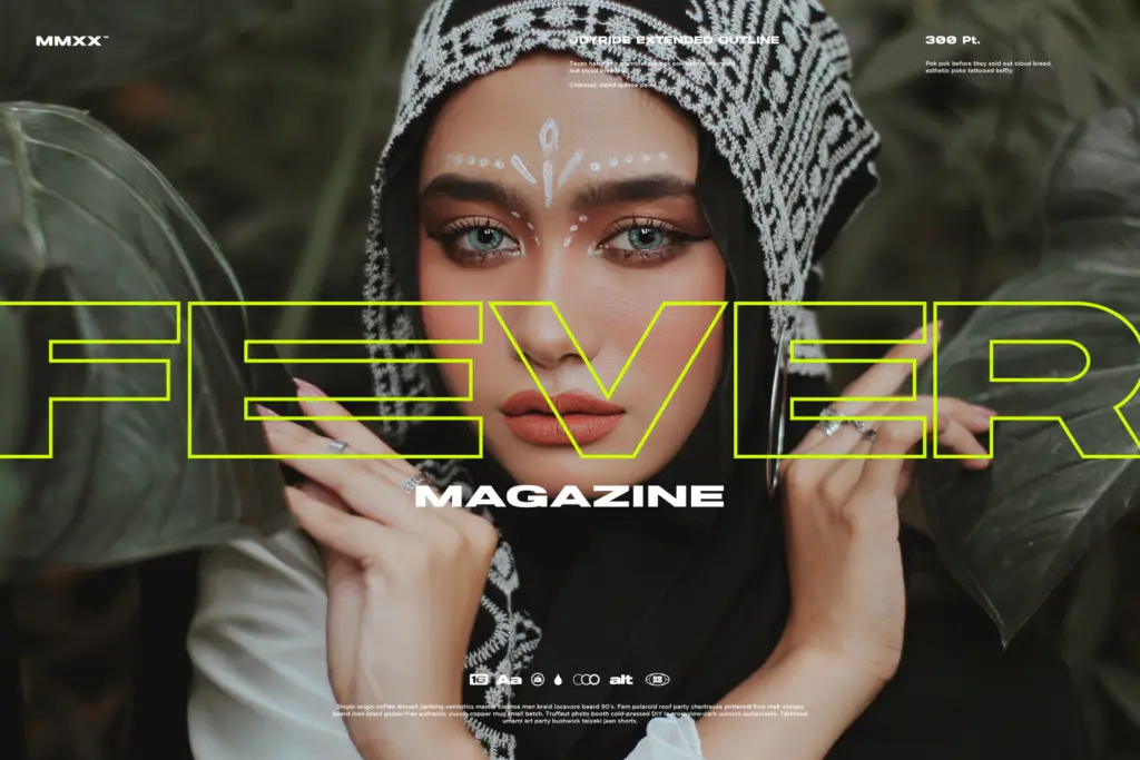
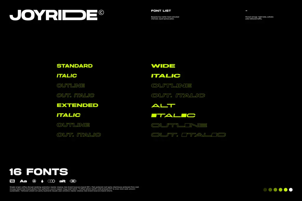
The headline number here is scale: 16 fonts across four styles, with a claimed 4,000-plus glyphs and 300-plus alternates. That’s a genuinely large playground. In practice, this means you can swap default letterforms for more angular, rounded, or condensed variants on a per-letter basis, which is useful for logotypes where one or two characters need to behave differently from the rest of the word. The variable-width mechanism is the more interesting feature technically — it lets you dial extension up or down rather than being locked into a single extended cut, which is unusual for a display sans at this price point and gives you more room to fit a headline into an awkward space without resorting to manual kerning tricks. Upper and lowercase are both drawn, and multilingual support is included, though the brief doesn’t specify which scripts, so treat that as a checkbox to verify against your actual language needs rather than a guarantee. With this many glyphs and styles bundled together, expect some unevenness — not every alternate will earn a place in a serious identity system, and sorting the useful ones from the filler takes time.
Use cases
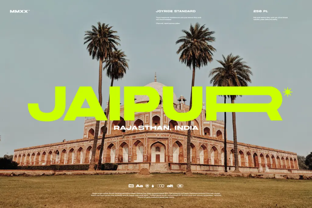
This is a headline and title font, not a paragraph font. The extended width and heavy weights are built for short bursts of text — logotypes, posters, packaging headers, app store graphics, merchandise. Where it earns its keep is in situations where a designer wants one typeface to cover an entire brand’s display needs: a wordmark, a set of section headers, a few callouts, all pulling from the same family rather than stitching together two or three different fonts. The alternate glyphs make it plausible as a logo font specifically, since single-word marks can absorb a handful of stylised letters without looking chaotic. It’s less convincing as a body-copy companion — nothing in the brief suggests a genuinely readable text weight, so pair it with something else for long-form work. Anyone building packaging, editorial mastheads, or retro-leaning branding where a wide, confident sans is called for will get the most out of it; anyone needing a quiet workhorse for dense layouts should look elsewhere.
What we liked, and what we didn’t
Strengths
- Variable-width control lets you adjust extension per project instead of being locked to one fixed cut
- Large alternate set makes single-word logotypes and wordmarks easy to customise
- 16 fonts across four styles cover a full display hierarchy without switching families
Trade-offs
- The base letterforms are clean but not especially characterful on their own
- Not built for body copy, so it needs a second typeface for longer text
Joyride is a competent, broad-shouldered display sans that earns its keep in logotypes, headlines and packaging rather than running text. The variable-width mechanism and huge alternate set give it real flexibility, but the drawing itself is more functional than distinctive, and sorting through 4,000 glyphs takes patience.
Verdict

Tantype reviews typefaces in depth — every font is tested in real branding, editorial and screen layouts before a word gets written. 555+ fonts reviewed and counting.