
Ponte: a high-contrast serif for editorial and fashion headlines
Design style
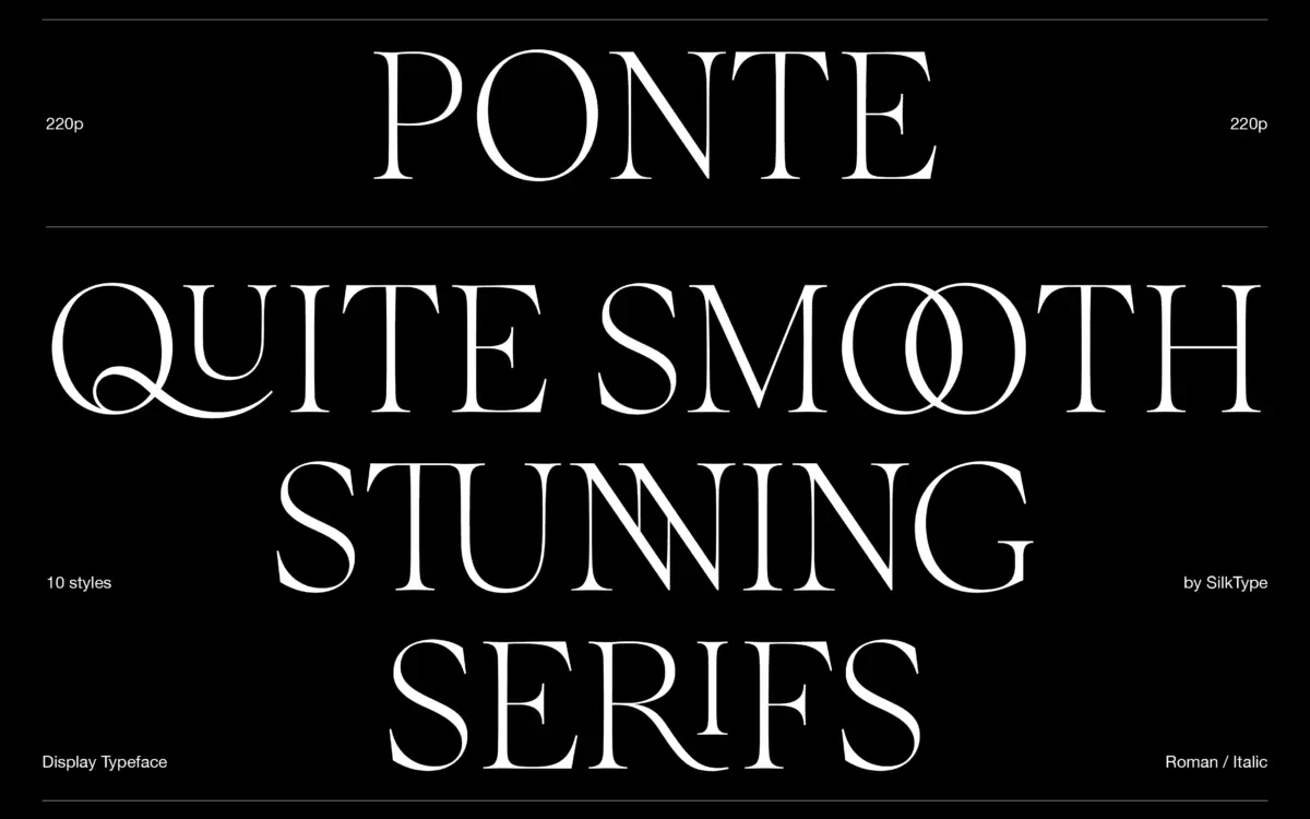
Ponte belongs to the current wave of high-contrast display serifs that lean on the fashion-editorial look: thin hairlines, generous stress on the round letters, and serifs that have been smoothed into soft, bracketless flicks rather than sharp slabs. The contrast is the whole personality here. Stems swell and thin quickly, which gives the face a wet, brushed quality at large sizes rather than the drier, engraved feel of a Didone. It sits closer to a modern fashion serif than a text serif, and it reads that way immediately.
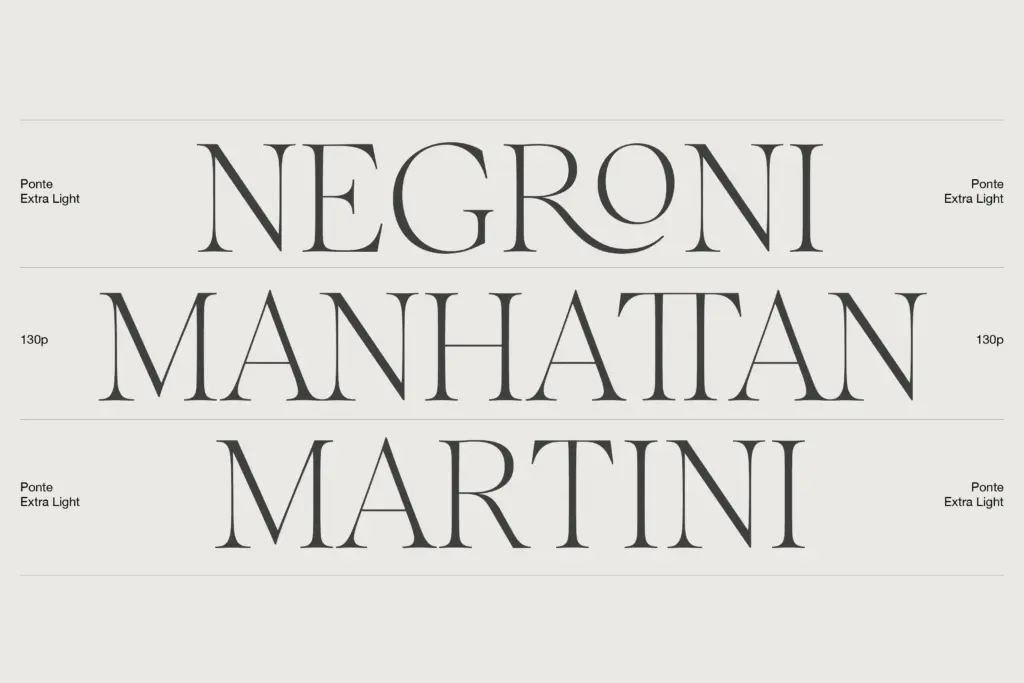
The five weights, from extra light to bold, don’t just scale the contrast evenly — the lighter weights push the hairlines to a real extreme, which is where the typeface looks most confident. The heavier weights compress that gap, and the drawing holds up less dramatically there; the bold starts to look like a different, more ordinary serif once the contrast narrows. That’s a common trade-off in high-contrast families, and Ponte doesn’t escape it, but the light-to-regular range is where the design earns its keep.
Character set and features
The headline feature is the ligature set — more than 80 of them, which is a substantial number for a display face. These aren’t just fi/fl pairs; the ligatures reshape connections between letters to mimic the joins of script lettering, letting the serif face borrow some of the flow of a calligraphic hand without becoming an actual script. Used well, they add texture to a wordmark or a short headline. Used carelessly across a full sentence, they’ll start to look busy, since so many combinations are covered that it’s easy to trigger more of them than a layout needs.
Both roman and italic are supported across all five weights, giving ten styles in total, which is a reasonable range for a display family — enough to build a hierarchy of headline, subhead and pull-quote without reaching for a second typeface. The italics carry more of the calligraphic influence than the romans and are worth testing on their own for anything with a fashion or beauty angle.
Use cases
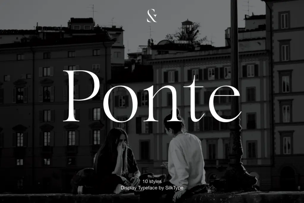
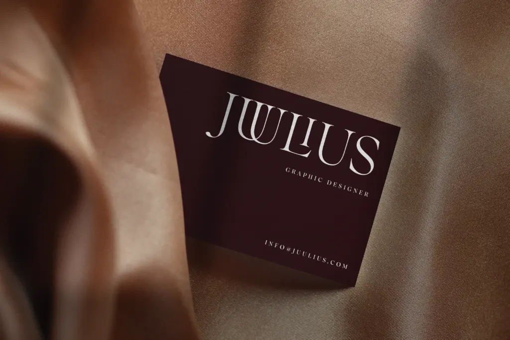
Ponte is built for headlines, not paragraphs, and it should stay there. At body-copy sizes the contrast that makes it distinctive also makes it fragile — hairlines thin out and the rhythm gets uneven on screen or in print at small point sizes. Set large, in a masthead, a fashion spread, a wedding invitation suite or packaging that wants a couture feel, it does its job well.
It’s a good fit for branding work where a single striking wordmark is needed rather than a full text system — logotypes, magazine mastheads, cosmetics packaging, invitation suites. Pair it with a plain, low-contrast sans for body text and captions; asking Ponte to carry both jobs will expose its limits. Designers should budget time to audit the ligature substitutions before shipping a layout, since automatic triggering can produce combinations that look accidental rather than intentional.
What we liked, and what we didn’t
Strengths
- The extensive ligature set adds genuine calligraphic texture to short headlines and wordmarks.
- Light-to-regular weights push the contrast to a distinctive, confident extreme.
- Ten styles across roman and italic give enough range to build a small headline hierarchy.
Trade-offs
- Legibility drops fast at small sizes because of the extreme stroke contrast.
- The bold weight loses much of the contrast-driven character that makes the lighter styles distinctive.
Ponte is a confident high-contrast display serif with a large ligature set that gives it a fashion-editorial edge, best used sparingly in headlines rather than body copy. The lighter weights are where the design is strongest; the bold loses some of the drama that defines the family. It's a solid pick for anyone building a single striking wordmark rather than a full text system.
Verdict

Tantype reviews typefaces in depth — every font is tested in real branding, editorial and screen layouts before a word gets written. 555+ fonts reviewed and counting.