
Belmonte Ballpoint: a two-style biro font with real handwriting variance
Design style
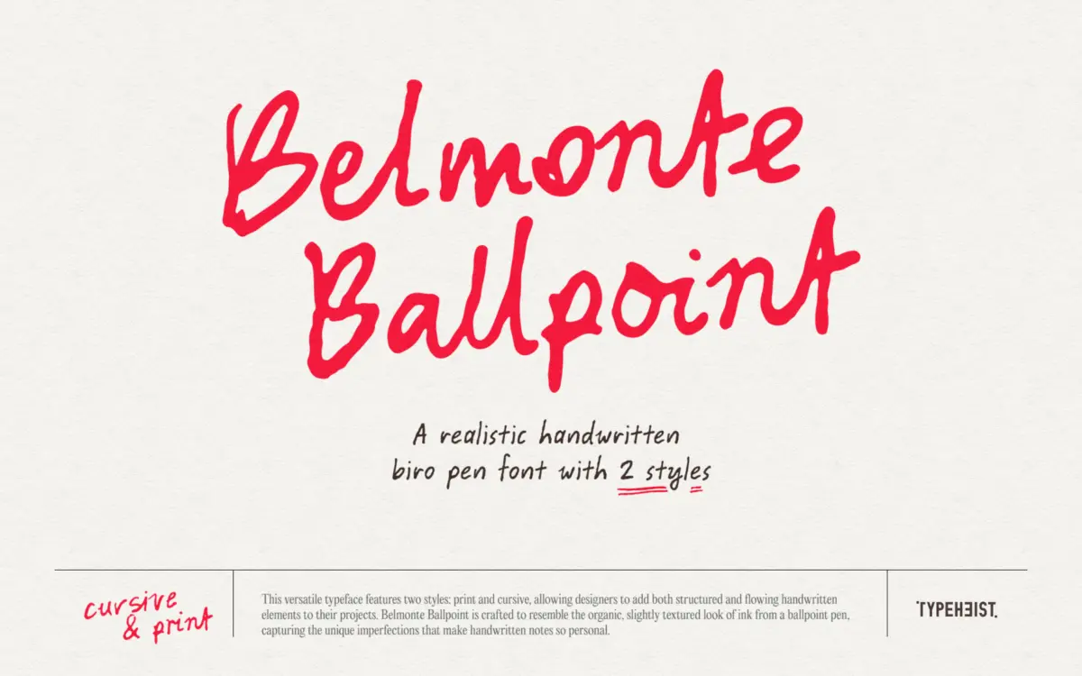
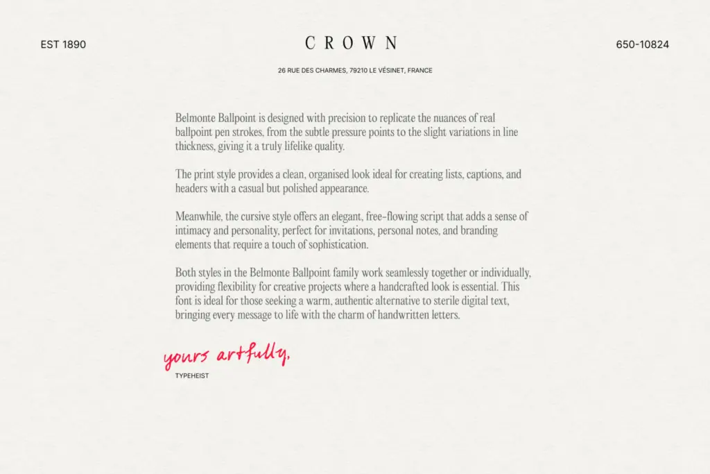
Belmonte Ballpoint sets out to look like actual ballpoint ink rather than a vectorised idea of it. The stroke has that faint scratchiness a real biro leaves when it skips slightly over paper texture, and the line weight varies just enough to suggest pressure changes without becoming inconsistent. It comes in two styles, a print version and a cursive version, and both keep the same slightly hurried, slightly uneven quality that separates genuine handwriting fonts from calligraphic ones dressed up as casual.
The print style reads as quick block lettering, the kind you’d use to fill in a form or annotate a diagram. The cursive style joins up with a loose, unforced rhythm rather than the continuous flowing line of a formal script. Neither style tries to look polished, and that’s the point — the texture is doing the work of authenticity, not the letter construction itself.
Character set and features
The set is unusually deep for a handwriting font. There are three alternate versions of A–Z and 0–9, so repeated letters within a word or across a layout don’t visibly repeat, which is the single biggest thing that gives handwriting fonts away when they’re used at any length. Two additional stylistic sets extend this further, and 197 ligatures handle common letter pairs so joins in the cursive style don’t look mechanically stamped together.
There’s also multilingual accented character support and an extended Latin set, which matters if the font needs to work outside English-language layouts — a lot of handwriting fonts skip this and fall apart the moment a project needs a diacritic.
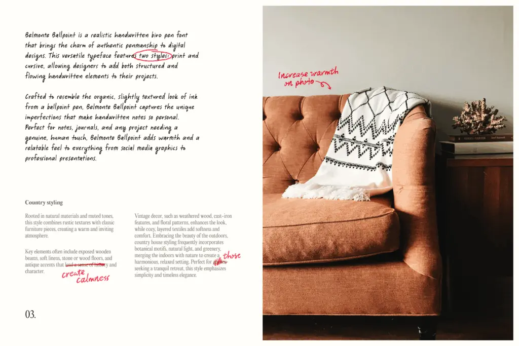
The most distinctive extra is a set of 25 scribble glyphs, accessed through keyboard shortcuts, that function as marginalia — underlines, circles, arrows, doodled marks. They’re a genuinely useful addition rather than filler, since they let you annotate a layout the way you’d mark up a printed page by hand, without hunting for a separate ornament font.
Use cases
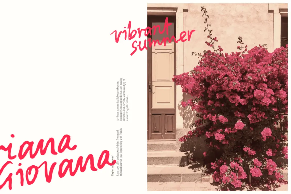
This is a font for projects that need to look like a person wrote something, not a font that wants to look designed. It suits packaging copy that mimics a handwritten note, editorial callouts, greeting cards, planner and stationery layouts, and any UI or print mockup that needs an authentic
What we liked, and what we didn’t
Strengths
- Three alternate sets per letter plus extra stylistic sets genuinely reduce visible repetition
- 197 ligatures make the cursive joins look handwritten rather than mechanically stitched
- 25 scribble glyphs add usable marginalia without needing a separate font
Trade-offs
- The deliberately uneven stroke texture limits legibility at small sizes or long paragraphs
- Cursive style's loose rhythm may read as too casual for formal branding contexts
Belmonte Ballpoint delivers convincing biro texture with enough alternates and ligatures to avoid the repetition that gives most handwriting fonts away. It's not built for long-form body text, but for notes, cards, packaging and mockups that need a personal touch, it does the job with more care than most in its category.
Verdict

Tantype reviews typefaces in depth — every font is tested in real branding, editorial and screen layouts before a word gets written. 555+ fonts reviewed and counting.