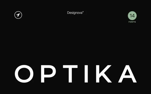
Optika: a Swiss-leaning minimalist sans built for logotypes and headlines
Design style Optika sits squarely in the grotesque-revival lane that has dominated branding work for the past decade: tight apertures,…
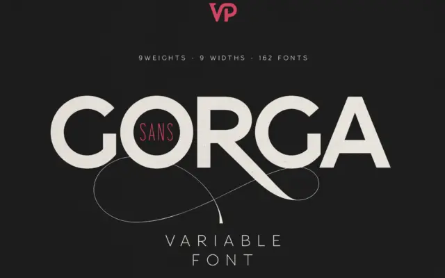
Design style Gorga Sans sits in familiar territory for a large-scale grotesque system: even stroke contrast, closed apertures, a fairly…
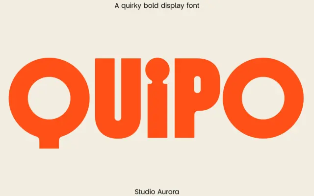
Design style Quipo is a chunky display sans built for close-up impact. The strokes are thick and rounded, with corners…
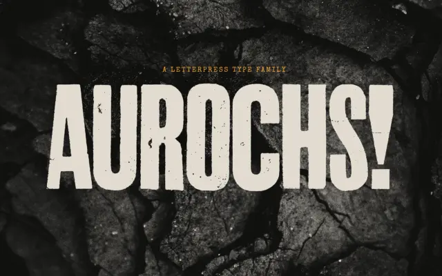
Design style Aurochs is a display sans drawn from scans of old letterpress and woodblock capitals, and it wears that…
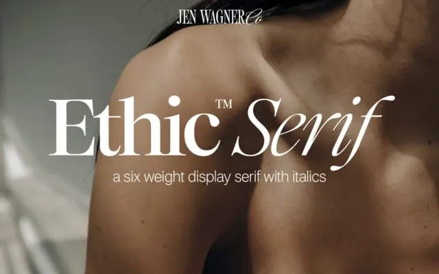
Design style Ethic Serif is a high-contrast serif built for scale rather than for reading in bulk. The thick-thin transitions…
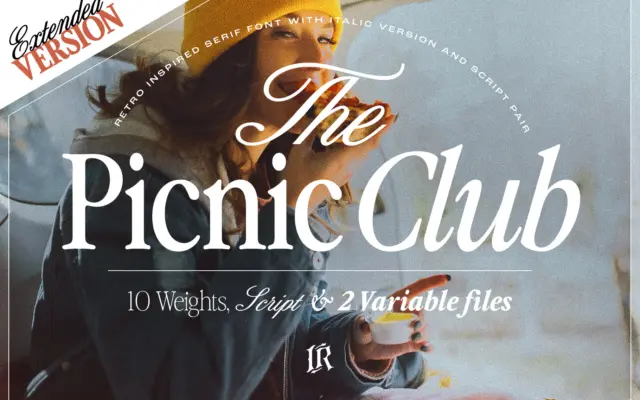
Design style The Picnic Club reads as a display serif with its roots firmly in late-1970s and 1980s lettering: slightly…
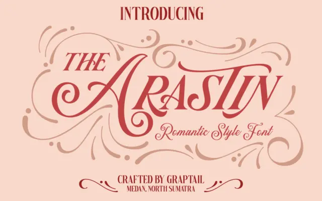
Design style Arastin is less a single typeface than a small family built around one gesture: an outer curve that…
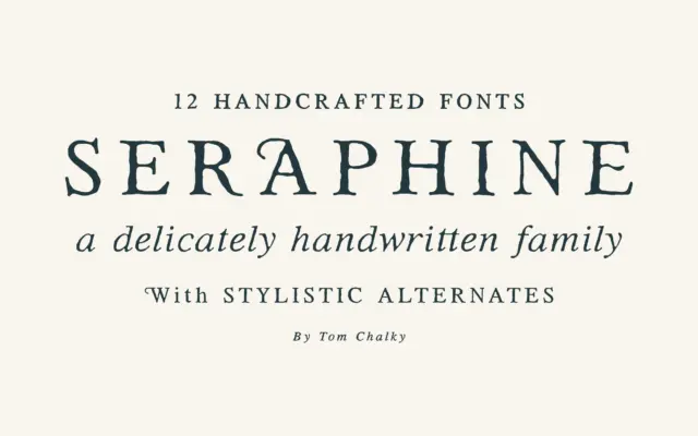
Design style Seraphine sits in the well-populated territory of the warm, handcrafted serif — the kind of face that wants…
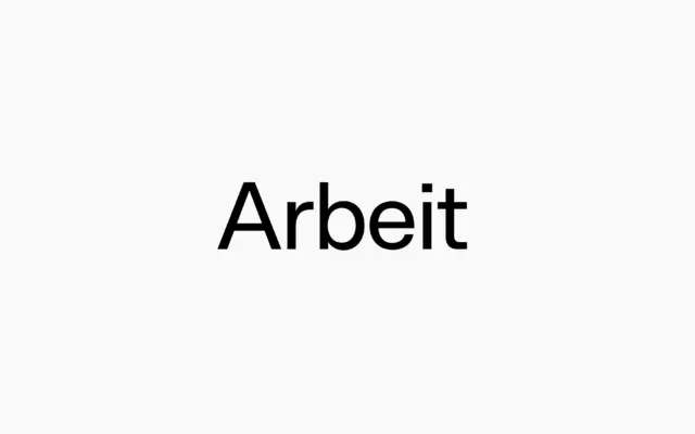
Design style Arbeit sits squarely in the Neo-Grotesque tradition, the family of sans serifs built on even stroke weight, closed…