
Quipo: A Bold, Curvy Display Sans for Headlines and Logos
Design style
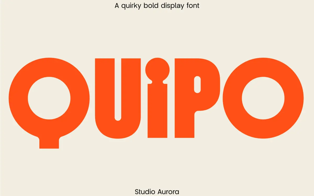
Quipo is a chunky display sans built for close-up impact. The strokes are thick and rounded, with corners that soften into stubby curves rather than staying sharp, which gives the whole face a slightly inflated, rubbery quality. It reads as friendly and a bit cartoonish without tipping into novelty-font territory, mostly because the proportions stay disciplined: x-height is generous, stroke width is consistent, and the letters don’t wobble off their baseline the way a lot of “quirky” faces do.
The curves are the whole point here. Bowls on letters like B, O and R are noticeably round and full, almost bubble-like, and that roundness carries through into the lowercase alternates as well. There’s a hand-built feel to some of the joins — you can see where a designer chose to let a stroke terminate abruptly rather than taper it, which keeps the letterforms feeling drawn rather than mechanically generated. It’s a display face with a personality, not a workhorse pretending to have one.
Character set and features
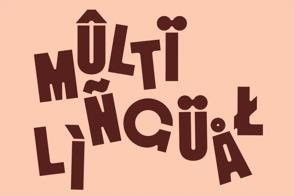
Quipo ships with a full uppercase set, punctuation, and numerals, plus a set of alternate lowercase glyphs. That alternate set matters more than it might sound: swapping between the default and alternate lowercase changes the character of a word noticeably, letting you dial the quirkiness up or down depending on context. It’s a smart inclusion for a font whose whole appeal rests on personality, since it gives some control over how loud that personality gets.
Language support extends to a reasonable spread of Western European languages plus Zulu, so accented characters for French, Spanish, German, Portuguese and similar are covered. There’s no mention of small caps, ligatures, or an extended symbol set, and nothing here suggests this is a font built for long runs of text — it isn’t, and it shouldn’t be judged as if it were.
At small sizes the thick strokes and tight curves start to close up, particularly in letters with enclosed counters. This isn’t a face for body copy or dense paragraphs; it wants space and size to breathe. Used at the scale it’s designed for — a few words, not a few sentences — it holds together well and the rounded terminals stay crisp rather than muddy.
Use cases
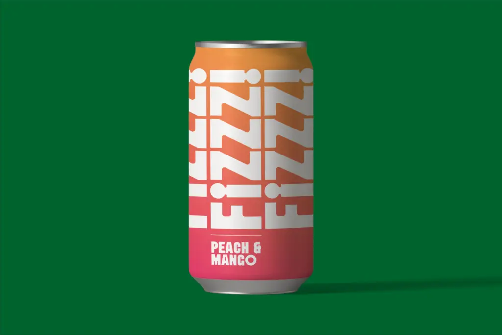
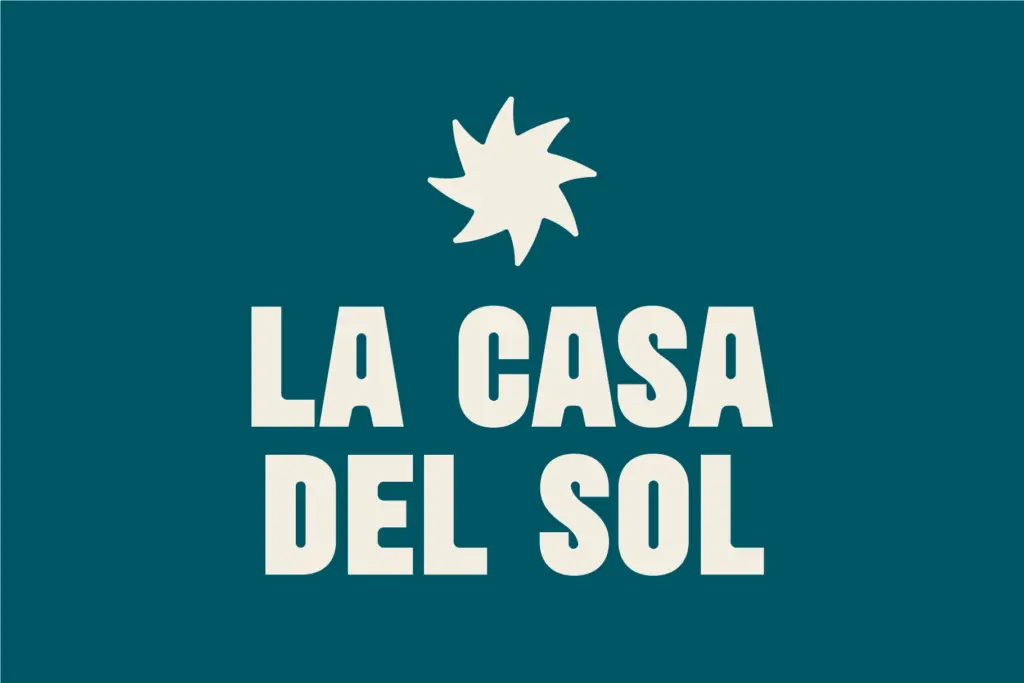
Quipo’s natural home is short-form and high-visibility: logotypes, wordmarks, magazine mastheads, poster headlines, social graphics, packaging call-outs. The bold, rounded character gives it warmth that works well for brands wanting to feel approachable rather than corporate — food and beverage, lifestyle products, kids’ brands, anything that wants to feel a bit playful without going full hand-lettered.
It’s less suited to anything requiring restraint or formality; the roundness reads as casual no matter how it’s set, so it won’t do quiet, minimal branding convincingly. Email marketing headers and app banners, mentioned in the seller’s own pitch, are plausible uses too, provided the type stays large and the word count stays short. Pair it with a plain, quiet sans or serif for supporting text, since Quipo has enough visual weight of its own that it shouldn’t be asked to compete with anything similarly loud on the same page.
What we liked, and what we didn’t
Strengths
- Rounded, consistent stroke weight gives it a distinct, approachable personality
- Alternate lowercase set lets you adjust how playful the word looks
- Holds up cleanly at large display sizes with crisp terminals
Trade-offs
- Enclosed counters start to close up at smaller sizes, limiting it to short, large-scale use
- No small caps or ligatures, so its feature set is fairly basic for a display face
Quipo is a solidly drawn, characterful display sans that does one job — big, bold, friendly headlines — well. It's not built for body text or formal branding, but within its lane it's confident and well-controlled.
Verdict

Tantype reviews typefaces in depth — every font is tested in real branding, editorial and screen layouts before a word gets written. 555+ fonts reviewed and counting.