
Arastin: a flowing script-and-sans headline set built for alternates
Design style
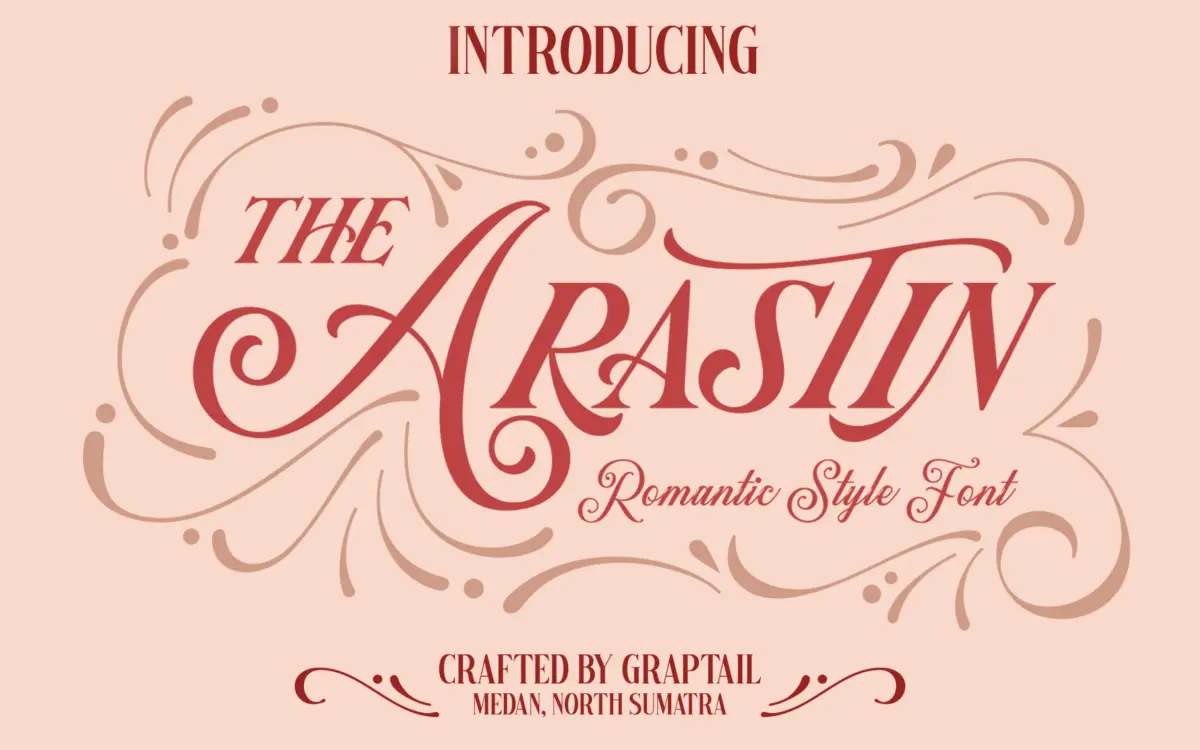
Arastin is less a single typeface than a small family built around one gesture: an outer curve that runs unbroken from the start of a letter to its close. That continuity is the whole idea. Bowls, arms and tails are drawn as one sweep rather than a series of stroke joins, and the same logic repeats across the set so the type colour stays even even when the individual letters get busy with swashes.
The package bundles three related cuts — a Pro version, a Script version, and a Std version — plus a set of ornaments. That’s a wider net than most single-style display fonts throw, and it means the ‘look’ of Arastin shifts depending on which file you open: the Script cut leans hard into connected, romantic cursive forms, while the Std and Pro versions read more like upright display letters with script DNA rather than a true joined script. Judged purely as drawing, the curves are confident and the tension in the thick-thin transitions is consistent, but this is a font that wants to be big. At small sizes the flourish that makes it interesting also makes it fussy.
Character set and features
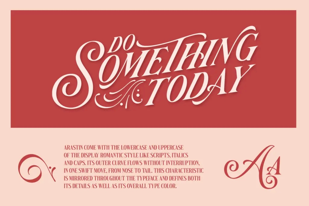
Each cut ships with upper and lowercase, and the family leans on OpenType stylistic alternates, stylistic sets, and contextual alternates to do a lot of the work — swapping in different swash tails or entry strokes depending on what follows. There’s also a wider bank of glyphs accessed through PUA encoding, which means anyone not using an OpenType-savvy app will need to go hunting through Character Map or Glyphs panel rather than typing alternates automatically. That’s a real friction point for anyone working outside Adobe or a similarly capable layout tool — it’s not a drop-in font for a basic word processor or a template builder that doesn’t support contextual substitution.
The ornament set (delivered as EPS) is a nice inclusion for filling out invitations or packaging panels, but it’s a separate asset, not something baked into the font’s glyph palette, so it needs to be brought in and placed by hand.
Use cases
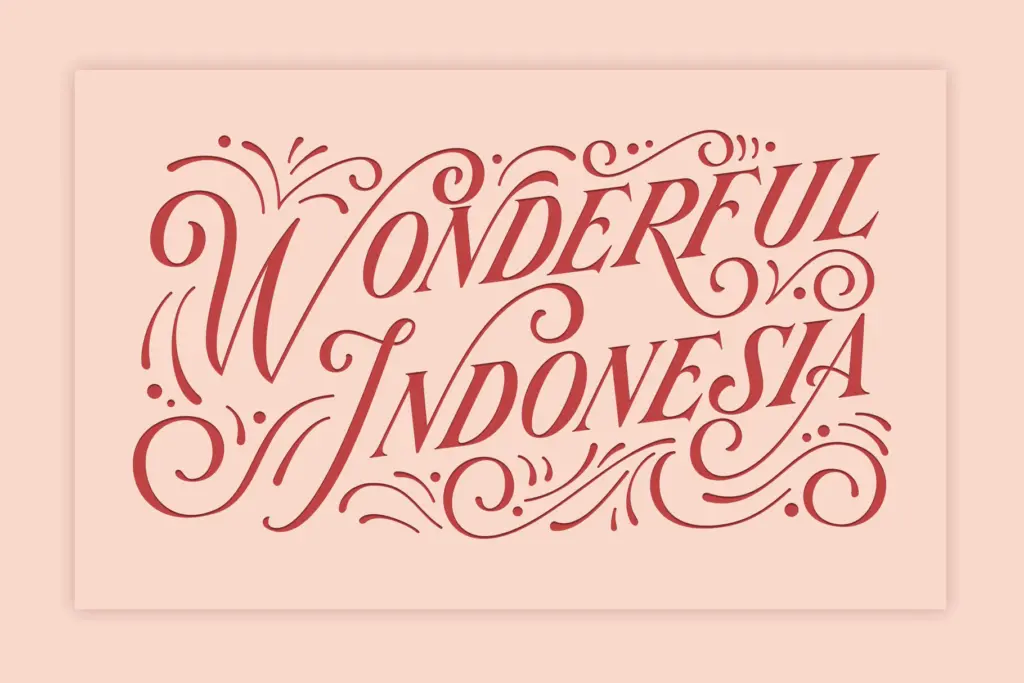
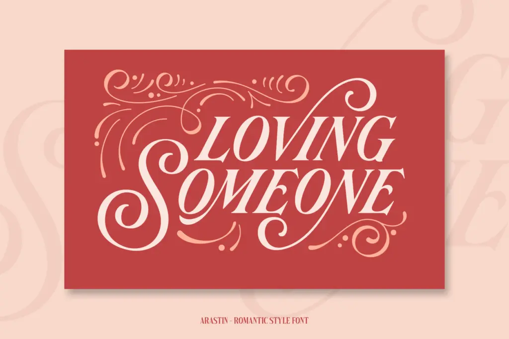
This is a headline font, full stop. It’s built for logotypes, posters, packaging fronts, T-shirt graphics, postcards and short invitation lines — anywhere a handful of words get to be the entire composition and can be set large enough for the joins and swashes to read as intentional rather than cluttered. Wedding and event stationery is an obvious fit given the romantic curve work, as is any branding project chasing a handmade, personal tone rather than a corporate one.
It’s not built for body copy, UI, or dense information design — the flourish and the variable widths of the alternates work against sustained reading. And because the alternates depend on OpenType feature support, teams working in tools without that support will end up with a flatter, less distinctive version of the font than the one shown in the specimen. Budget time to explore the stylistic sets before committing to a layout; the difference between the default glyphs and the alternates is where most of this font’s value sits.
What we liked, and what we didn’t
Strengths
- Three related cuts (Pro, Script, Std) give real variety within one purchase
- Deep stylistic alternate and contextual alternate support rewards careful hand-setting
- Included ornaments add useful decoration for invitation and packaging layouts
Trade-offs
- Legibility drops fast below headline sizes because of the swash-heavy curves
- PUA-encoded extras require manual glyph access outside OpenType-savvy apps
Arastin is a competent display family for anyone who wants a romantic, hand-curved feel across a few related styles rather than one fixed look. The alternates are where the personality lives, but they demand OpenType-capable software and a headline-scale setting to pay off. It's a solid pick for branding and invitation work, not for anything that needs to be read in paragraphs.
Verdict

Tantype reviews typefaces in depth — every font is tested in real branding, editorial and screen layouts before a word gets written. 555+ fonts reviewed and counting.