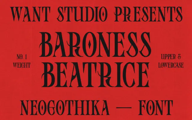
Baroness Beatrice: a blackletter with a softened, contemporary edge
Design style Baroness Beatrice sits in that increasingly common space where blackletter structure gets filed down for modern taste. The…
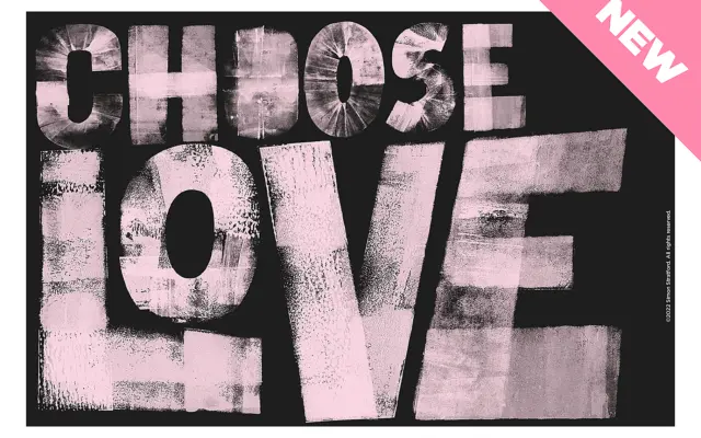
Design style Choose Love is a bold sans built from cardboard cutouts and an ink brayer, then scanned and turned…
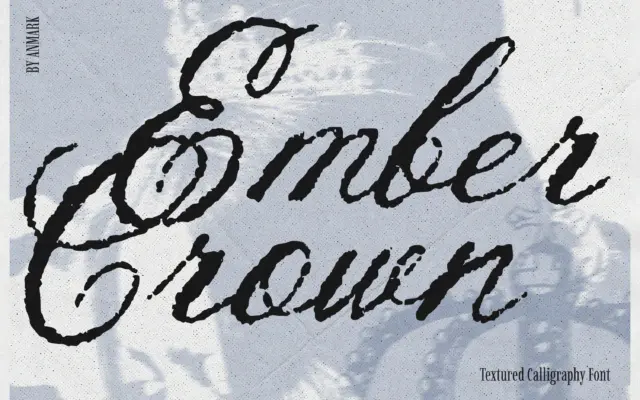
Design style Ember Crown is a brush-driven script built on a rough, distressed surface rather than a clean calligraphic line.…
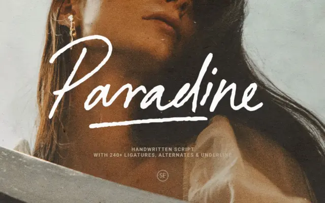
Design style Paradine sits in the crowded field of signature-style scripts, but it leans more toward an unhurried, handwritten feel…
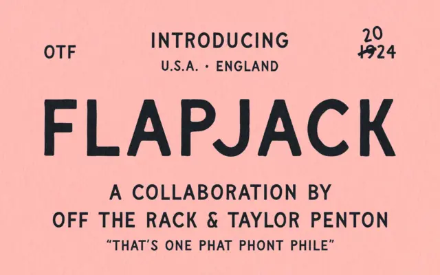
Design style Flapjack sits closer to signwriting than it does to conventional sans serif design, though that’s the category it…
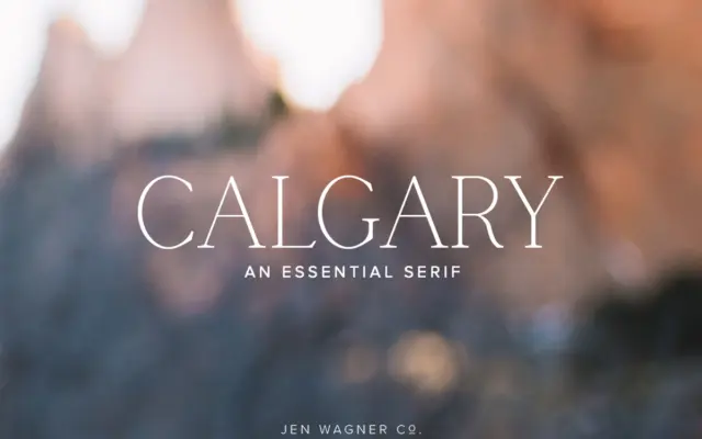
Design style Calgary is a narrow serif built for restraint rather than flourish. The letterforms are tall and condensed, with…
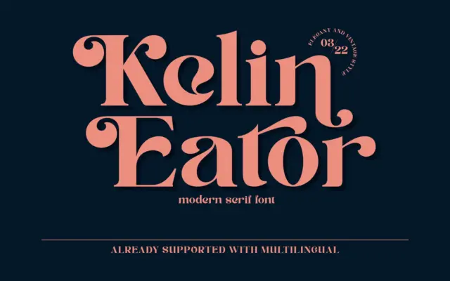
Design style Kelin Eator sits in the well-worn territory of vintage-inspired display serifs: moderate contrast, bracketed serifs, and a general…
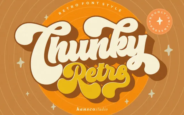
Design style Chunky Retro Font sits squarely in the bold, rounded display tradition that pulls from mid-century signage and packaging…
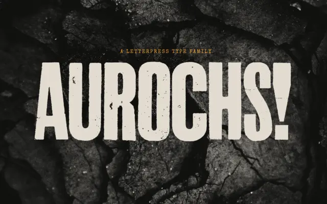
Design style Aurochs is a display sans drawn from scans of old letterpress and woodblock capitals, and it wears that…