
Paradine: a handwritten script for brands that need a personal signature
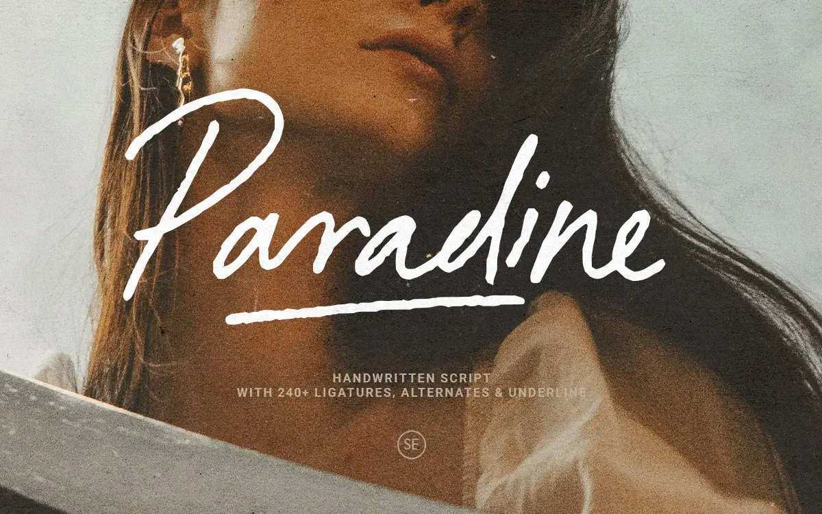
Design style
Paradine sits in the crowded field of signature-style scripts, but it leans more toward an unhurried, handwritten feel than the tight, brush-lettered scripts that dominate the category. The strokes have a casual slant and a slightly uneven baseline that reads as genuine handwriting rather than a font pretending to be handwriting. Letters connect with real joins in places, and the ligatures are doing a lot of the work here — they’re what stops the script from looking like isolated letters glued together.
The stroke contrast is moderate. Nothing about it screams for attention, which is part of the point: this is a script meant to feel like a note written by someone with decent handwriting, not a calligrapher’s flourish piece. There’s an alternate character set that shifts the mood toward something slightly more composed, useful when the default lowercase feels too loose for a given layout.
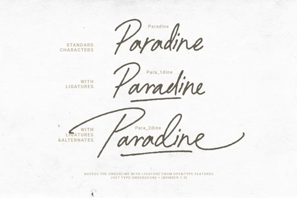
Character set and features
The ligature set is the headline feature, and it’s substantial enough to change how you type rather than just decorate the ends of words. Left to its own devices with standard OpenType features switched on, Paradine will substitute common letter pairs automatically, smoothing over the awkward joins that plague lesser handwritten fonts. That said, ligature-heavy scripts always ask more of the person setting the type — you’ll want an app that actually supports OpenType features, and you’ll want to proof the output, because automatic substitution occasionally picks a join that doesn’t sit right in a particular word.
The alternates give you a second personality within one purchase: swap in the stylistic set and words tighten up, less looping, better suited to a headline that needs to hold its shape at a glance rather than be read letter by letter. Multi-language support is mentioned in the font’s documentation, which matters if your work isn’t limited to English copy, though the specifics of which diacritics are covered aren’t something to take on faith — check the character map before committing to a layout that depends on them.

Use cases
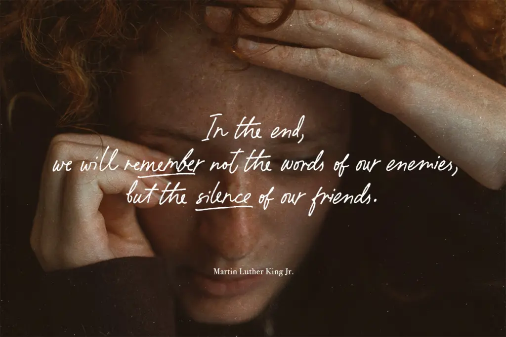
Paradine’s natural home is anywhere a brand wants to look personally signed — wedding stationery, packaging labels, quote graphics for social posts, logotypes for businesses trading on warmth rather than precision. The looseness that makes it feel handwritten also means it needs room to breathe: cramped kerning or small sizes will collapse the joins and turn elegant ligatures into mush. Set it big, on invitations, headers, or short lines of display text, and it holds up. Set it as body copy or in a dense paragraph and it stops working entirely, as most scripts in this style do.
It pairs well with a plain, quiet sans or serif doing the heavy lifting of actual reading, leaving Paradine to handle the one line that needs a human touch — a signature, a title, a name on a card. Anyone building a wedding suite, a boutique label, or a lifestyle Instagram brand kit will find it does that one job capably.
What we liked, and what we didn’t
Strengths
- The ligature set genuinely smooths over awkward letter joins instead of just decorating them
- Stylistic alternates give you a tighter, more composed option without switching fonts
- Reads as authentic handwriting rather than an obviously templated script
Trade-offs
- Needs generous size and spacing to work; it degrades quickly in small or dense settings
- Automatic ligature substitution occasionally needs manual proofing to avoid awkward joins
Paradine is a solid, unpretentious handwritten script that leans on a genuinely useful ligature set to fake natural handwriting. It's built for short lines at display sizes — headlines, signatures, labels — and it will disappoint anyone who tries to push it into body copy or tight layouts.
Verdict

Tantype reviews typefaces in depth — every font is tested in real branding, editorial and screen layouts before a word gets written. 555+ fonts reviewed and counting.