Serif
3.7
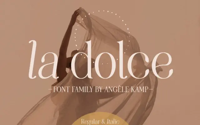
La Dolce: a feminine serif family for wedding and branding work
Design style La Dolce sits in the modern serif camp that has become a staple of feminine branding: moderate stroke…
 Tantype

Design style La Dolce sits in the modern serif camp that has become a staple of feminine branding: moderate stroke…
Tantype
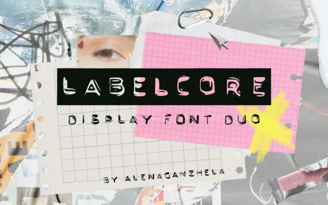
Design style LABELCORE takes its cue from the plastic embossed label makers that lived in every junk drawer in the…
Tantype
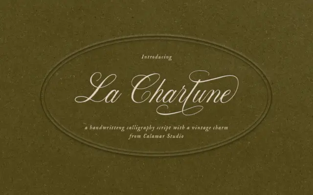
Design style La Charlune takes the bones of copperplate script — the steep slant, the thick-thin contrast built from pressure…
Tantype
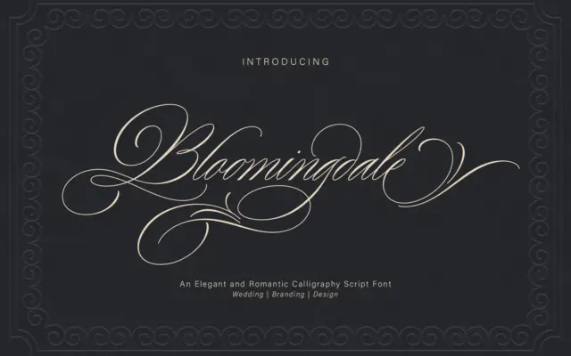
Design style Bloomingdale sits in the crowded field of connected scripts modelled on brush and pointed-pen handwriting, with a fairly…
Tantype
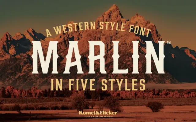
Design style Marlin sits squarely in the old-west signage tradition: condensed slab serifs, heavy vertical stress, and slightly worn edges…
Tantype
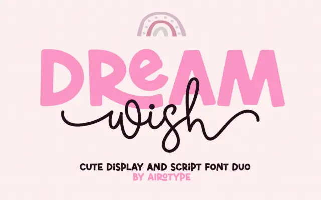
Design style Dream Wish is a two-part set built around a single mood: cheerful, slightly childlike, and unfussy. The script…
Tantype
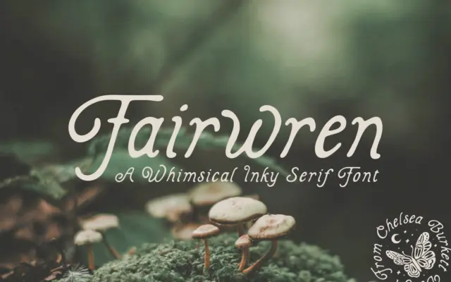
Design style Fairwren is a bold serif built on solid, slightly irregular strokes with inky edges that suggest a nib…
Tantype
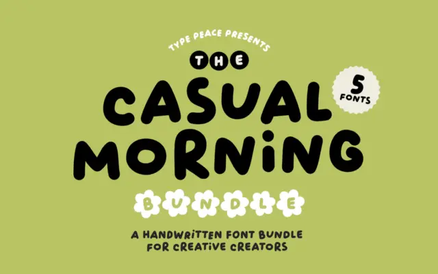
Design style Casual Morning is an all-caps handwritten face built on thick, marker-like strokes rather than fine calligraphic ones. The…
Tantype
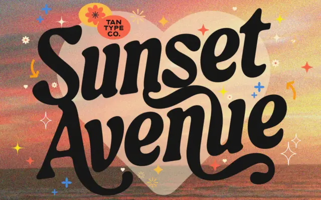
Design style TAN-SUNSET sits in serif territory but leans hard into personality rather than restraint. The strokes carry noticeable contrast,…
Tantype