Serif
4.0
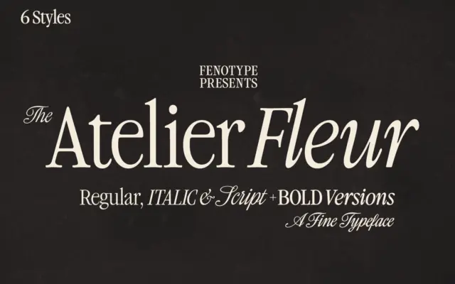
Atelier Fleur: a condensed Garamond-inspired serif for editorial headlines
Design style Atelier Fleur takes Garamond’s old-style bones and squeezes them into a condensed frame built for headline duty rather…
 Tantype

Design style Atelier Fleur takes Garamond’s old-style bones and squeezes them into a condensed frame built for headline duty rather…
Tantype
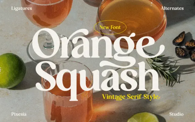
Design style Orange Squash sits in the family of bold vintage serifs that borrow from 1970s packaging and signage rather…
Tantype
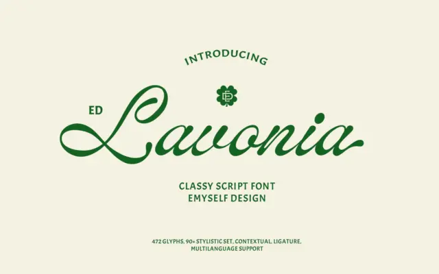
Design style ED Lavonia sits in the well-populated field of connected, classic-leaning scripts, but it avoids the overly bouncy or…
Tantype
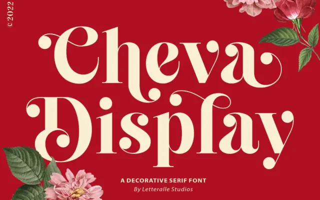
Design style Cheva Display sits somewhere between a slab and a transitional serif, with heavy strokes that carry a soft…
Tantype
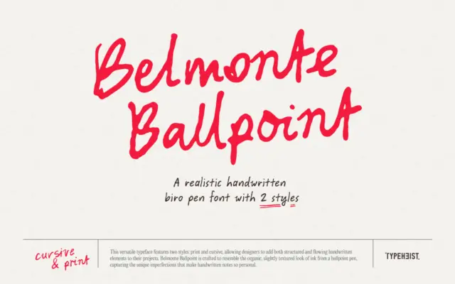
Design style Belmonte Ballpoint sets out to look like actual ballpoint ink rather than a vectorised idea of it. The…
Tantype
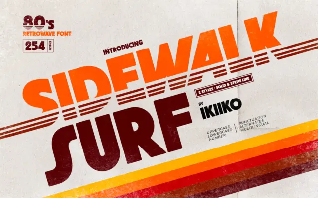
Design style Sidewalk Surf is a heavyweight display letterform built to sit inside the 1980s retrowave revival — the world…
Tantype
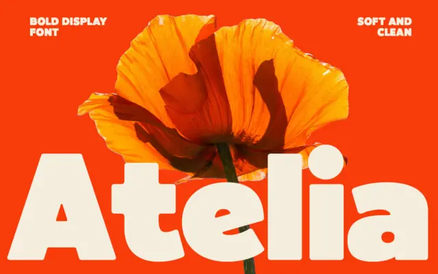
Design style Atelia is a bold, rounded display sans that leans hard into weight. The strokes are thick and consistent,…
Tantype
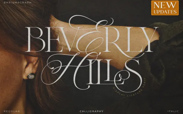
Design style Beverly Hills sits at the intersection of calligraphy and serif construction, and it wears that hybrid identity openly.…
Tantype
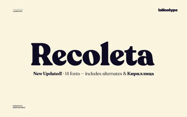
Design style Recoleta belongs to the family of soft slab serifs that took cues from 1970s display faces like Cooper…
Tantype