
The Blank Weirdos: a scrappy handwritten font for offbeat branding
Design style
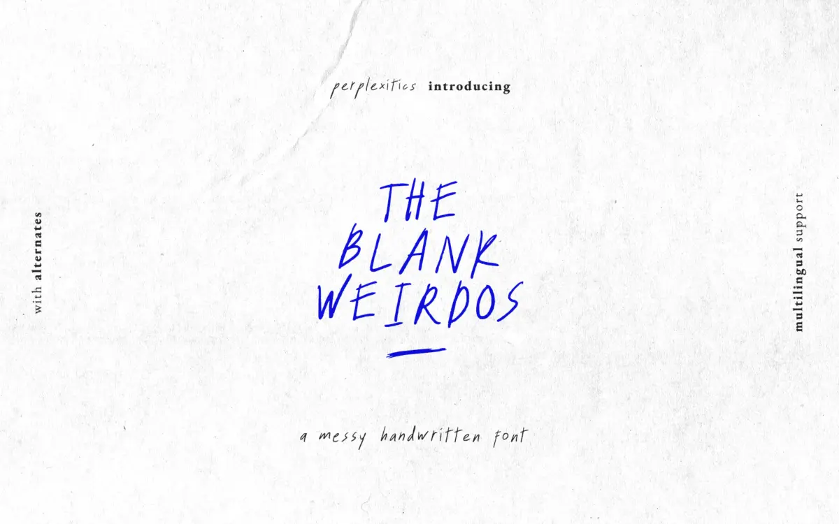
The Blank Weirdos is a loose, deliberately imperfect handwritten face. Strokes wobble, baselines drift, and letters look like they were dashed off with a dry marker rather than ruled with a pen. There’s no attempt at calligraphic polish here — the appeal is in the rawness, the sense that a real hand with real hesitation made these marks. Terminals are blunt, joins are inconsistent from letter to letter, and the overall texture reads as sketchy rather than smooth.
This is a font built around irregularity as a feature. If you’re after a handwritten style that behaves predictably at every size and in every word, this isn’t it. The whole point is that it doesn’t behave — it’s meant to look like scribbled notes, quick annotations, or the kind of lettering you’d find on a zine cover rather than a wedding suite.
Character set and features
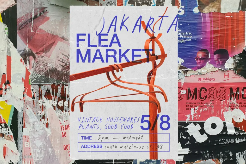
The package includes a Regular style plus three numbered alternates, each shipped as both OTF and TTF, and the Regular comes with three alternate letterforms built in for extra variation within a single setting. That’s a reasonable amount of flexibility for a font in this price bracket — swapping between the four styles, or mixing in the alternates, gives you more visual variety than a single static handwritten font would offer, which helps offset the fact that any one style on its own can look repetitive across a long passage.
Coverage includes uppercase and lowercase letters, numerals, and punctuation, along with an extended set of accented characters covering most Western and Central European diacritics. That’s useful if you’re designing for a non-English audience, though as with most display handwritten fonts, the character set is built for short bursts of text rather than long-form typesetting — kerning irregularities and the intentional roughness of the forms mean paragraphs of body copy are not what this font is for.
Because the letterforms are so loosely drawn, legibility drops off if you push the font too small. It wants room to breathe — headlines, short phrases, single words — where its imperfections read as character rather than confusion.
Use cases
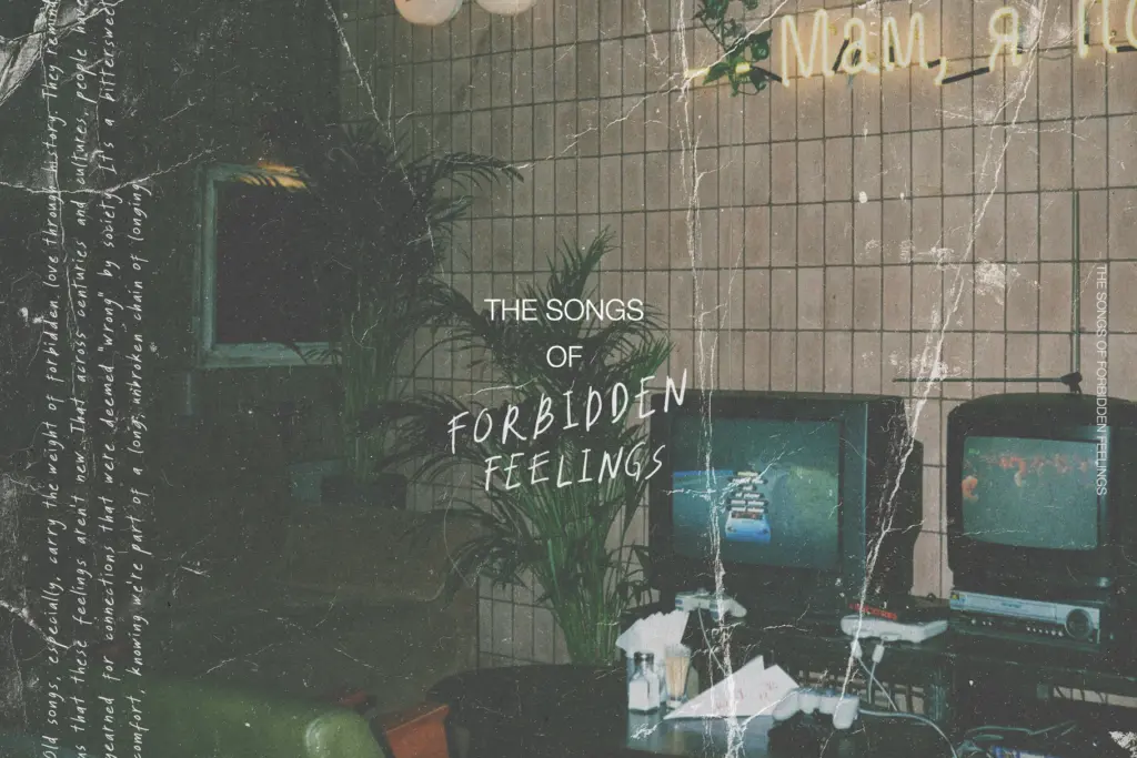
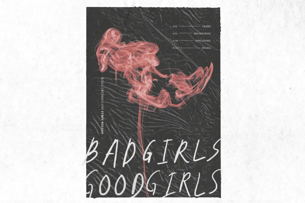
This is a font for projects that want to look handmade and a little unruly: packaging for a small-batch product, a zine or poster with a DIY sensibility, social graphics that need to feel personal rather than corporate, or a logotype for a brand that’s leaning into imperfection as a value. The alternates make it workable for short pieces of lettering where you want the letters to look non-identical, like a hand-scrawled note or a casual signage piece.
It’s less suited to anything that needs to read cleanly at small sizes or hold up across dense paragraphs — invoices, body text, long-form editorial. Pair it sparingly with a plain, restrained sans or serif for supporting text, and let The Blank Weirdos do the work of a single expressive line rather than carrying a whole layout.
What we liked, and what we didn’t
Strengths
- Four style variants plus built-in alternates give more variety than a single handwritten font typically offers
- Extended European diacritic support broadens its use beyond English-only projects
- The rough, wobbly texture reads as authentically handmade rather than artificially distressed
Trade-offs
- Legibility suffers at small sizes, limiting it to short headline-length text
- The intentional irregularity can look repetitive or messy across longer passages
The Blank Weirdos is a competent scrappy handwritten font that does one job well: looking deliberately unpolished. It's not built for long text or fine detail work, but for headlines, packaging, and casual branding it delivers a genuine handmade texture.
Verdict

Tantype reviews typefaces in depth — every font is tested in real branding, editorial and screen layouts before a word gets written. 555+ fonts reviewed and counting.