
Studio Nomad: a monoline script duo built for gel-ink texture and glitch swashes
Design style
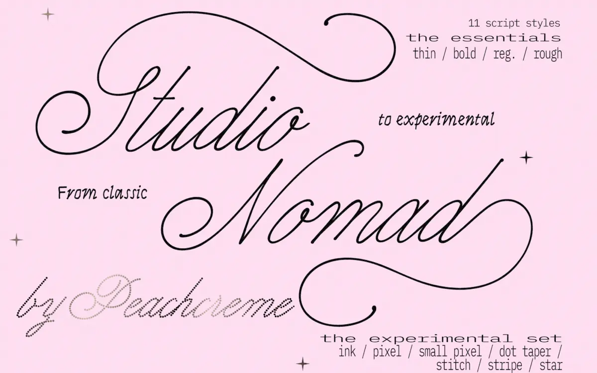
Studio Nomad reads as a reaction against the copperplate tradition rather than an extension of it. The thick-to-thin contrast that defines classic pointed-pen scripts is mostly gone here, replaced by a even, gel-pen line that moves at a steady weight through the whole letterform. That monoline approach gives the base styles, grouped as the Essentials, a loose, unhurried feel — closer to fast handwriting than formal engraving. The joins are soft, the entry strokes short, and the overall rhythm reads more casual than luxe.
The second half of the family, the Experimental Set, is where the concept gets more interesting and more polarising. Styles built around stars, dots, pixels and stitched lines break the stroke into small repeating units rather than a continuous line. It’s less a script and more a texture system dressed as one — the letters are still legible cursive forms underneath, but the surface has been swapped for a pattern of micro-marks. This is a font family with two personalities: one built for restraint, one built for noise.

Character set and features
The Essentials carry the OpenType apparatus you’d expect from a working script — alternates and swashes accessible through stylistic sets, allowing entry and exit strokes to be swapped without redrawing anything by hand. That flexibility matters here specifically because the monoline base is plain enough that the swashes do most of the personality lifting; without them the letters would read fairly generic.
The Experimental styles are a different kind of typeface entirely, and buyers should treat them as such. Because the strokes are built from discrete geometric units — dots, stars, stitched segments — character spacing and kerning behave less predictably than in a standard script, and the seller’s own disclosure about character overlaps is worth taking seriously: at small sizes or tight tracking, the pattern units can collide or clump rather than reading as clean letterforms. These styles want room to breathe, both in point size and in line spacing.
Use cases
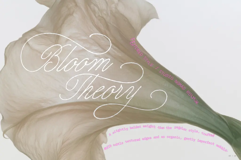
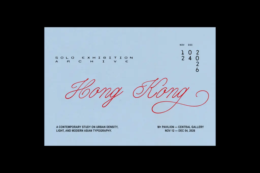
The Essentials are the more dependable half of this purchase. They suit short editorial lines — a pull quote, a masthead flourish, a product name on packaging — where a monoline script needs to feel current rather than bridal. They’re not the choice for a formal invitation suite; the character is too casual and the contrast too flat for that register. Think boutique branding, streetwear-adjacent packaging, social graphics, anywhere a script needs to feel handwritten but not fussy.
The Experimental styles are a narrower tool. They’re built for headline moments where the texture itself is the point — a Y2K-leaning logo mark, an album cover, a poster where the star-and-dot construction reads as deliberate design rather than a legibility problem. Set them large, give them space, and don’t expect them to carry body copy or long product names. Used at the wrong scale they stop being a script and start being noise, which is the trade-off you accept for the novelty.
What we liked, and what we didn’t
Strengths
- Swash and alternate sets give the plain monoline base real personality without redrawing
- Experimental styles offer a genuinely distinctive texture-built construction rarely seen in script fonts
- Works across a wide register, from casual branding to deliberately glitchy display headlines
Trade-offs
- Experimental styles lose legibility fast at small sizes due to their dot-and-stitch construction
- The Essentials' flat, even contrast can feel generic without the swash alternates applied
Studio Nomad is really two typefaces bundled together: a dependable monoline script and a riskier texture-built experimental set. The Essentials do solid, quiet work for branding and packaging; the Experimental styles are a specialist tool best reserved for large-scale display moments where legibility isn't the priority.
Verdict

Tantype reviews typefaces in depth — every font is tested in real branding, editorial and screen layouts before a word gets written. 555+ fonts reviewed and counting.