
Perfections: a romantic calligraphy script for weddings and boutique branding

Design style
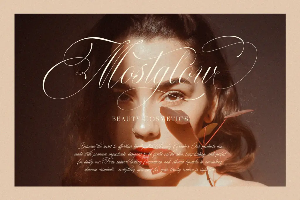
Perfections belongs to the crowded field of connecting calligraphy scripts built around a flat-brush or pointed-pen feel: thick downstrokes, thin upstrokes, and a steady rightward slant that gives the whole alphabet a fluent, unhurried motion. The joins between letters are smooth rather than sharp, so words read as continuous ribbons of ink rather than a chain of separate marks. Swashes appear on the entry strokes of capitals and on a handful of terminal letters, but they’re kept close to the baseline rather than looping high above or below it, which keeps the overall texture calmer than many scripts in this category. It reads as considered rather than showy — the kind of script that’s trying to look like good handwriting rather than a stunt.
Character set and features
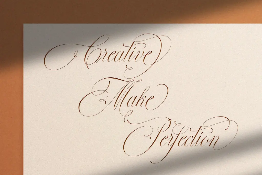
The letterforms carry the usual calligraphic vocabulary: entry strokes that curl before settling into the stem, exit strokes that taper rather than snap off, and a moderate degree of contrast between thick and thin that stays legible at small sizes without flattening into a monoline look. Capitals lean more decorative than lowercase, with extra flourish on letters like the capital P, F and L — the kind of forms that work well as a single initial or monogram but need care in a full word set in caps, where the swashes can start to collide. As is typical for scripts of this kind, spacing needs attention: kerning pairs will need occasional manual adjustment, particularly around repeated ascenders or descenders, and setting it in all caps is not something the design encourages. The font is best treated as a display tool for short phrases rather than a workhorse for paragraphs.
Use cases
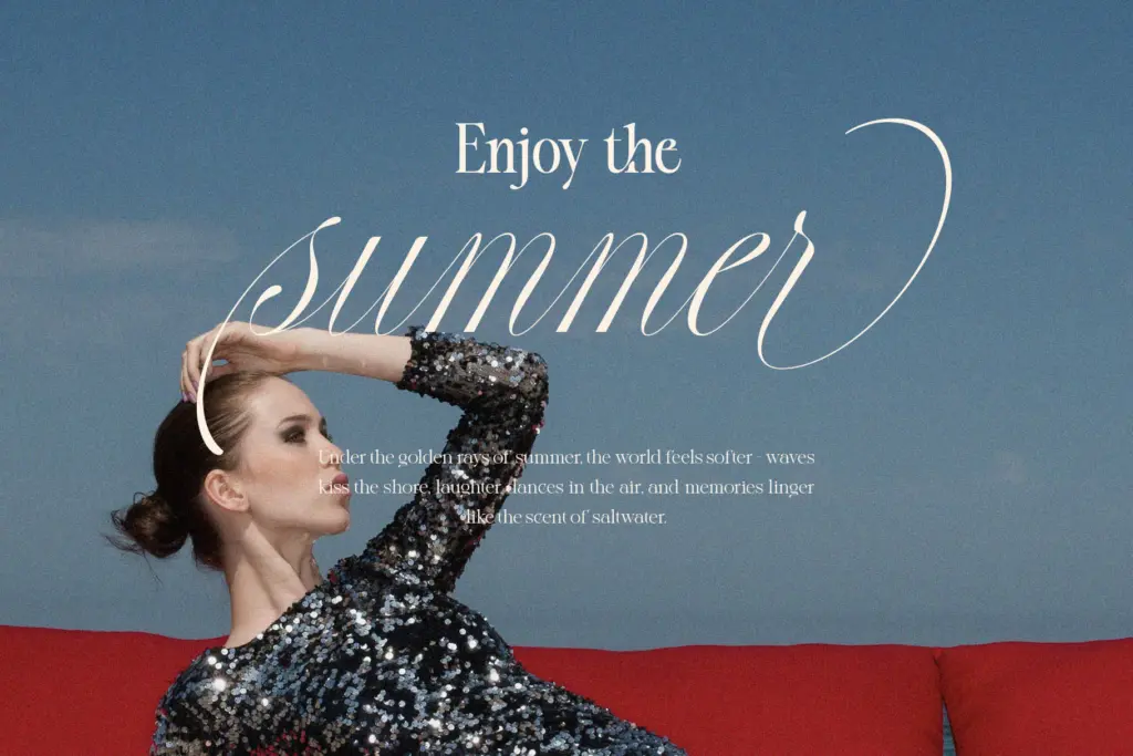
This is a font for identity work where the brief calls for warmth without heaviness — invitation suites, place cards, a signature line on a certificate, or a logotype for a small fashion or beauty label that wants to signal craft rather than mass production. It also does well as a secondary voice: a script pull-quote against a plain sans, or a monogram on packaging for cosmetics or gourmet goods where the brand wants a handwritten touch without tipping into anything too casual. Where it struggles is in contexts that demand absolute clarity at very small sizes — a script’s inherent trade-off, and this one is no exception, given the flourish on its capitals. It’s also not a font to lean on for body text or long headlines; its value is in short, deliberate uses where a designer can control the kerning and let the curves breathe. Used at the right size, with enough surrounding white space, it does the job it’s built for: making a few words look handwritten by someone who cared.
What we liked, and what we didn’t
Strengths
- Consistent, fluent joins give words a natural handwritten rhythm
- Swashes stay close to the baseline, avoiding the overcrowded look common in the category
- Reads clearly at the small-to-medium sizes typical of invitation and packaging work
Trade-offs
- Capitals with heavy flourish need manual kerning care in full-word or all-caps settings
- Not suited to body text or long headline use, where the contrast and joins lose clarity
Perfections is a competent, well-mannered calligraphy script with restrained swashes and a smooth, connected flow. It suits short, deliberate uses — invitations, monograms, packaging accents — more than anything demanding dense text or all-caps setting. Not groundbreaking, but a solid, usable addition to the wedding-and-branding script category.
Verdict

Tantype reviews typefaces in depth — every font is tested in real branding, editorial and screen layouts before a word gets written. 555+ fonts reviewed and counting.