
The Faitline Romantic Script: a soft, vintage-leaning script for wedding and love-themed work
Design style
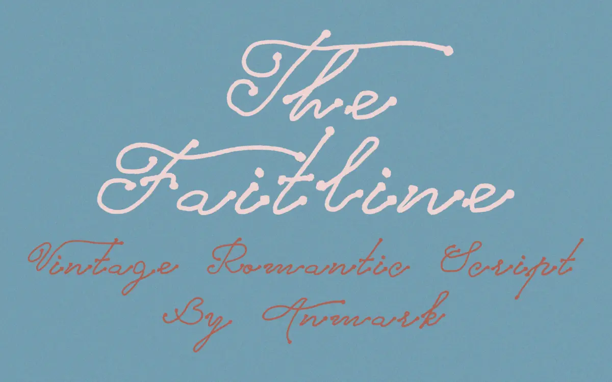
The Faitline sits in the well-populated family of romantic scripts built around connected, low-contrast strokes and a relaxed, slightly backward-leaning rhythm. The letterforms are rounded rather than pointed, with soft entry and exit strokes instead of sharp calligraphic flicks. There’s no dramatic thick-thin swing here — the contrast is gentle, which keeps the overall texture even rather than showy. It reads as handwriting that’s been tidied up for print, closer to a warm note than a formal invitation hand.
The baseline has a deliberate wobble to it, a common trick in script design meant to suggest an actual hand at work. On Faitline it’s used with restraint — letters don’t lurch, but they do drift up and down enough that the line feels organic rather than mechanically repeated. Where some romantic scripts overreach with swash capitals and tangled connectors, Faitline keeps its ambitions modest. That’s a design choice worth noting: it won’t dazzle on its own, but it also won’t fight the rest of a layout for attention.
Character set and features
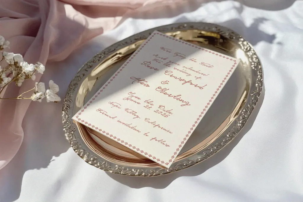
The glyphs are built to connect in a continuous script style, so letter spacing and kerning carry real weight here — set this font loose with default tracking and the joins can look cramped or, in wider measures, slightly strained. It rewards careful manual kerning more than most display fonts would. The seller’s materials point to standard alternates and ligatures as part of the package, which is typical for scripts of this type and necessary if you want the connections to look convincing rather than glued together.
What’s not specified is language support beyond basic Latin characters, so anyone needing accented characters for non-English copy should check the glyph set before committing a layout to it. Similarly, there’s no detail on weight variation — this appears to be a single-weight script, which simplifies use but also limits how much hierarchy you can build without switching to a second typeface for contrast.
Use cases
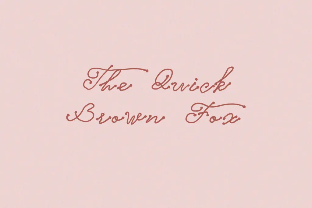
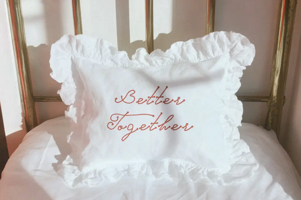
This is a font built for intimate, small-scale romantic contexts: wedding invitations, save-the-dates, greeting cards, and short lines of sentimental copy on packaging or perfume labels. It’s at its best as a featured word or short phrase — a couple’s names, a date, a single tagline — rather than as a vehicle for paragraphs of text, which is true of nearly every connected script and no fault unique to Faitline.
In branding, it could work for a boutique or bridal logotype where softness and nostalgia are the point, but it’s not distinctive enough to anchor a brand identity entirely on its own; it would need supporting typography to carry body copy and structural information. Treat it as a voice for the romantic moment in a layout, not the whole conversation.
What we liked, and what we didn’t
Strengths
- Even, low-contrast stroke weight keeps the script legible at small sizes.
- Restrained baseline variation gives it a handwritten feel without looking chaotic.
- Well suited to short phrases on stationery, labels, and invitation type.
Trade-offs
- Default spacing on connected letters can look cramped without manual kerning.
- Single-weight design limits how much hierarchy you can build without a second typeface.
The Faitline does one job well: short, warm, romantic lines for wedding and gift-related work. It's competently drawn but doesn't push past the conventions of its category, and it needs careful kerning and a supporting typeface to really perform in a layout.
Verdict

Tantype reviews typefaces in depth — every font is tested in real branding, editorial and screen layouts before a word gets written. 555+ fonts reviewed and counting.