
Friend Regular: a tall rounded serif with a warm, approachable voice
Design style
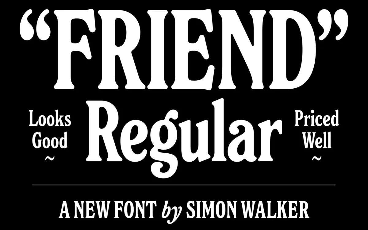
Friend is a serif built on a tall x-height and softened, rounded terminals rather than sharp bracketed serifs. The letters stand upright and narrow, giving the face a lanky, open-chested feel rather than the compact density you get from traditional book serifs. Where a classical serif would end a stroke with a crisp wedge, Friend rounds it off, so the overall impression is less formal and less austere than you’d expect from the serif category.
The roundness isn’t decorative flourish — it reads as a structural choice. Bowls are generous, counters stay open even at the tall proportions, and stroke contrast is kept moderate so nothing gets spindly. It avoids the two obvious traps of ‘friendly serif’ design: it isn’t so rounded that it slides into a novelty or children’s-book register, and it isn’t so restrained that it just reads as a slightly odd book serif. It sits in its own middle ground, which is the harder thing to pull off.
Character set and features
The family includes a matching italic, cut with enough slant and narrowing to read clearly as a second voice rather than a mechanical oblique of the roman. The italic keeps the same rounded terminal treatment, so the two weights pair without any visual argument between them — useful if you’re setting a pull quote or a name against body copy in the same spread.
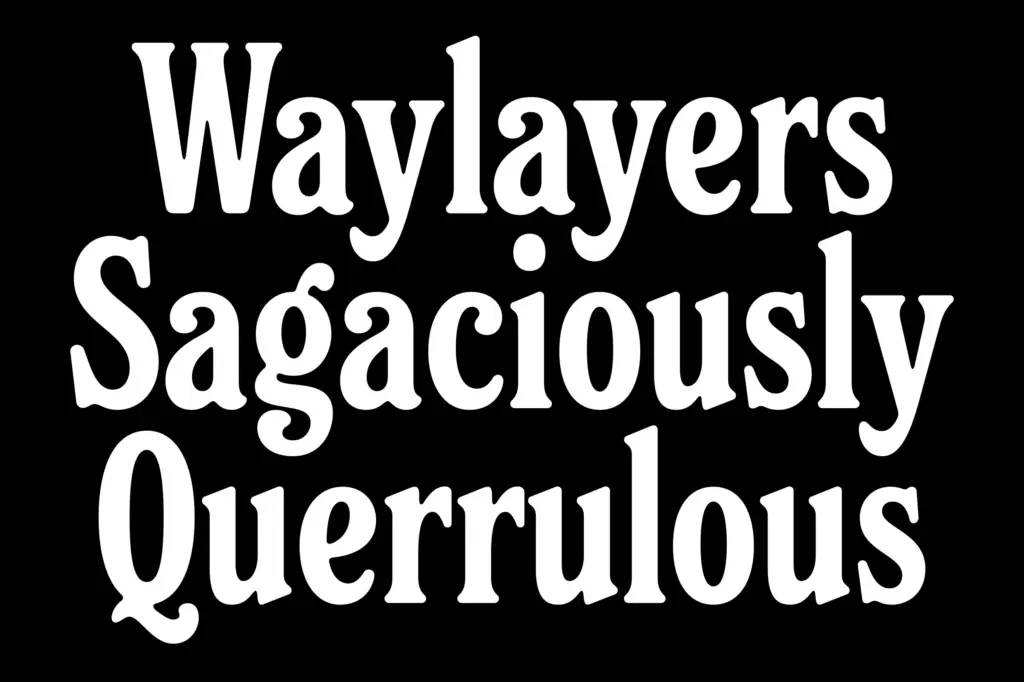
At the letterform level, the tall x-height does a lot of work. It keeps the face legible at smaller sizes despite the serif detailing, because the lowercase doesn’t have to fight for space the way a shorter x-height, high-contrast serif would. Spacing is generous rather than tight, which suits the tall proportions but means you’ll want to keep an eye on tracking in headline settings where letters can start to look loosely strung together if you leave default spacing untouched.

Use cases
Friend reads best as a display or subhead face — editorial titles, packaging callouts, logotypes, invitation lettering — rather than as dense body text for long-form reading. The tall, open construction that makes it approachable at display sizes is the same thing that eats up line length if you try to run paragraphs of it at 10pt. Treat it as the voice of a headline or a short block of set copy, and let a plainer workhorse handle the long text.
It’s a natural fit for branding work that wants warmth without going into full script or handwritten territory — think packaging for food and lifestyle brands, wedding stationery that wants some personality but not ornate calligraphy, or editorial mastheads looking for a serif with a bit of air in it. The italic extends that into invitation inner text, signage subtitles, or anywhere you need a secondary voice that still belongs to the same family.

What we liked, and what we didn’t
Strengths
- Rounded terminals give it warmth without tipping into novelty territory
- Tall x-height keeps it legible at smaller display sizes despite the serif detail
- Italic shares the same construction, so the two weights pair cleanly
Trade-offs
- Not suited to long body text, where the tall proportions eat up line length
- Generous default spacing needs tightening for tracked headline settings
Friend is a well-drawn rounded serif that finds a genuine middle ground between formal and playful, helped by a tall x-height and a competent companion italic. It's built for display and short-copy settings rather than long reading, so its usefulness depends on matching the job to its strengths.
Verdict

Tantype reviews typefaces in depth — every font is tested in real branding, editorial and screen layouts before a word gets written. 555+ fonts reviewed and counting.