
iBrand Ligature: a ligature-driven logotype font for monogram marks
Design style
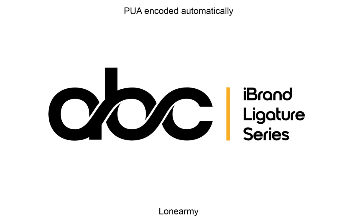
iBrand Ligature belongs to the family of fonts built less for reading than for interlocking. The letterforms are stripped down, geometric in leaning, with even stroke weight and minimal ornament so that the eye focuses on how one character connects to the next rather than on any single glyph’s personality. This is a font designed around its ligatures, not around its lowercase alphabet, and that shows in how deliberately plain the base letters are — they’re a scaffold for the joins to do the work.
There’s a restraint to the drawing that’s worth noting. Nothing swashes unnecessarily, nothing curls for the sake of curling. The connections between letters are engineered rather than decorative, which suits its stated purpose: building compact, self-contained logo marks rather than setting words in a sentence.
Character set and features
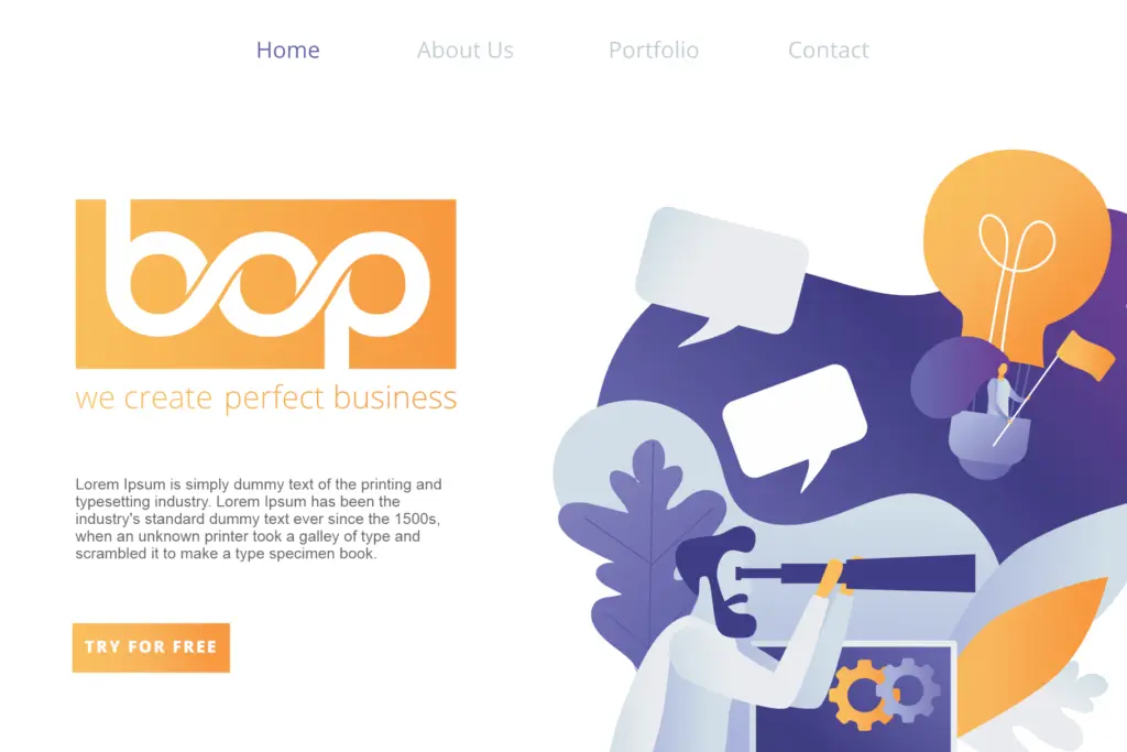
The core of this font is its ligature set, which allows selected letter pairs to merge into single combined glyphs — the kind of thing you’d use to build a two-letter or three-letter monogram that reads as one unified icon rather than two separate letters bolted together. Kerning and spacing appear to have been tuned specifically for this task, which matters more here than in a text face, since a monogram lives or dies on whether the join looks intentional or accidental.
The seller is upfront that this isn’t a body text font, and that’s the right way to think about it. Set it in a paragraph and the sameness of stroke weight and the tightness calibrated for two-letter combinations will fight you. This is a display-only tool, and a narrow one at that — it does one job, the icon-logo job, and doesn’t pretend to do others. Files are supplied in OTF, TTF, WOFF and WOFF2, which covers desktop design software and web use without issue.
Use cases
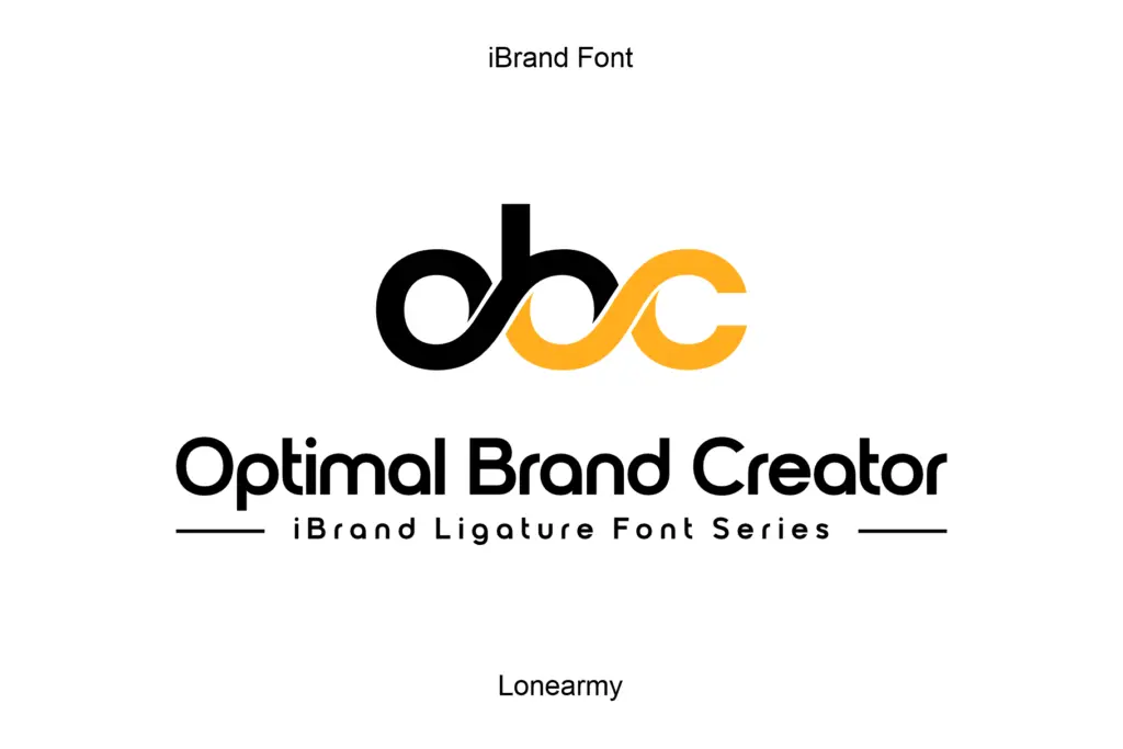
The obvious home for iBrand Ligature is monogram and initial-based logo work: two initials merged into a single mark for a boutique, a personal brand, a small studio, or a product line that wants a compact emblem rather than a wordmark. It also suits icon design more broadly — app icons, favicons, stamp-like marks, anywhere a design needs to compress identity into a small, self-contained shape.
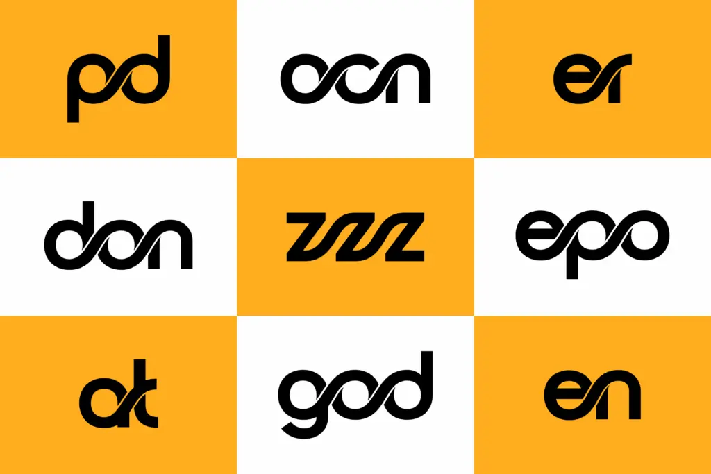
It’s less useful anywhere text needs to read at length or at small sizes in a paragraph — headlines, straplines and body copy are outside its brief. Designers should also expect to hand-pick which letter combinations actually get dedicated ligatures; not every two-letter pairing a client might want will necessarily have a bespoke join, so it’s worth testing the specific initials before committing to a direction. Used within its lane — as a single-mark generator rather than a general display face — it does a focused job cleanly.
What we liked, and what we didn’t
Strengths
- Ligatures are engineered specifically for merging initials into a single icon-like mark.
- Restrained, even stroke weight keeps the joins looking deliberate rather than decorative.
- Delivered in OTF, TTF, WOFF and WOFF2, covering both design software and web use.
Trade-offs
- Not built for body text or even short headlines — stroke sameness works against sentence-length reading.
- Not every letter pairing will have a dedicated ligature, so specific initials need testing before a project is built around them.
iBrand Ligature is a narrow tool that does one thing: turning two initials into a single connected logo mark. It's not a text face and doesn't pretend to be, so judge it purely on how convincingly its joins read as intentional rather than improvised.
Verdict

Tantype reviews typefaces in depth — every font is tested in real branding, editorial and screen layouts before a word gets written. 555+ fonts reviewed and counting.