
Chunko Bold: a chunky rounded display sans for headline-sized impact
Design style
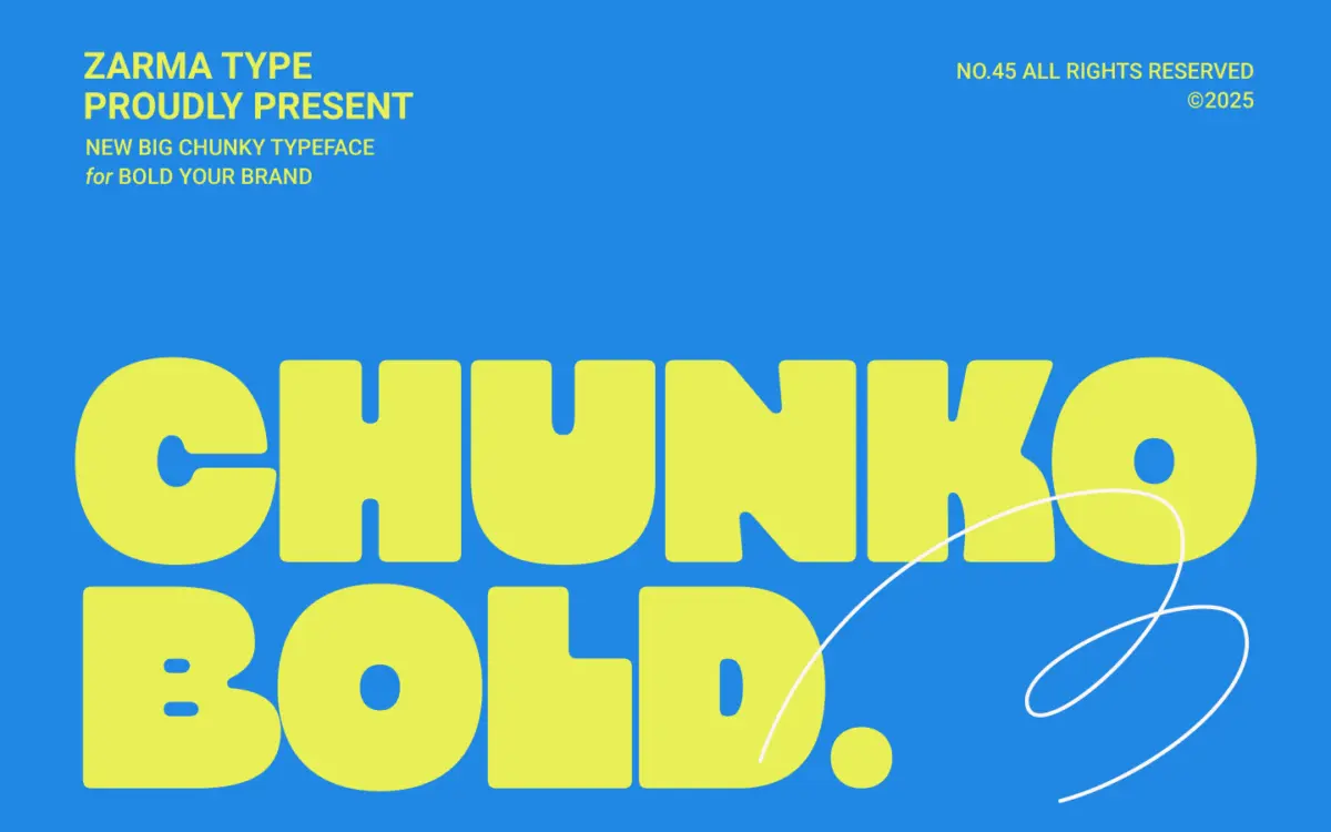
Chunko Bold sits in the current wave of oversized geometric sans faces built for one job: filling space with confidence. The strokes are thick and uniform, corners are softened rather than squared off, and the whole alphabet reads as a set of chunky, rounded blocks. There’s no attempt at contrast or flourish here — this is a face built on mass, not nuance. The rounding on the terminals gives it a slightly friendly, bubbly quality rather than the harder-edged look of true grotesque display faces, which puts it closer to playful than corporate.
The geometry is fairly consistent letter to letter, which is what you want in something this heavy — inconsistent weight at this size would look like a mistake rather than a style. Curves like the bowl of the ‘g’ or the shoulders of the ‘R’ echo the same rounded logic as the straight strokes, so the typeface holds together as a single visual idea rather than a patchwork of shapes.
Character set and features
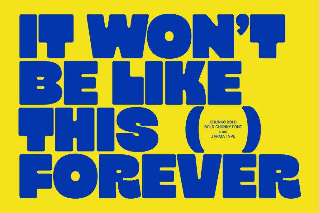
As a bold-only display font, Chunko doesn’t try to be a workhorse family. There’s no light or regular counterpart described, no italic, and nothing suggesting an extended script beyond standard Latin characters. That’s fine for what it’s asked to do — this is a headline tool, not a text face — but it does mean you’re locked into one weight and one mood. If a project needs a body copy partner or a lighter version for hierarchy, you’ll be sourcing that elsewhere.
At the letterform level, the rounded corners and thick strokes mean tight tracking will cause letters to visually merge, especially in words with adjacent round characters. Generous spacing helps keep the chunkiness readable rather than muddy. Numerals follow the same heavy, rounded treatment as the lowercase, so they’ll sit comfortably in the same compositions rather than looking bolted on.
Use cases
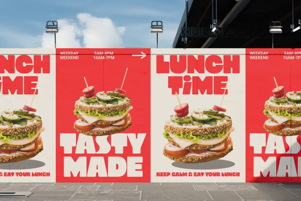
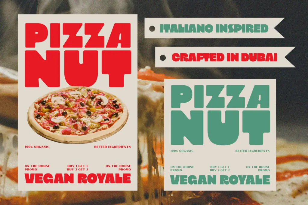
This is a display face, full stop — it wants to be big. At headline sizes, on posters, packaging fronts, or app icons, the thick rounded strokes give it presence without needing colour or texture to carry the design. It reads at a glance, which is exactly the point of a chunky minimalist sans: the typography itself becomes the graphic element, not just a label sitting on top of one.
It suits brands that want a friendly, confident voice rather than a slick or luxury one — think snack packaging, casual food and drink branding, youth-oriented apps, or bold social graphics where a single word needs to dominate the frame. It’s less suited to anything requiring restraint or refinement; the rounded chunkiness reads as loud even in small doses; there’s no way to dial it back within the family itself.
Don’t ask it to run a paragraph. At body sizes the heavy rounded strokes clot together and the letterforms lose the individuality that makes them work as headlines. Keep it to short words, single lines, or short phrases and it earns its keep. Push it into a run of text and it becomes an unreadable smear.
What we liked, and what we didn’t
Strengths
- Consistent rounded geometry gives it a cohesive, single-idea look
- Reads instantly at large sizes without needing colour or extra styling
- Numerals match the lowercase weight, so it works cleanly in mixed compositions
Trade-offs
- Bold-only with no companion weights, so hierarchy has to come from elsewhere
- Tight tracking causes round letterforms to visually merge into each other
Chunko Bold does one thing — loud, rounded, chunky headline type — and does it competently, without pretending to be more than that. It's a good pick for punchy packaging or social graphics, but it's a one-note instrument with no lighter weights to lean on when the mood needs to shift.
Verdict

Tantype reviews typefaces in depth — every font is tested in real branding, editorial and screen layouts before a word gets written. 555+ fonts reviewed and counting.