
Brilon: an Art Deco serif with alternates for logos and invitations
Design style
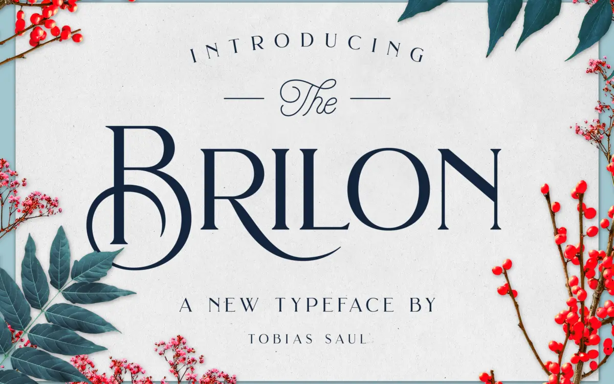
Brilon leans on the geometric serif vocabulary of Art Deco signage without going full pastiche. The uppercase carries the bulk of the personality: flared terminals, a few letters squared off where you’d expect a curve, and a general sense of letters built from compass and ruler rather than a pen. The lowercase is quieter, closer to a standard modern serif, which keeps the face from tipping into costume-design territory when it’s set in running text rather than a headline.
The contrast between thick and thin strokes is moderate rather than dramatic, so the Deco references read as detailing rather than structure. That’s a deliberate trade-off: it makes Brilon easier to use in more contexts, but it also means the drama is front-loaded into the special capitals and alternates, and the typeface looks noticeably plainer without them.
Character set and features
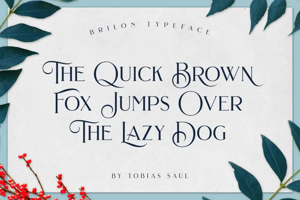
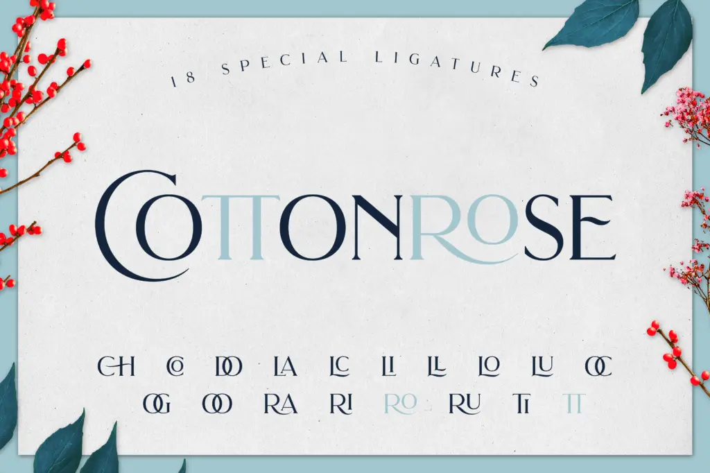
The set covers A–Z with a group of special uppercase forms designed for moments where you want more flourish — monograms, drop caps, the first word of a headline. Alongside those sit stylistic alternates and a set of ligatures, which combine to let you build a wordmark that doesn’t look like it was typed in one pass. Numerals and standard punctuation are included, along with accented characters covering Western European languages, so the font isn’t limited to English-only copy.
What’s missing is any indication of weight variation — this reads as a single-weight family, so anyone hoping to build a full hierarchy within Brilon alone will need to lean on size, spacing and the alternate caps rather than a bold or light cut. The extras bundled in — eight botanical photographs — are a nice addition for mockups but have nothing to do with the typeface’s actual utility; treat them as a bonus, not a reason to buy.
Use cases
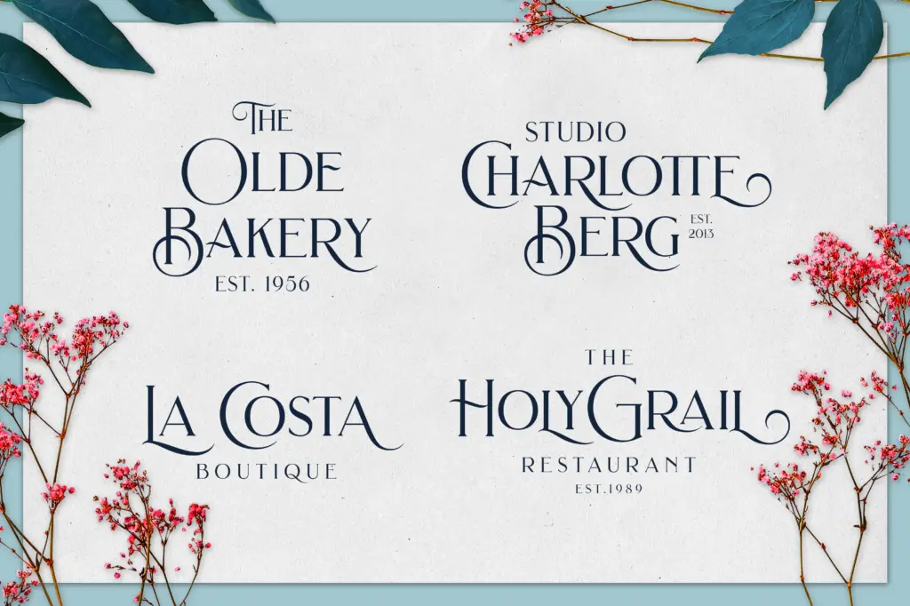
Brilon is built for short-form, high-visibility work: logotypes, monograms, packaging headers, invitation suites, menu headers. The special capitals and ligatures do real work at display sizes, where their shapes have room to register. That’s also where the font is strongest — a few words set large, with alternates swapped in by hand, is where it earns its Art Deco reference.
It’s less suited to body copy. The moderate contrast holds up reasonably well at smaller sizes, but the lowercase doesn’t have enough character of its own to carry paragraphs — it was clearly drawn to support the display caps rather than to stand alone as a text face. Pair it with a plain sans or a quieter serif for anything beyond a line or two, and let Brilon do the header lifting. For a boutique brand, a wine label, or a wedding suite that wants a vintage-adjacent touch without going full antique revival, it’s a reasonable single-purpose tool — just don’t ask it to do a whole publication’s worth of setting.
What we liked, and what we didn’t
Strengths
- Special uppercase alternates give wordmarks real Art Deco character
- Ligatures and stylistic alternates allow varied, handcrafted-looking headline setting
- Western European accented characters extend it beyond English-only use
Trade-offs
- No weight variation, so building hierarchy within the family alone is difficult
- Lowercase is plain enough that it struggles to carry body copy
Brilon is a capable display serif with genuine Art Deco detailing in its alternate capitals and ligatures, best used sparingly at larger sizes. It's a single-weight, display-first face, so it won't replace a full text system. Good fit for branding and invitation work, limited beyond that.
Verdict

Tantype reviews typefaces in depth — every font is tested in real branding, editorial and screen layouts before a word gets written. 555+ fonts reviewed and counting.