
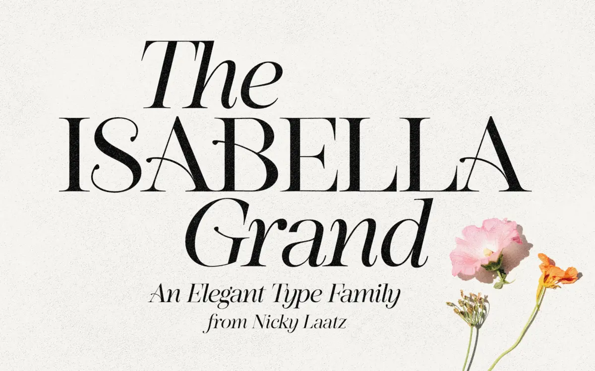
Isabella Grand: an editorial serif with a flourish-heavy italic for branding
Design style
Isabella Grand is a serif pairing built around contrast: a confident roman with a deliberately theatrical lowercase f, set against an italic that leans soft and cursive rather than mechanically slanted. The roman has the bones of a classic editorial serif, but that f is the whole pitch — a long, curling descender that reads more like a calligraphic flourish than a text letterform. It is distinctive, and it is also divisive, which is presumably the point.
The italic is where the typeface relaxes. Strokes are lighter, joins are looser, and there is more visible brush influence than you’d expect from a companion italic to a fairly structured roman. Paired on a page, the two styles create a tension between formality and looseness that reads as a deliberate design choice rather than an accident of drawing two unrelated faces and calling them a family.
Character set and features
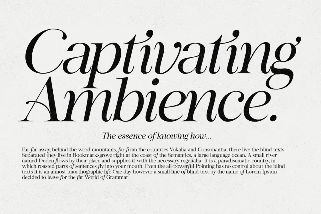
Because the signature f is so assertive, Nicky Laatz has sensibly included a plain alternate f, and a separate font style built around that quieter f for situations where the flourish would be a distraction. That’s a practical hedge: a single wrong keystroke shouldn’t force you to abandon the typeface for a whole project.
OpenType support extends to a set of less-fancy uppercase alternates, which tone down some of the swashier capitals for settings where restraint matters more than drama, and double-letter ligatures — the fancy italic ‘ti’ being the example the designer points to. All of this sits behind standard OpenType Alternates and Ligatures panels, so you’ll need software that actually exposes those features; dropping the font into a basic text box will give you only the default glyphs, missing most of what makes the typeface worth choosing in the first place.
Language support covers a reasonable spread of Western European languages — Danish, French, German and its regional variants, the Nordic languages, Portuguese — which is enough for most European branding work without stretching into anything exotic.
Use cases
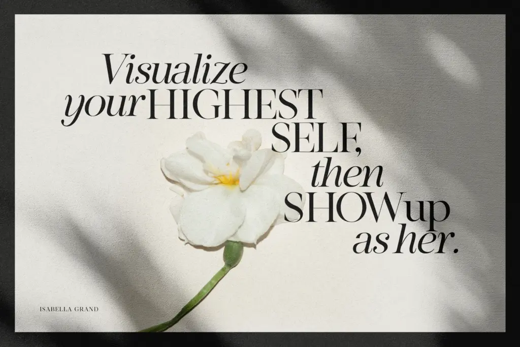
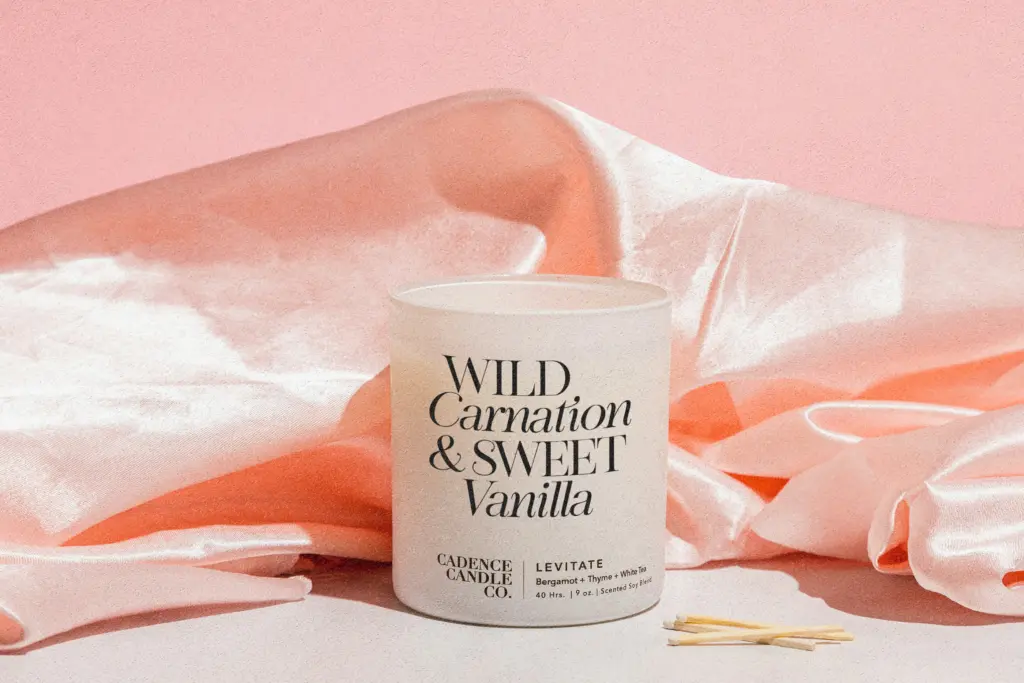
This is a display typeface first, and it should be treated that way. The roman works at headline and subhead sizes, on packaging panels, on invitation covers, in logotypes where a single distinctive letterform earns its keep. At body-text sizes the drama of that f and the looseness of the italic start working against reading comfort, and the family isn’t drawn for long-form setting anyway.
Wedding stationery is an obvious fit given the italic’s warmth, and the roman’s seriousness makes it workable for upscale product branding and packaging where a hint of vintage glamour is wanted without going fully script. Logo designers should budget time to test the alternates — the default f won’t suit every mark, and switching to the plain-f style may be the better call for anything that needs to stay legible at small sizes, like a favicon or a spine.
What we liked, and what we didn’t
Strengths
- The alternate plain-f style gives practical flexibility without losing the family's character
- OpenType ligatures and alternates add real variation for branding work, not just decoration
- The italic has genuine warmth and works well standing alone
Trade-offs
- The signature flourished f demands OpenType support, so it's lost entirely in basic software
- Not legible enough at small sizes or in long-form text, strictly a display and headline tool
Isabella Grand is a confident, somewhat theatrical display serif with a soft, flourish-friendly italic partner. It earns its keep in branding, packaging and wedding work at headline sizes, but it needs OpenType-aware software to show its best features and isn't built for body text.
Verdict

Tantype reviews typefaces in depth — every font is tested in real branding, editorial and screen layouts before a word gets written. 555+ fonts reviewed and counting.