
Aveline: a soft serif with ligatures for romantic branding and editorial titles
Design style
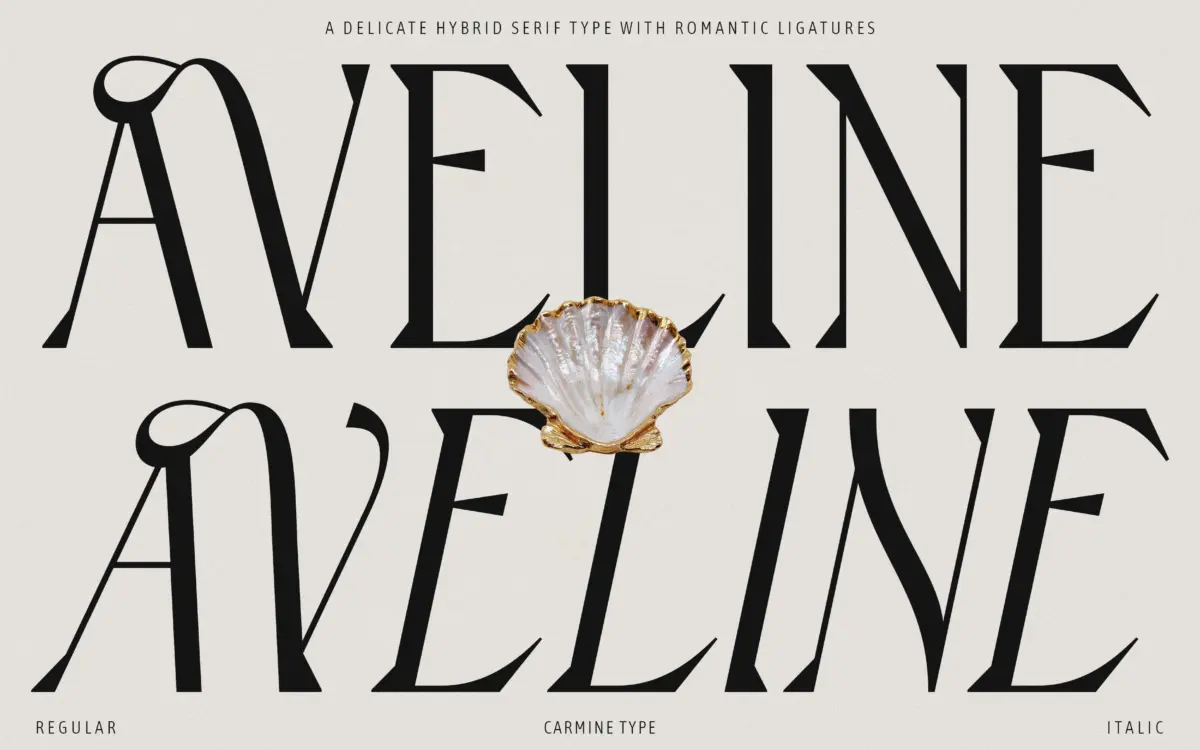
Aveline sits in that hybrid zone between sans and serif that’s become common in branding work lately, but it leans further toward serif than most. The strokes have a gentle contrast — not the sharp hairline-to-thick swing of a classical serif, but a soft modulation that keeps the letters feeling calm rather than dramatic. Serifs themselves are small and rounded rather than bracketed or wedge-shaped, which is where the ‘soft’ in its naming earns its keep.
The overall texture is quiet. Nothing in the regular weight shouts. Terminals curve gently instead of ending in a hard cut, and the x-height sits a touch low, giving the font a slightly old-fashioned air without tipping into pastiche. It reads as considered rather than stylised — a typeface built to recede into a layout rather than dominate it, until you reach the alternates and ligatures, where the personality shows up.
Character set and features
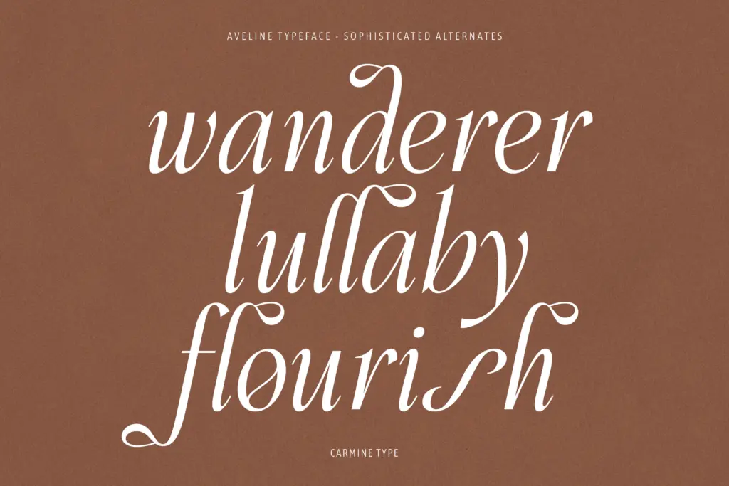
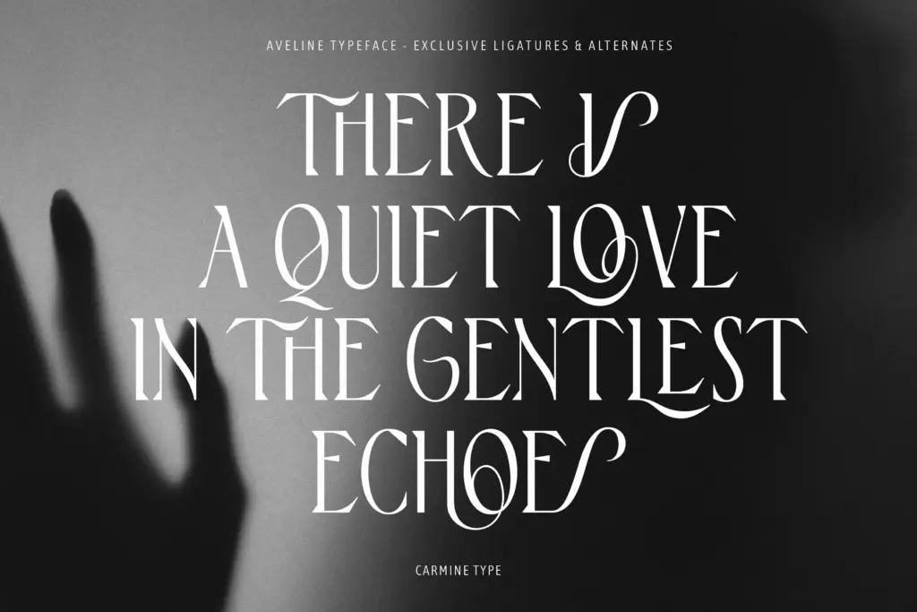
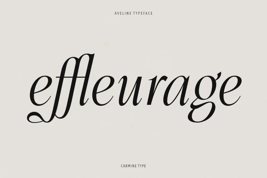
The alternates are where Aveline distinguishes itself from a plain workhorse serif. The Victorian-inspired swashes and connecting ligatures add flourish to specific letter combinations without covering the whole word in ornament — you get a raised stroke here, a looped descender there, rather than a uniform calligraphic treatment across every line. That restraint matters: a font with 170-odd ligatures and alternates could easily become a novelty, but here the extras are deployed selectively, meant to be dropped into a headline word or two rather than set wholesale.
Roman and Italic are both included, and the italic carries more of the cursive character — tighter joins, a steeper slant, a few connecting forms that nudge it closer to script territory. Multilingual support across Western, Central and Eastern European character sets means the font is usable beyond English-language branding, which is worth noting for anyone working across European markets. Full punctuation and OpenType features round it out, though as with most display-leaning serifs, actually accessing the alternates requires software that supports OpenType features — a plain word processor won’t show you what the font can do.
Use cases
Aveline is built for display first. Logotypes, book covers, magazine mastheads, packaging for beauty and fashion brands — anywhere a word or short phrase needs to carry warmth without looking hand-lettered. The soft serif construction also means it holds up reasonably well in short text blocks: pull quotes, product descriptions, subheadings. It’s not a font you’d set a novel in, but it wasn’t built for that.
Wedding stationery and romantic branding are obvious fits given the Victorian alternates, though the restraint in the base letterforms means it won’t feel saccharine if used for something more editorial, like a fashion magazine feature or a boutique product label. Where it struggles is at small sizes in dense paragraphs — the soft contrast and delicate serifs start to blur below body-text thresholds, so this stays a headline-and-short-copy typeface rather than a full workhorse family.
What we liked, and what we didn’t
Strengths
- Restrained use of alternates means the flourishes read as accents, not decoration overload.
- Multilingual support across European character sets extends its practical reach.
- Roman and Italic styles both carry a consistent, quiet warmth without feeling mismatched.
Trade-offs
- Low x-height and soft contrast make it unreliable for body text below display sizes.
- Accessing the ligature set properly requires OpenType-aware software, which not every buyer will have.
Aveline is a well-mannered soft serif that uses its ligatures and alternates sparingly, which keeps it from tipping into novelty territory. It's best suited to headlines, logotypes and short editorial text rather than long-form reading, where its delicate contrast starts to thin out.
Verdict

Tantype reviews typefaces in depth — every font is tested in real branding, editorial and screen layouts before a word gets written. 555+ fonts reviewed and counting.