
The Regals Serif: a transitional serif built for headlines and logos
Design style
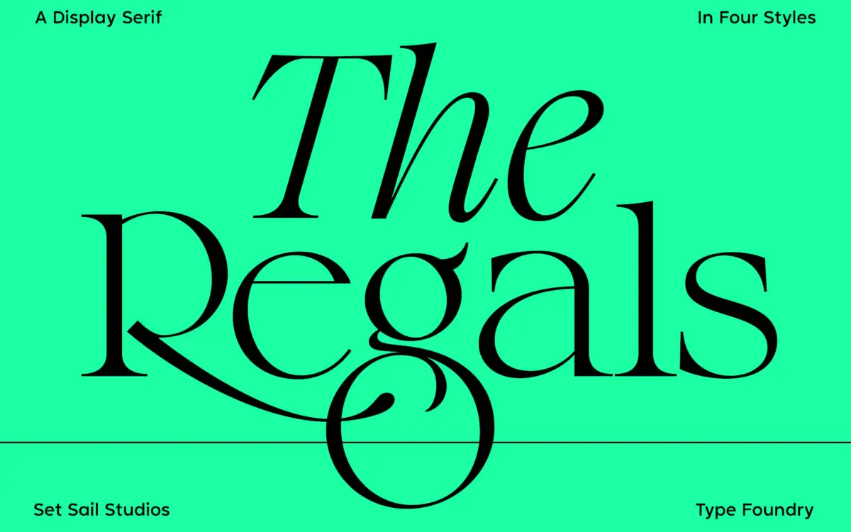
The Regals sits in transitional serif territory, the family of forms between Garalde old-style and the sharper rationalism of Didone. You can see that lineage in the moderate stroke contrast and the bracketed serifs, but the drawing has been tightened up for current display work. Thin strokes are thinned further than a text face would allow, hairlines on the bowls of the B and R are crisp rather than soft, and the apex of the A comes to a clean point rather than a rounded one. The italic leans harder into flourish, with entry strokes that suggest a pen rather than a chisel, which gives the family some tonal range between its upright and italic cuts.
This is a display serif dressed in classic clothing, not a book face. The contrast and the tight spacing make that clear at a glance — it wants to be large, where the thins can hold their shape and the serifs read as deliberate rather than fragile.
Character set and features
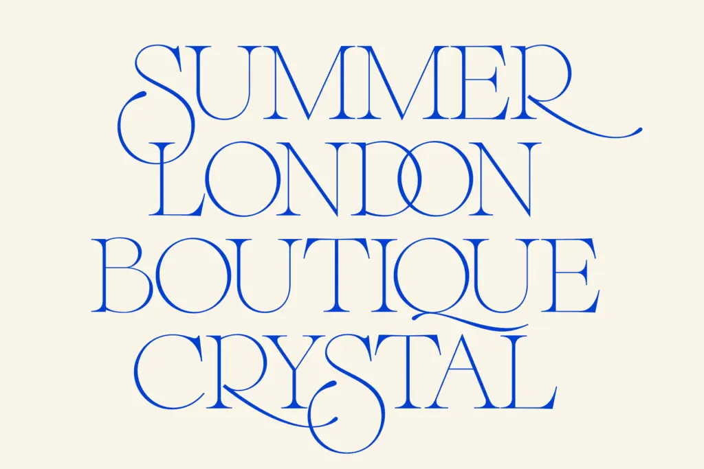
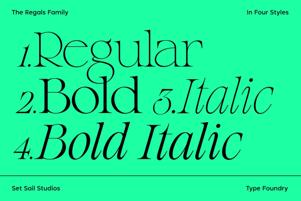
The family ships in four styles — Regular, Bold, Italic, Bold Italic — which covers the basics of hierarchy without overcomplicating the offering. The more interesting part of the package is the alternate and ligature set. Switching on Stylistic Alternates swaps the S, Q, R, g and t for versions with extra swing or swash detail, useful for a wordmark that needs one letter to do a bit more talking than the rest. The 36 ligatures handle overlapping and connecting pairs, the sort of thing that reads as hand-finished lettering rather than typeset copy when it’s used with restraint.
Both the alternates and ligatures are accessible through OpenType features in any app that supports them, or manually via the glyphs panel if your software doesn’t expose the toggle. Worth noting: the alternates only apply to Regular and Bold, not to the italics, so if your layout depends on that alternate R or swash Q carrying through the whole family, you’ll need to work around it. Language support covers a good spread of Western and Central European diacritics, enough for most European-market branding and editorial work without needing a workaround.
Use cases
This is a font for moments where a brand or a layout wants to borrow some old-world authority without actually looking old. Logotypes benefit most — the alternates give you a built-in way to customise a wordmark without commissioning custom lettering, and the contrast reads well at the small sizes a logo eventually gets shrunk to, provided it isn’t reversed out of a busy background. Editorial headers, quote treatments, and packaging that wants a hint of heritage without full pastiche all sit comfortably within its range.
It’s less suited to continuous reading. The contrast that makes it handsome at 60pt starts to fight the eye at paragraph sizes, so keep it to display roles and let a plainer serif or sans carry body copy. Four styles is enough for headline hierarchy but not for a typographic system that needs a light or condensed cut — know that limit before you build a whole identity around it.

What we liked, and what we didn’t
Strengths
- Alternate characters on S, Q, R, g and t give wordmarks an easy way to feel custom.
- 36 ligatures add handmade texture without requiring custom lettering.
- Strong, legible high-contrast drawing that holds up well at large display sizes.
Trade-offs
- Alternates don't carry over to the italic styles, limiting consistency across the family.
- Contrast and tight spacing make it a poor fit for body text or long-form reading.
The Regals is a confident display serif with a genuine point of view in its contrast and its alternate set, best used where it can stay large. It won't do duty as a text face and the alternates don't extend to the italics, but for logotypes, headers and quote treatments it earns its keep.
Verdict

Tantype reviews typefaces in depth — every font is tested in real branding, editorial and screen layouts before a word gets written. 555+ fonts reviewed and counting.