
1950s Fonts: 10 Best 50s Fonts for Diner, Rockabilly and Mid-Century Designs
The best 1950s fonts bring back the lettering of postwar America: brush scripts on soda ads, neon script over diners and motels, and chunky capitals on paperback covers and travel posters. If you want a 50s font that reads as the real decade rather than a generic “vintage” look, start with three picks: Rockabilly Romance for rock ‘n’ roll and diner graphics, Burbank for a clean mid-century advertising script, and MidCentury Typeface for poster and badge capitals.
All ten fonts in this guide are commercial fonts sold on Creative Market, so you need a licence to use them. If your budget is zero, skip to the free Google Fonts section further down.
Browse 50s fonts on Creative Market Commercial fonts; desktop licences for these picks ran $18 to $30 in October 2026
What is a 1950s font?
A 1950s font is a typeface that looks like the printed and painted lettering of the decade, mostly American advertising, signage and pop culture. No single typeface defines it; four styles overlap.
Casual brush scripts. Brush Script, drawn by Robert E. Smith for American Type Founders in 1942, caught on with advertisers and retailers almost at once and stayed popular through the 1950s. (Fonts In Use notes that its many digital versions vary in quality.) Its best-known siblings were Dom Casual (Peter Dom, 1951), which appears in a 1956 rock ‘n’ roll teen film, and Mistral, which Roger Excoffon based on his own handwriting and released through Fonderie Olive in 1953.
Neon and sign-painter scripts. Neon signs were popular in the United States from about the 1920s to the 1950s. Kaufmann, a 1936 ATF script, became popular with neon sign makers thanks to its fluid forms and even stroke weight.
Googie and atomic-age display lettering. Roadside coffee shops, motels and gas stations in the US were built in the Googie style from about 1945 into the early 1970s, with tall pylon signs, starbursts, boomerangs and bold neon letters. The wider Atomic Age design movement, roughly 1945 to 1967, filled ads and fabrics with atoms, stars and starbursts.
Modernist sans serifs. Helvetica, drawn in 1956 to 1957, became a hallmark of the International Typographic Style, and Brush Script’s popularity waned as that style grew in the 1960s. That’s why a loose script reads as “fifties” today. Most people searching for 50s fonts want the first three looks.
The best 1950s fonts at a glance
- Rockabilly Romance — a fast rock ‘n’ roll script with a glossy “lipstick” version.
- Burbank — a connecting script modelled on mid-century ad lettering.
- MidCentury Typeface — all-caps poster face with 55 badge templates.
- Amaretti — swashy 50s signage script in three weights plus obliques.
- Foxed & Inked — a brush script restored from historical lettering books.
- Pomp & Circumstance — textured, bouncy handwriting for cards and invites.
- Hotel Motel — loose sign-painter script for neon and motel looks.
- Space Rocks — hand-drawn caps based on 1950s TV sci-fi titles.
- Funfare — a serif display face drawn from a 1950s candy ad.
- Palmello — a non-connecting script based on European ads of the 50s and 60s.
Best 1950s fonts on Creative Market
Prices are for a one-seat desktop licence as listed on Creative Market in October 2026; sales and price changes are common, so check the listing.
Prices below are the Creative Market desktop licence as listed on October 15, 2026. Shops run sales often, so check the listing before you buy.
1. Rockabilly Romance
Christopher King of Wingsart Studio built Rockabilly Romance around 1950s Americana: retro diners, drive-in movies and rock ‘n’ roll. The curves are fast and free-flowing. The package has a standard version and a second version with a “lipstick gloss” highlight already drawn into the strokes, so you get a shiny effect without building it yourself. There are underlines, ligatures and alternates to play with. Use it for menu headers, gig posters, album covers and car-show flyers. Desktop licence: $28.
See Rockabilly Romance on Creative Market
2. Burbank
StudioWorks says Burbank was inspired by the hand-cut lino scripts of mid-century advertising, and it shows: this is the neat, persuasive kind of script that sold products in 1950s magazine ads. The lowercase sits on a slightly raised baseline, which pushes the capitals forward and makes a brand name feel confident. Burbank comes with stylistic alternates and contextual ligatures, plus figures and standard punctuation, as an OTF file. It’s tidy enough for packaging, logos and headlines. Desktop licence: $21.
See Burbank on Creative Market
3. MidCentury Typeface
MidCentury Typeface, from The Good Store, is an all-caps display face based on 1950s poster, illustration and novel-cover lettering. Strokes are even and terminals blunt, so words land as solid, stamped blocks. The extras make it good value: 55 logo and badge templates, a flyer, Instagram post and story templates, two background patterns and 20 mid-century icons, all as Illustrator files. Use it for coffee-shop badges, book covers, record sleeves and travel-poster headlines. It has no lowercase, so keep it to short lines. Desktop licence: $29.
See MidCentury Typeface on Creative Market · Read our MidCentury Typeface review
4. Amaretti
Nicky Laatz drew Amaretti to recall hand-lettered advertising and signage from the 50s. Strokes swell and taper like a loaded brush, and the swashes are generous. Unlike most scripts, it comes in three weights, each with an oblique. The OpenType set includes alternates, ligatures and swashes, and the font is PUA-encoded, so Canva users can reach the extras too. Language support is English plus a few common accents. Good for bakery and ice-cream branding, invitations and greeting cards. Desktop licence: $28.
See Amaretti on Creative Market · Read our Amaretti review
5. Foxed & Inked
HipFonts calls Foxed & Inked a revival restored from historical lettering books, aimed at the hand-painted advertising of the 1950s. The result is a brush-pen script with heavy strokes, lively connections and small irregularities, closer to Brush Script’s world than to polished modern scripts. It looks at home on a roadside diner sign, a soda ad or a retro product label. It’s the closest pick here to the casual-script feel of the period, without the over-familiar Brush Script itself. Use it for restaurant menus, labels, apparel and posters. Desktop licence: $19.
See Foxed & Inked on Creative Market
6. Pomp & Circumstance
Nicky Laatz’s second pick is the friendliest font here. She describes it as a bouncy, textured “retro 50s style” handwritten script, and the baseline really does hop from letter to letter, like a marker moving quickly. There are plenty of alternates and ligatures, and the font is PUA-encoded, so you can copy and paste extra glyphs from Font Book or Character Map if your app has no OpenType menu. A bonus pack of the illustrations from the previews comes as SVG, PNG, AI and EPS. Best for party invitations, greeting cards and playful branding. Desktop licence: $30.
See Pomp & Circumstance on Creative Market · Read our Pomp & Circumstance review
7. Hotel Motel
Price Foundry’s Hotel Motel is the roughest script in this list. The designer describes a loose, hand-painted script in the spirit of a neon motel sign on the edge of town, mixing a mid-century sign painter’s hand with a modern twist. You get OTF and TTF files plus an Illustrator file of the example images. Use it for bar and diner logos, band posters, merch and anything that should feel a little after-hours. Desktop licence: $29.
See Hotel Motel on Creative Market
8. Space Rocks
For the atomic-age side of the decade, Wingsart Studio based Space Rocks on the opening titles of 1950s television science-fiction serials. It is an all-caps design, drawn entirely by hand, with different letter shapes on the upper and lowercase keys and discretionary ligatures for a comic-book touch. There’s a Regular and an Outline version, plus alternates, underlines and symbols. It is too wild for a café logo, but right for B-movie posters, retro sci-fi book covers, album art and Halloween or space-themed parties. Desktop licence: $24.
See Space Rocks on Creative Market
9. Funfare
Funfare is the one serif in this list. StudioWorks drew it from a 1950s candy advertisement, and it has the flared terminals, pointy serifs and bouncing baseline of hand-lettered ad type from the period. It comes in Regular and Italic, with upper and lowercase, so it can set a short line of copy as well as a headline, which most retro display fonts can’t. Pair it with Burbank, from the same designer. Use it for candy and snack packaging, fair and festival posters and kids’ party invitations. Desktop licence: $18.
See Funfare on Creative Market
10. Palmello
SAMPLE’s Palmello is a non-connecting script based on European advertisements from the 1950s and 60s. Each letter stands on its own, so there are no awkward joins to fix, and the capitals look more like label lettering than looping script caps. The designer says it holds up in supporting copy as well as display, and its short swashes keep lines compact. Choose it when you want an Italian or French poster feel instead of a Route 66 one: gelato, aperitivo, coffee and travel branding. Desktop licence: $26.
See Palmello on Creative Market · Read our Palmello review
How to choose a 1950s font
- Pick the slice of the decade first. Diner, rockabilly and car culture call for a fast, slanted script (Rockabilly Romance, Hotel Motel). Clean postwar advertising calls for a tidier script such as Burbank or Amaretti. Posters want capitals (MidCentury Typeface); sci-fi themes want Space Rocks.
- Pair a script with plain capitals. Period ads almost always set the brand name in script and the details in a sturdy sans or slab. Two scripts side by side looks muddled.
- Never set a script in all caps. Script capitals are drawn to start words. For caps, use an all-caps display face.
- Check legibility at the real size. Rough scripts like Hotel Motel and Pomp & Circumstance lose detail when small. For a menu, use the script for section titles and something plainer for the dishes.
- Think about signs and neon. A real or LED neon sign needs a monoline script with simple joins. Heavy brush contrast, as in Amaretti or Foxed & Inked, is better for print and painted signs.
- Cutting machines and Canva. For Cricut or vinyl, pick a connecting script with solid joins and avoid textured versions, which cut badly. If you design in Canva, PUA-encoded fonts (Amaretti, Pomp & Circumstance) give you access to the alternates.
Free 1950s fonts
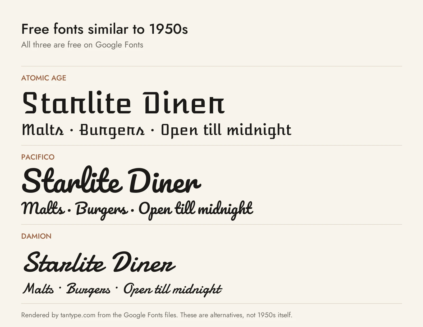
These three are free on Google Fonts under the SIL Open Font License, which allows personal and commercial use. They have fewer alternates and less character than the paid picks, but each has a real 50s link.
- Atomic Age by James Grieshaber was inspired by the connected scripts on the nameplates of 1950s American cars. It drops the connections, so it reads as a crisp, mechanical italic rather than a brush script. It’s the free choice for car-show and garage graphics, and more legible at small sizes than any script above.
- Pacifico by Vernon Adams is a fat brush script inspired by 1950s American surf culture. It is rounder and simpler than Rockabilly Romance or Foxed & Inked and has been used so widely that it can look generic. It now covers Cyrillic as well as Latin.
- Damion, also by Vernon Adams, is a casual script based on mid-century casual typefaces such as Max Kaufmann’s 1936 script for ATF, the script neon makers favoured. It’s lighter and more even than the paid brush scripts, which makes it the free pick for neon-style mockups.
Licensing: personal vs commercial use
Creative Market sells fonts under four licence types, set out on its font licence page:
- Desktop: install the font and use it in unlimited personal and commercial projects, including physical products, packaging, social posts and paid ads. On websites and apps it may only appear as images, not live text. Buy one seat per person who uses it.
- Webfont: embed the font on websites you own or control, within the pageview limit you pick at checkout.
- App: embed the font in one app or game, in a form users can’t extract.
- E-pub: use the font in one ebook or electronic publication title.
Two points matter for 50s-style work. First, print-on-demand: Creative Market forbids using the font in a print-on-demand tool where the customer, not you, sets the text. Second, logos: Creative Market allows a font in a logo as long as the lettering is modified and isn’t the dominant element; if you register the logo as a trademark you must disclaim the font and can’t claim rights in it. Licence terms can change, so read the current page and the shop’s notes before you buy. This is a summary, not legal advice.
1950s font FAQ
What fonts were popular in the 1950s?
For ads and signs, casual scripts led the way: Brush Script (1942), Kaufmann (1936), Dom Casual (1951) and Mistral (1953). In Europe, modernist sans serifs such as Helvetica arrived late in the decade. The fonts in this guide are modern designs inspired by that lettering, not digital copies of those typefaces.
What is the best 50s font for a diner sign or menu?
For the sign or the menu header, a slanted script such as Rockabilly Romance, Hotel Motel or Foxed & Inked. For the menu items, use a plainer face; MidCentury Typeface works for section headings in capitals. Avoid setting long lists of dishes in any script.
What font looks like 1950s neon signs?
Kaufmann, a fluid 1936 script with an even stroke weight, was popular with neon sign makers. Among free fonts, Damion is the closest. Among the paid picks, Hotel Motel gives the loosest sign look, while Burbank gives a cleaner one.
What is a good rockabilly font?
Rockabilly Romance was drawn for exactly that: 1950s rock ‘n’ roll, diners and drive-ins. For tattoo flash or car-club lettering with more grit, pair it with chunky capitals such as MidCentury Typeface.
Are 50s fonts and mid-century modern fonts the same?
They overlap. Mid-century modern covers roughly 1945 to 1970 and includes clean geometric sans serifs as well as the playful scripts most people mean by “50s fonts”. MidCentury Typeface and Palmello sit in that overlap, while Rockabilly Romance and Space Rocks are firmly 1950s pop culture.
