
Pomp & Circumstance: a bouncy retro script for playful invites and branding
Design style
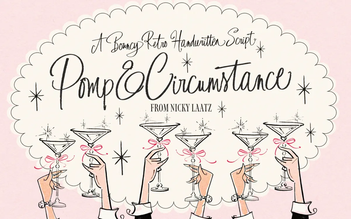
Pomp & Circumstance is a handwritten script built on a bounce rather than a slant. Baselines dip and hop from letter to letter, the way a marker moves when someone is writing fast and enjoying it. The strokes carry a rough, slightly textured edge rather than a clean vector line, which gives it the look of a 1950s hand-lettered sign rather than a formal calligraphy hand. It doesn’t try for elegance. It goes for warmth and a bit of mischief instead, and it holds that tone consistently across the alphabet.
Contrast is modest and fairly even, so no single stroke thins out to nothing or swells into a blob. That restraint is what keeps a textured script like this from turning muddy at small sizes, and it’s the main reason the letterforms read as friendly rather than chaotic.
Character set and features
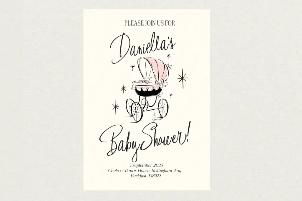
The face is built around alternates and ligatures, which is where a script like this earns its keep. Swapping in alternate letterforms for repeated characters or awkward pairings breaks up the mechanical look that scripts get when the same glyph shows up twice in a word. The ligatures do similar work on common letter combinations, joining them the way a hand actually would rather than forcing two separate glyphs to sit side by side.
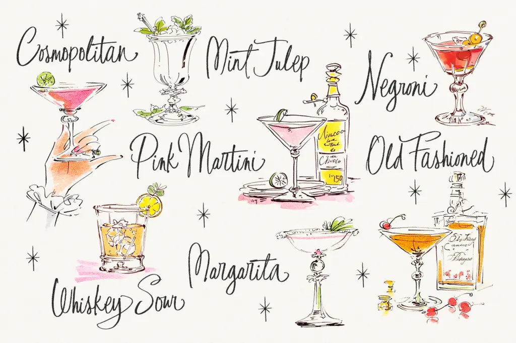
Access to these extras depends on your software. In OpenType-savvy apps like Illustrator or InDesign, alternates surface through the usual stylistic panels. Elsewhere, the font has been PUA-encoded, so the glyphs are still reachable through Font Book or Character Map if you’re willing to copy and paste — a workaround, not a convenience, and worth knowing before you commit to a layout that depends on it. A set of matching illustration files is bundled in, useful for filling out a greeting card or invite without hunting down separate art.
Use cases
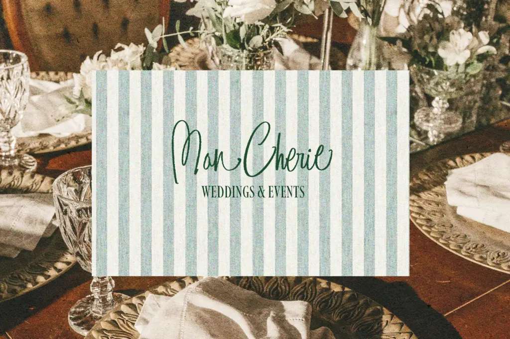
This is a display script, not a text face — it wants big sizes and short lines. Greeting cards, invitations, gift tags and packaging labels are the natural home for it, especially anything aiming at a retro or handmade feel rather than a polished, contemporary one. Wedding stationery works if the couple wants quirky and warm rather than formal; a black-tie invite this is not.
Branding and logo work is a reasonable stretch, particularly for food, craft or lifestyle brands chasing a nostalgic, personal tone. It’s less suited to anything that needs to look neutral or corporate, and it will fight you if you try to set more than a few words at a time — the bounce and texture that make it charming at headline size become fatiguing once you ask it to carry a paragraph. Pair it with a plain, quiet sans or serif for any supporting text; the script should stay the loud one in the room, and the words it says should be few.
What we liked, and what we didn’t
Strengths
- Even, moderate contrast keeps the textured strokes from turning muddy at smaller display sizes
- Generous alternates and ligatures let you break up repeated letters convincingly
- Bundled illustration files add practical value for card and invite layouts
Trade-offs
- Accessing alternates outside OpenType-capable software means manual copy-paste via Font Book or Character Map
- The bounce and texture that read as charming in a headline become fatiguing across longer text
Pomp & Circumstance is a confidently drawn retro script that does one job well: playful, hand-lettered display type for cards, invites and quirky branding. It's not built for long text or formal work, and the alternate glyphs are easiest to use if your software supports OpenType properly, but within its lane it's charming and well textured.
Verdict

Tantype reviews typefaces in depth — every font is tested in real branding, editorial and screen layouts before a word gets written. 555+ fonts reviewed and counting.