
Beach Bound: a pencil-drawn script for casual, hand-lettered branding
Design style
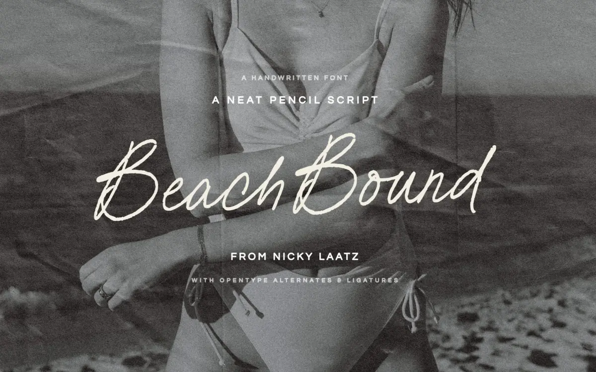
Beach Bound is a pencil script, and it reads like one rather than like a smoothed-over digital imitation of one. The strokes carry the slight texture and inconsistency of graphite on paper — thin entry strokes, soft pressure changes through the curves, and the kind of wobble that comes from a hand moving at a relaxed pace rather than a plotter drawing a path. It doesn’t try to be elegant in the formal-calligraphy sense. The joins are loose, the baseline drifts a little letter to letter, and the overall mood sits closer to a note scribbled on a postcard than an invitation suite.
Two weights are included, which matters more than it sounds like it should for a script. The lighter weight keeps the pencil feel delicate, almost faint in places, while the heavier weight gives the same letterforms enough graphite to hold up as a standalone word or short headline. Used together they give a design some hierarchy without reaching for a second typeface.
Character set and features
The font leans on OpenType ligatures and alternate letters to avoid the repetitive, stamped-out look that plain scripts tend to fall into. Turn the features on in software that supports them — Illustrator, InDesign, Photoshop and similar — and recurring letter pairs pick up small connecting variations instead of repeating identically. Without OpenType support switched on, the font still works, but it reads flatter and more mechanical, so this is not a typeface to drop into software that ignores stylistic sets without checking it first. Canva compatibility is noted by the designer, which covers one of the more common gaps for script fonts bought for quick social or packaging work.
Language support extends across a handful of Northern and Western European languages, which is worth knowing if the font is headed for international packaging or stationery rather than English-only use.
Use cases
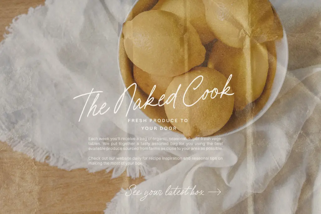
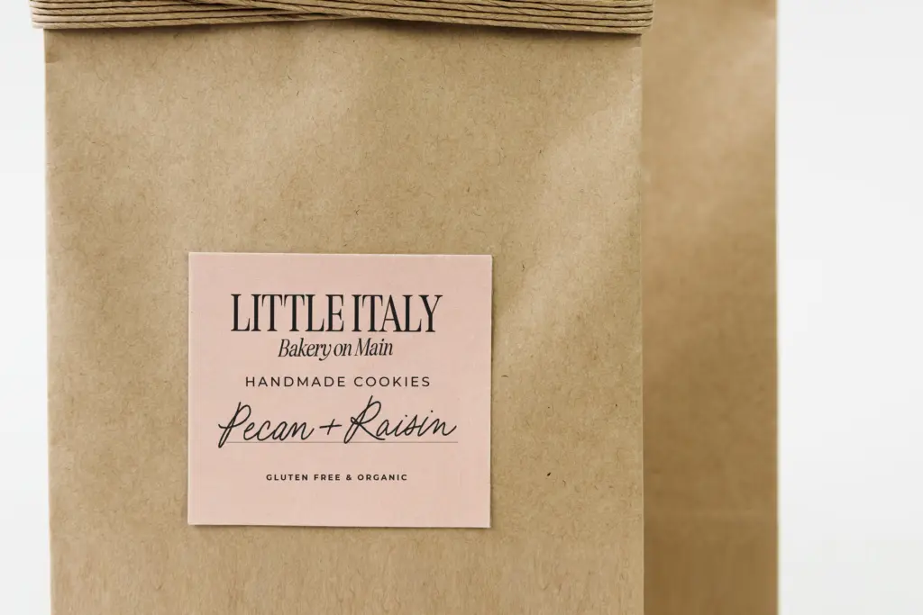
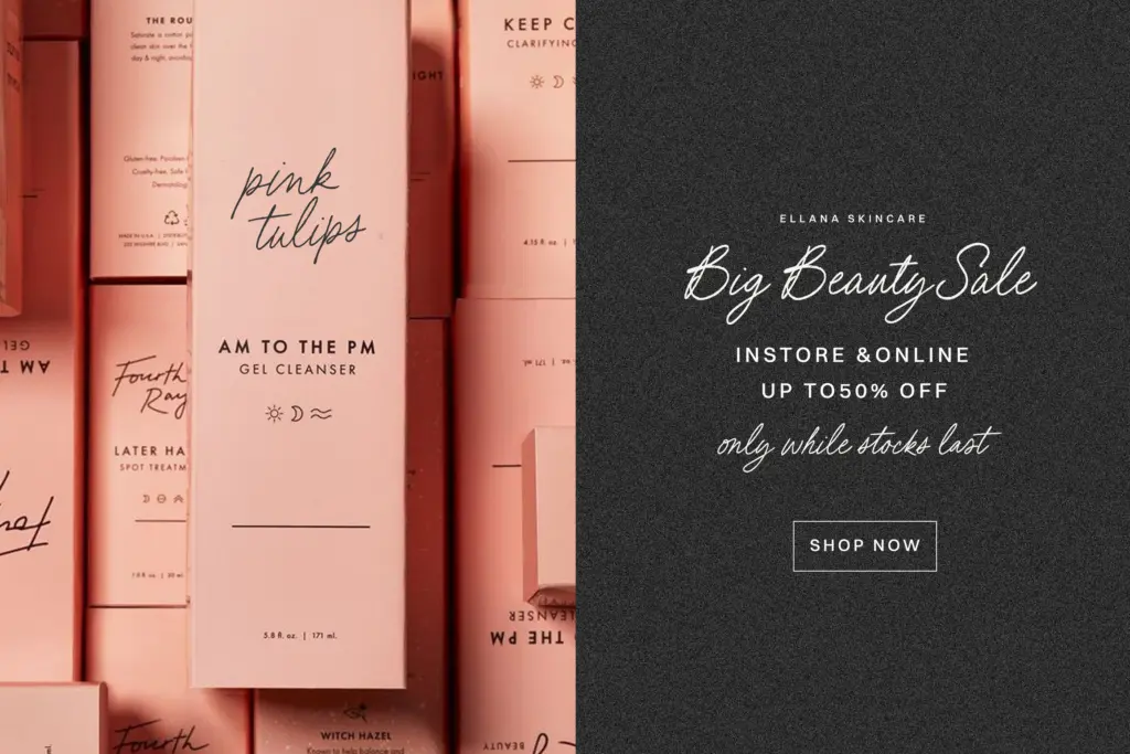
The pencil texture and the slightly undone baseline put this font in casual, lifestyle-adjacent territory rather than formal or luxury work. It suits beach and travel branding, market stall or small-batch packaging, greeting cards, and social graphics where a hand-lettered feel is the point rather than an afterthought. The two weights give enough range to pair a lighter word with a bolder one in the same lockup — a product name in the heavier weight over a tagline in the lighter one, for instance — without needing to bring in another typeface.
It’s less suited to dense paragraph setting or anywhere legibility at small sizes is critical; like most pencil scripts, the texture that gives it character also softens the edges of individual letters, so it wants to be set large, short, and with room to breathe. For anyone building wedding stationery, it reads a touch too casual unless the event itself is informal — a beach wedding invite, a save-the-date for a relaxed gathering, that kind of brief.
What we liked, and what we didn’t
Strengths
- Genuine pencil texture with pressure variation rather than a flat digital script look
- Two weights give usable hierarchy without needing a second typeface
- Ligatures and alternates meaningfully change the rhythm when features are enabled
Trade-offs
- Loses most of its character in software that doesn't support OpenType features
- Too casual and loose-baselined for formal or luxury branding work
Beach Bound delivers a convincing pencil-script texture with enough OpenType depth to avoid looking stamped out. It's built for casual, lifestyle and packaging work rather than formal stationery, and it needs OpenType-aware software to show its best side.
Verdict

Tantype reviews typefaces in depth — every font is tested in real branding, editorial and screen layouts before a word gets written. 555+ fonts reviewed and counting.