
TNSC Special Season: a sign-painter trio for branding that needs a bit of grit
Design style
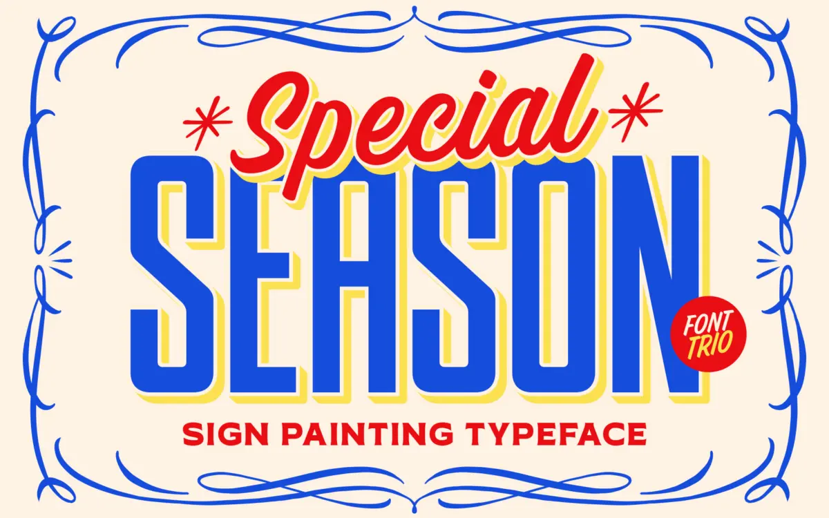
TNSC Special Season is built on the look of hand-lettered signage rather than any single letterform tradition, which is why it ships as three fonts instead of one. The Brush carries the loose, gestural energy of a sign painter’s loaded brush, with inconsistent stroke weight and a few deliberately rough edges. The Condensed and Expanded styles pull from block-letter sign alphabets: squared proportions, blunt terminals, a construction that reads as cut or stencilled rather than drawn. Put together, the trio is less a cohesive type family in the formal sense and more a toolkit of complementary voices meant to sit on the same poster or label. The condensed and expanded companions share enough DNA in their counters and stroke contrast that they don’t fight the brush script when stacked, which is the main thing a trio like this needs to get right.
Character set and features
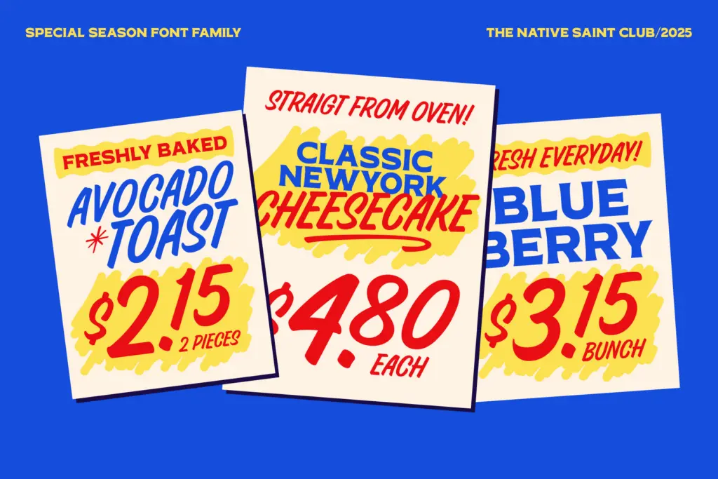
Alongside the three main styles, the set includes a dingbat collection of catchwords and symbols, the kind of ampersands, banners, and small ornaments that sign painters historically used to fill gaps or punctuate a layout. These are a genuine convenience rather than padding; building that vocabulary by hand from scratch is tedious, and having it bundled saves real production time. The brush script is the font that needs the most care in use. Its texture works at display sizes but loses definition quickly once you’re setting anything smaller than a headline — the rough stroke edges and variable weight that give it character also reduce legibility under pressure. The condensed and expanded sans/serif styles are sturdier and hold up better across a range of sizes, which makes them the workhorses of the trio while the brush script stays decorative. There’s no indication here of extended language support beyond the standard Latin set, so treat this as a Latin-script tool unless you check the character map for specific diacritics you need.
Use cases
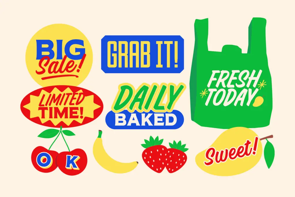
This is a trio built for branding and packaging work that wants a vintage, sign-painted feel without looking like a single overused script font. Think craft beverage labels, bakery signage, market stall branding, or any packaging project chasing a handmade, slightly weathered Americana look. The condensed and expanded styles are well suited to headlines, logotypes, and badge-style lockups where you need letterforms to hold their shape at a distance — the kind of job sign painting itself was built for. The brush script earns its place as an accent: a signature line, a single word of emphasis, a flourish inside a larger lockup, but not body copy and not small print. The dingbats extend the kit into invitations, menus, and packaging flourishes where a stray ampersand or banner saves a trip to a separate ornament set. Treat it as a branding system rather than a general-purpose text family, and it does its job well; ask it to carry long-form reading and it will show its limits quickly.
What we liked, and what we didn’t
Strengths
- Three complementary styles let you build full sign-painted lockups without hunting for pairings
- Bundled catchwords and dingbats save real time on ornamental details
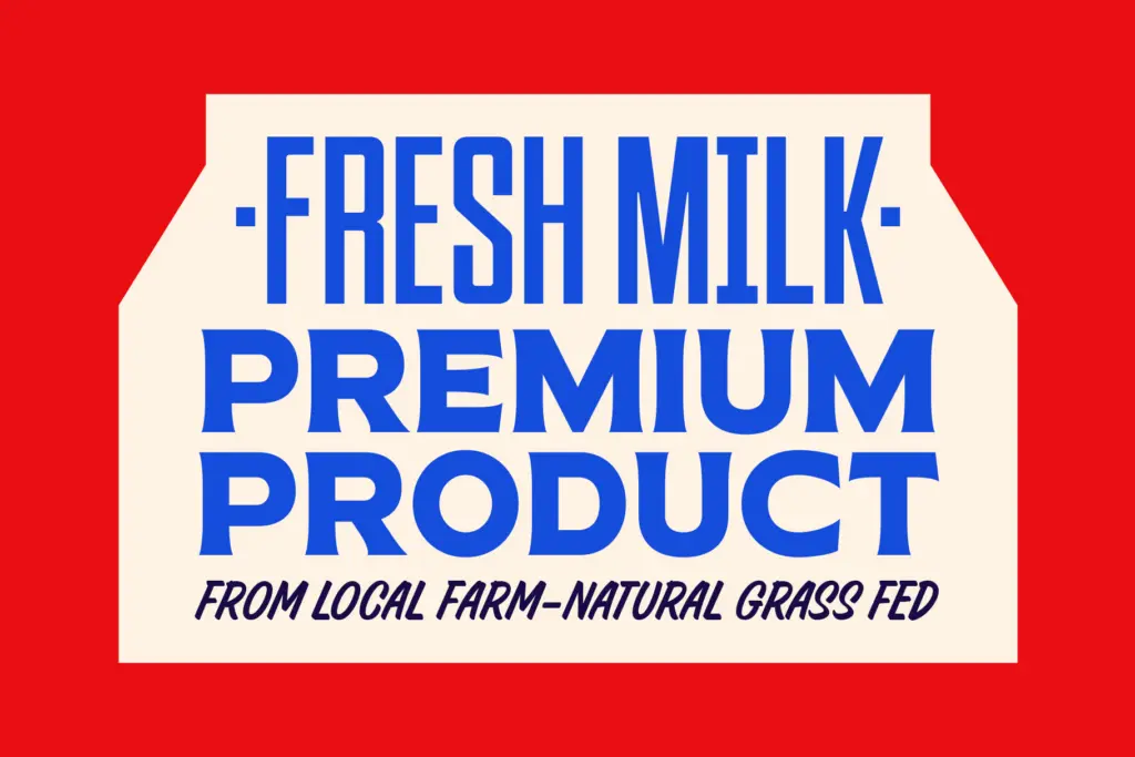
- Condensed and expanded styles stay legible across a range of display sizes
Trade-offs
- The brush script loses clarity quickly below headline size
- No indication of extended language or diacritic support beyond basic Latin
TNSC Special Season is a solid toolkit for vintage sign-painted branding, with the condensed and expanded styles doing the heavy lifting and the brush script reserved for accents. It's not built for body text or small sizes, but for packaging, badges, and headline lockups it delivers the handmade look it promises. Buy it for the system, not for any single style standing alone.
Verdict

Tantype reviews typefaces in depth — every font is tested in real branding, editorial and screen layouts before a word gets written. 555+ fonts reviewed and counting.