
Supa Mega Fantastic Font Duo: a sign-painter script paired with a chunky companion sans
Design style
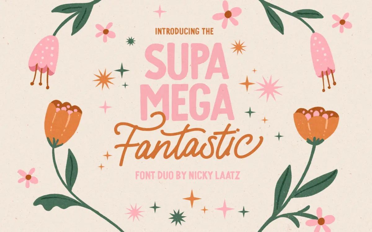
This is a duo built on the old sign-writer’s trick of pairing a loose monoline script with a blunt, all-caps workhorse. The script leans casual rather than formal — even strokes, no calligraphic swelling, letters that lean and bounce slightly off baseline the way a hand-painted shopfront sign does. It reads as drawn, not engineered, which is the point: you can feel the brush or marker behind it rather than a pen-tool curve.
The companion sans is the ballast. Thick, slab-footed capitals with a bit of ink-trap character at the joints, built to sit underneath the script and hold a layout down. On its own it’s blunt and a touch clumsy, which is exactly right for a supporting role — it’s not trying to be a display face in its own right, it’s there to anchor the flourish above it.
Two weights of the script are included, a regular and a slightly thinner cut. The thinner one is pitched for light-on-dark use, the regular for dark-on-light, which is a sensible practical distinction rather than a genuine optical size range — don’t expect the kind of contrast you’d get from a proper weight axis.
Character set and features
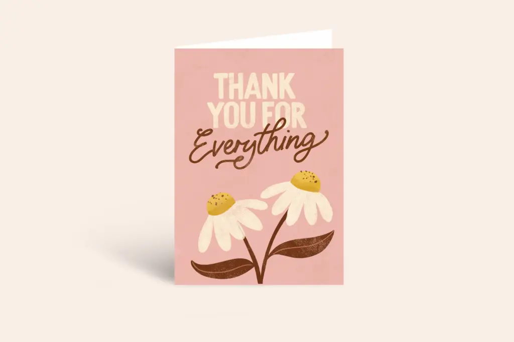
The script’s real depth is in its OpenType alternates. Every capital has a swash alternate, and the lowercase carries a run of variant forms per letter, enough to break up repeated letters in a word or soften an awkward collision between neighbours. Accessed through a design app that reads OpenType features properly, this is where the font earns its keep — used blind, typing it straight out of the box, you get a flatter, more generic script that undersells what’s actually in the file.
That’s the trade-off worth naming: the alternates aren’t automatic contextual substitution, they’re a manual glyph palette. If your workflow is Illustrator or InDesign with stylistic sets and glyph panels, fine. If you’re dropping type into a template builder or a tool with limited OpenType support, you’ll likely only see the base set, and the script reads noticeably plainer than the marketing suggests.
Language coverage runs across the main Nordic and central European sets — Danish, Finnish, German, Norwegian, Swedish, Spanish and Swiss German variants — so it’s usable for regional projects beyond English without hunting for a workaround on accented characters.
Use cases
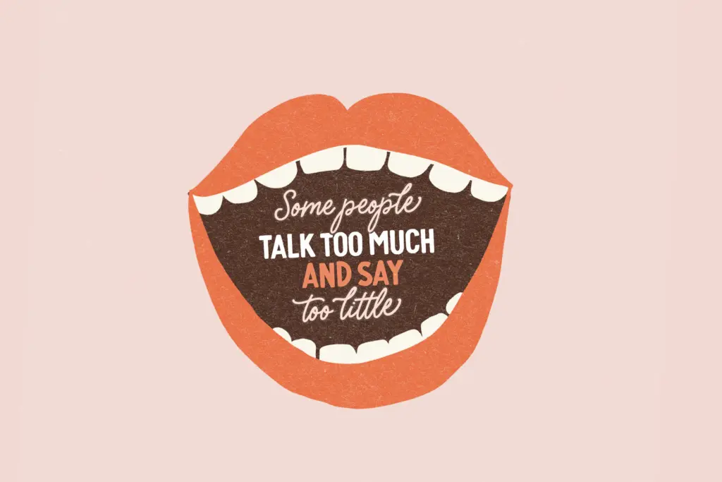
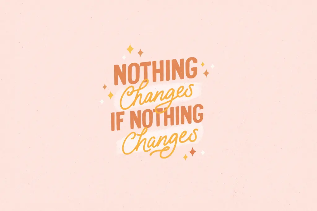
This pairing is built for the casual end of branding work — greeting cards, packaging with a handmade feel, quote graphics, invitation suites that want warmth rather than polish, small-batch product labels. The sans gives you a legible fallback for anything that needs to actually be read at a glance: a product name, a headline, a short line of copy where the script would blur.
It’s not a typeface for restrained, minimal branding or for long-form editorial use — the script’s looseness and the sans’s heft both work against subtlety. Keep it to short lines, playful contexts, and situations where the hand-lettered feel is the message, not just the decoration.
What we liked, and what we didn’t
Strengths
- Deep set of OpenType alternates on both cases of the script for genuine variation
- Companion sans gives a legible, sturdy fallback for short headline text
- Solid multilingual character support for Nordic and central European projects
Trade-offs
- Alternates require an app with proper OpenType feature support or the script reads generic
- Loose, bouncy style limits use to playful contexts, not suited to formal or editorial layouts
A solid, well-made pairing for casual, hand-drawn branding work, provided your design software can actually surface the alternates that make the script interesting. Without OpenType support it's a decent but unremarkable casual script; with it, there's real personality to find. Not a font for restrained or editorial-leaning projects.
Verdict

Tantype reviews typefaces in depth — every font is tested in real branding, editorial and screen layouts before a word gets written. 555+ fonts reviewed and counting.