
TAN Mon Cheri: A Clean Sans With Retro Ligature Flourishes
Design style
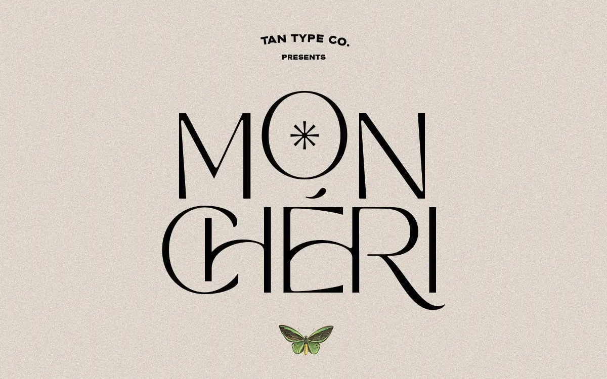
TAN Mon Cheri sits in a small but familiar niche: a plain, well-behaved sans serif skeleton dressed up with a handful of decorative ligatures that nod toward mid-century signage and fashion typography. The base letterforms are unfussy. Strokes are even in weight, apertures are open, and there’s no attempt to be clever with the basic alphabet. That restraint is the point — it leaves room for the ligatures to do the talking.
Where the personality shows up is in the connecting strokes and swashes triggered through OpenType features. These borrow the confident, looping gestures of retro script lettering but graft them onto sans serif letters, which is a less common move than pairing swashes with a serif or script base. The result reads as considered rather than gimmicky, provided you use the ligatures sparingly rather than turning every word into a chain of flourishes.
Character set and features
The family covers standard multilingual character support, so accented Latin languages are accounted for beyond a basic English set. The ligature and alternate letter system is the feature that matters most here, and it only works if the software you’re setting type in actually supports OpenType features — this isn’t automatic in every app, and it’s worth checking before committing to a layout that depends on the alternates.
Without activating those features, Mon Cheri behaves like a tidy, generic-leaning sans: legible, evenly spaced, unremarkable in isolation. That’s not a criticism so much as a description of how the font is built — the plain glyphs are a canvas, and the ligatures are the decoration layered on top. Designers who skip the OpenType step are getting a fraction of what they paid attention to when they picked this typeface.
The letterforms don’t carry much contrast or personality of their own at the individual glyph level, which keeps the font legible at small sizes but also means it won’t stand out in a lineup of similar minimal sans faces if you’re not using the special features.
Use cases
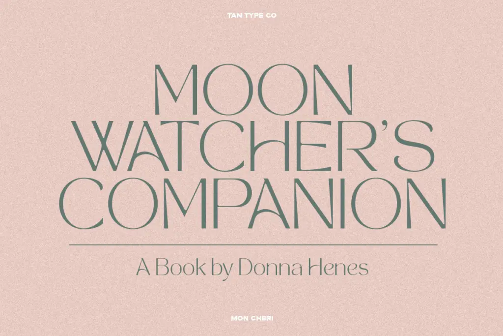
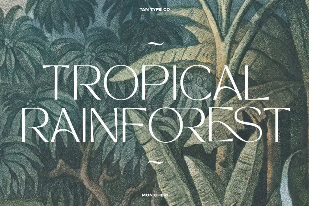
This is a display-leaning font best suited to short strings — logotypes, headlines, packaging typelines, invitation lettering — rather than paragraphs of running text. The ligatures need room to be seen and appreciated, and they’re most effective on words rather than sentences. Fashion branding, boutique packaging, and wedding stationery are the obvious lanes, given the retro-fashion inflection of the swashes.
It also works reasonably well as a plain minimal sans for logo type or short taglines if you never touch the alternates, though at that point you’re not getting much beyond what a dozen other neutral sans faces already offer. The value here is really in the ligature system, so it’s worth testing your layout software’s OpenType handling before building a whole identity around the feature. For body copy or long-form editorial work, look elsewhere — this typeface wasn’t drawn with paragraph rhythm in mind, and its charm is concentrated in short, decorative moments rather than sustained reading.
What we liked, and what we didn’t
Strengths
- Ligature system gives an otherwise plain sans a distinct retro-fashion character
- Base letterforms stay legible even at small sizes
- Multilingual character support extends its reach beyond basic English sets
Trade-offs
- Personality depends entirely on OpenType feature support, which not every app handles cleanly
- Individual letterforms are plain enough that the font blends in without the special ligatures active
TAN Mon Cheri is a competent minimal sans that earns its personality entirely through an OpenType ligature layer rather than the base letterforms. It's a solid pick for short branding and packaging work if your software supports the features properly, but it's not built for running text or heavy everyday use.
Verdict

Tantype reviews typefaces in depth — every font is tested in real branding, editorial and screen layouts before a word gets written. 555+ fonts reviewed and counting.