
Tallica: an extra-condensed grotesque built for tight headline space
Design style
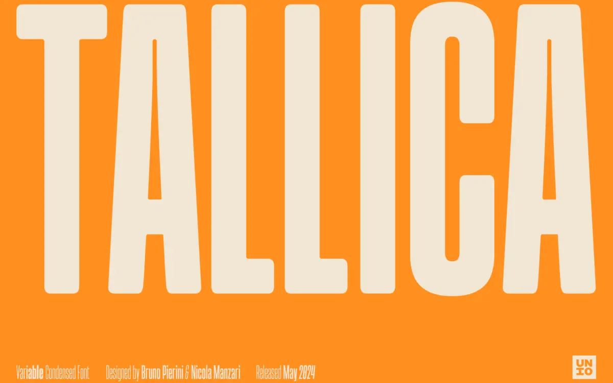
Tallica is a grotesque pushed to its extra-condensed limit, and it wears that compression as its whole identity. The letterforms are squeezed hard but not distorted — strokes stay upright, apertures stay open, and the skeleton reads as a normal grotesque rather than a stretched one. That restraint is the design decision worth noting: a lot of ultra-condensed faces start warping their curves to survive the narrowing, but Tallica keeps its bowls round and its counters legible instead of collapsing them into slits.
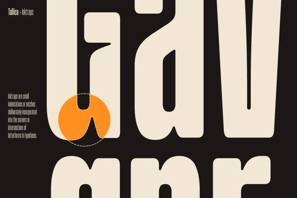
The rounded ink-trap treatment at stroke junctions is the other distinguishing feature. Rather than the sharp notched ink traps you see in older display grotesques, Tallica softens those junctions with small rounded reliefs. It’s a quiet detail, but it gives the typeface a slightly friendlier, less industrial edge than a typical condensed grotesque, without tipping into anything decorative.
Character set and features
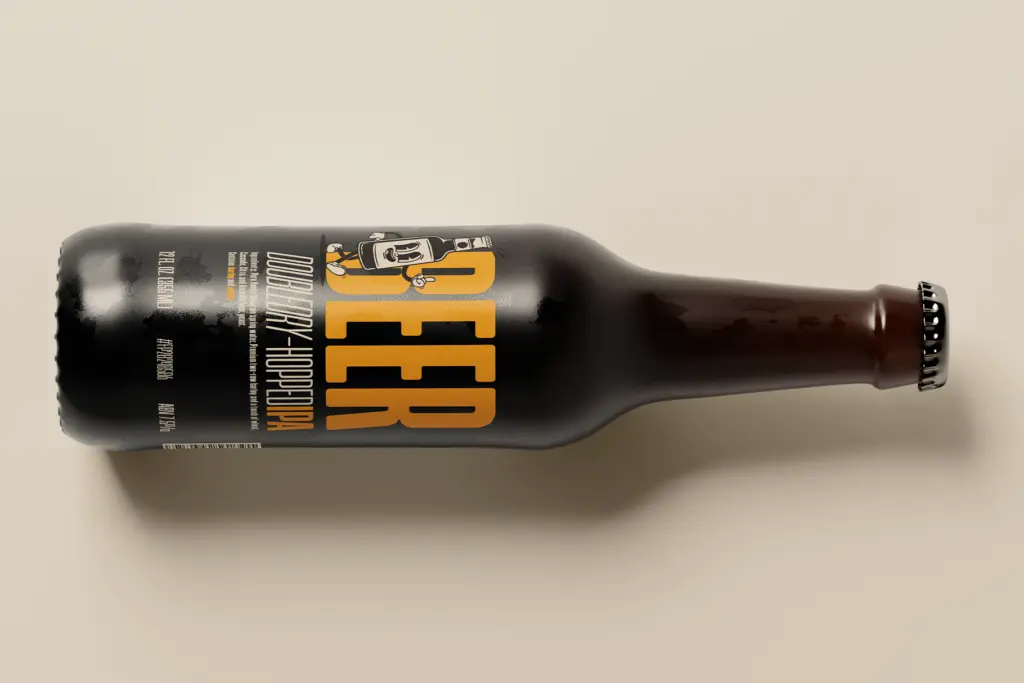
As a variable font, Tallica runs from Thin through Bold, with an oblique paired to each weight along the axis. That gives you a genuinely continuous range to pick from rather than a fixed handful of static cuts, which matters more in condensed families than most because the difference between adjacent weights can shift the texture of a headline noticeably at this width.
The x-height is generous, which is doing a lot of the legibility work here. In an extra-condensed face, a tall x-height combined with tight spacing is usually what keeps words from turning into a picket fence of vertical strokes at small sizes — Tallica leans on this correctly. Line spacing is set tight by design, which reinforces the compact, stacked look the typeface is going for, but it does mean you’ll want to add space back in manually for anything beyond a single punchy line or two.
The obliques are functional companions rather than a separate design statement — useful for adding a secondary voice within a headline system, not for carrying long stretches of text on their own.
Use cases
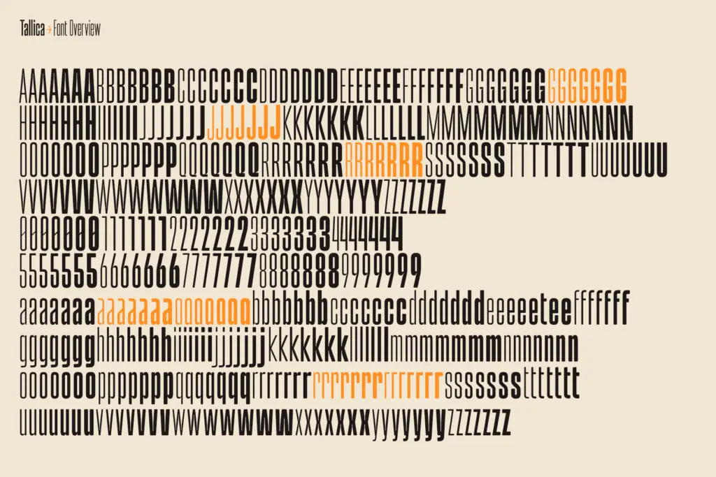
This is a headline typeface first. It’s built for situations where horizontal space is the constraint: packaging call-outs, editorial kickers, poster type crammed into a narrow column, app store screenshots, anywhere you need loud type in a tight box. The variable weight axis makes it easy to dial in exactly how much visual weight a given line needs without switching families.
It can stretch into logotypes and short branding marks too, particularly where a client wants something that reads as contemporary and slightly technical rather than warm. Where it starts to strain is body copy or anything set at length — the condensation that makes it striking in a headline becomes fatiguing across paragraphs, and the tight leading isn’t forgiving at small sizes. Treat it as a display specialist that happens to have a wide weight range, not a full-service text family, and pair it with a separate text face for anything longer than a caption.
What we liked, and what we didn’t
Strengths
- Rounded ink traps keep tight junctions legible instead of clogging at small sizes
- Generous x-height prevents the extreme condensation from collapsing into illegibility
- Continuous variable weight axis with matching obliques gives fine control over headline weight
Trade-offs
- Tight default line spacing needs manual adjustment for anything beyond one or two lines
- Not suited to body text or long-form setting despite the wide weight range
Tallica does one job well: loud, compact headlines that need to fit into narrow spaces without losing legibility. The rounded ink-trap detail and generous x-height keep it from feeling brittle at extreme compression, but it's a display specialist, not a general-purpose family.
Verdict

Tantype reviews typefaces in depth — every font is tested in real branding, editorial and screen layouts before a word gets written. 555+ fonts reviewed and counting.