
Highway Motel: a split-personality sans-script for retro branding
Design style
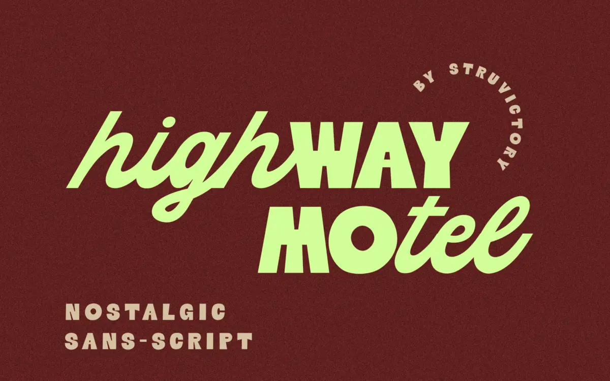
Highway Motel is built on a simple structural trick that ends up doing most of the work: the uppercase and lowercase don’t behave like the same typeface. Capitals are drawn as a bold geometric sans, with the kind of confident, slightly rounded curves you’d associate with old diner signage or a motel marquee. Lowercase switches register entirely, running as a connected script with a steady, looping rhythm. Put a capital next to a string of lowercase and you get a jolt — blocky next to fluid, static next to moving. That contrast is the whole idea, and it reads as deliberate rather than accidental, which is the difference between a gimmick and a concept.
The retro reference points are legible without being a costume. There’s no forced grunge texture, no distressed edges standing in for nostalgia — the geometric caps do that job through proportion and stroke weight alone. The script lowercase keeps its joins tight and its loops modest, so it never tips into full calligraphic flourish. It’s a font that wants to sit on a sign, not a wedding invitation.
Character set and features
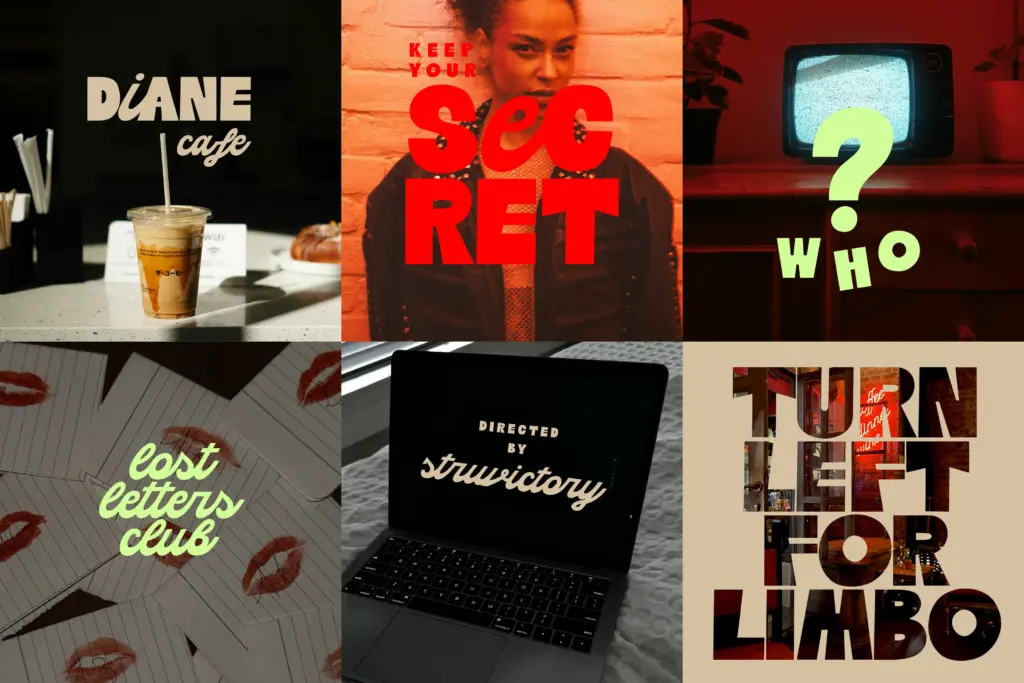
Latin support covers the standard range of Western European languages, so accented characters should be available if your project needs them — worth checking the specific diacritics you need before committing, as is true of most display faces built for a single visual idea rather than exhaustive coverage. Because the design leans on the upper/lowercase contrast as its core feature, the character set doesn’t need to lean on stylistic alternates or swash sets to carry interest — the personality is baked into the base letterforms rather than layered on top.
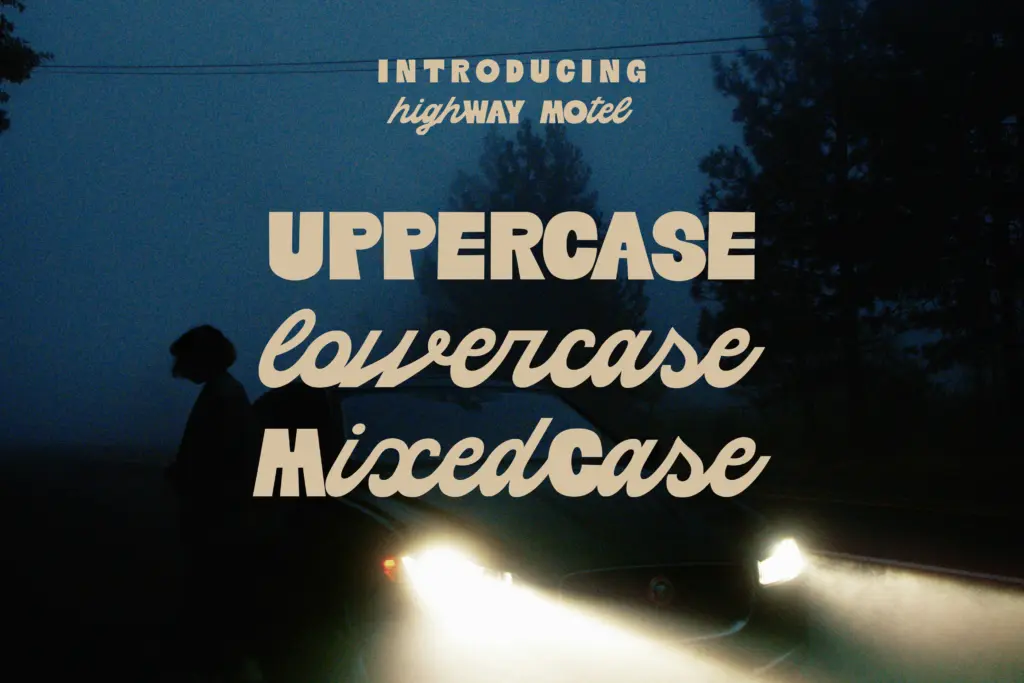
That said, the two-register construction means the font is less forgiving about how it’s set. All-caps text loses the contrast that makes the design work, flattening it into a fairly plain geometric sans. All-lowercase text loses the anchor of the blocky capitals and starts to feel like a generic connected script. The font wants mixed case, sentence-style or title-style, to actually perform. Anyone setting long runs of text should expect to do some manual adjustment of pairs where the sans cap meets the script lowercase — those transitions are the most delicate part of the design and the ones most likely to need attention at larger sizes.
Use cases
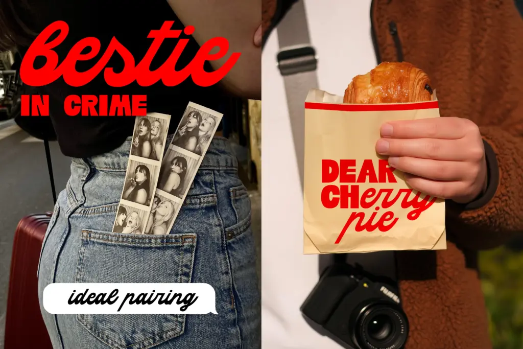
This is a headline and logotype font first. It suits short lockups — a brand name, a poster title, a single line on packaging — where the case contrast can be seen and appreciated rather than lost in a paragraph. The highway-and-neon mood makes it a natural fit for anything trading on Americana, road-trip, or late-night-diner references: menu headers, event posters, motel or hospitality branding, retro-themed social posts. It also works as an editorial display face for features with a nostalgic or cinematic angle, where a single big word can carry a page.
It’s not a body text font and shouldn’t be asked to be one — the script joins and the case-switching would tire the eye well before a paragraph ends. Treat it as a voice for short-form, high-impact type, and pair it with a plain, quiet body font for anything that needs to be actually read.
What we liked, and what we didn’t
Strengths
- The blocky-sans-cap-plus-connected-script-lowercase contrast is genuinely distinctive, not just decorative texture
- Retro mood comes through in proportion and stroke weight rather than applied grunge effects, so it stays clean at large sizes
- Well suited to short lockups — logotypes, poster titles, packaging headers — where the case contrast is visible
Trade-offs
- Setting it in all-caps or all-lowercase erases the concept and leaves a fairly ordinary result
- Not usable for body text; the script joins and case-switching become fatiguing beyond a short line
Highway Motel gets real mileage out of one clean idea: geometric caps against connected script lowercase. It's a strong headline and logotype font for retro Americana branding, but it's a one-trick performer that needs mixed-case setting to work and isn't built for body copy.
Verdict

Tantype reviews typefaces in depth — every font is tested in real branding, editorial and screen layouts before a word gets written. 555+ fonts reviewed and counting.