Sans Serif
4.0
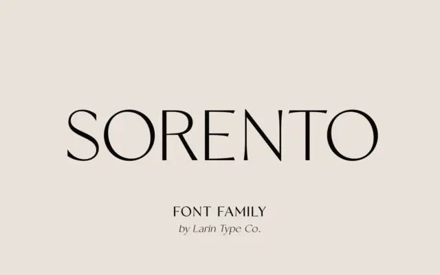
Sorento: a high-contrast sans family for editorial and label work
Design style Sorento is a contrast sans, which is a slightly unusual proposition — most sans families flatten stroke weight…
 Tantype

Design style Sorento is a contrast sans, which is a slightly unusual proposition — most sans families flatten stroke weight…
Tantype
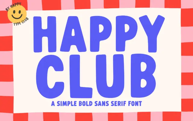
Design style Happy Club is a bold, monoline sans built around rounded terminals and generous, even stroke weight. The letters…
Tantype
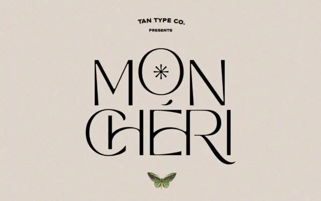
Design style TAN Mon Cheri sits in a small but familiar niche: a plain, well-behaved sans serif skeleton dressed up…
Tantype
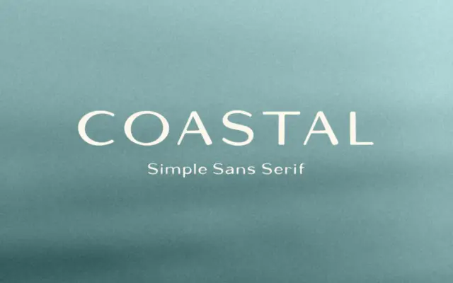
Design style Coastal is a sans serif with a hand-built feel rather than a strict grid-drawn one. The strokes carry…
Tantype
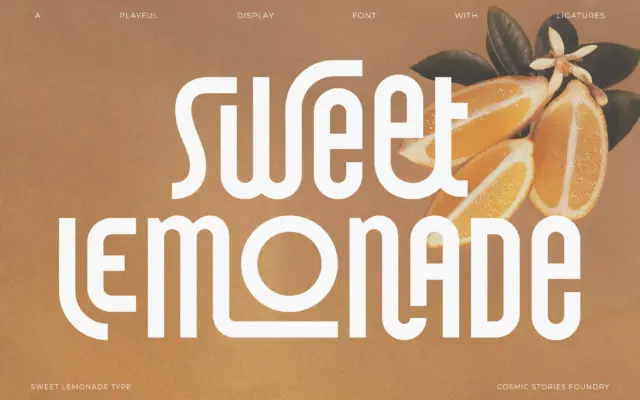
Design style Sweet Lemonade is a condensed, tall-set sans with a retro lean rather than a full period pastiche. The…
Tantype
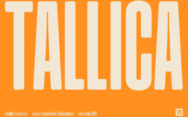
Design style Tallica is a grotesque pushed to its extra-condensed limit, and it wears that compression as its whole identity.…
Tantype
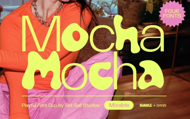
Design style Mocha is a four-font set built around one idea: a bouncy, hand-drawn bubble letter paired with a clean,…
Tantype
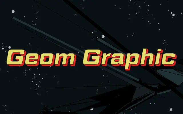
Design style Geom Graphic works the same territory as the square-geometric sans faces that came out of the Eurostile lineage,…
Tantype
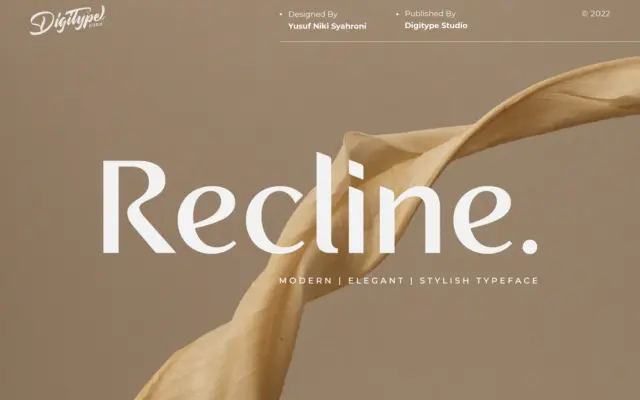
Design style Recline is a modern sans built around restraint rather than personality. The letterforms are clean, low-contrast, and even…
Tantype