
Atelier: a geometric display sans for logotypes and headline work
Design style
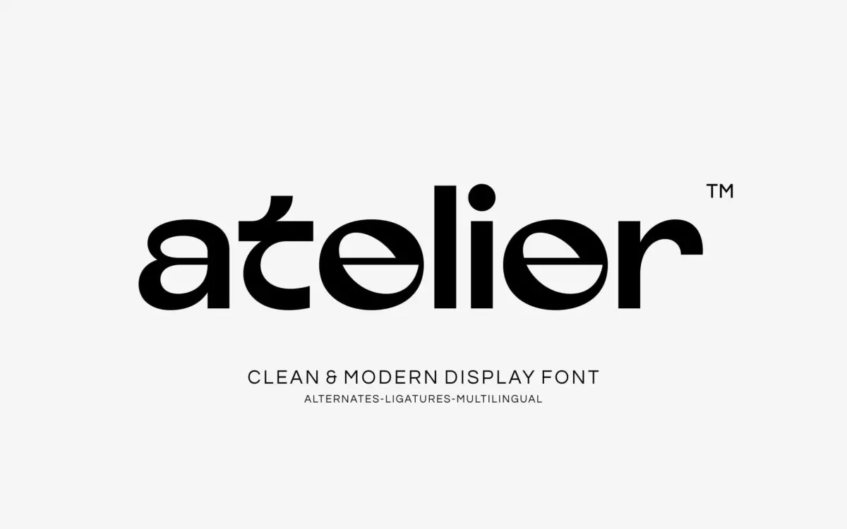
Atelier sits in that familiar territory between geometric sans and display face, built around circular bowls, even stroke widths and a few deliberately loosened joints where the geometry gives way to something softer. The seller calls this a tension between rigid structure and organic fluidity, and you can see the intent in letters like the ‘a’ and ‘g’, where the terminal curls instead of closing flush. It reads as a mid-century reference filtered through a contemporary, slightly experimental hand rather than a straight revival.
The geometry is confident rather than mechanical. Circles aren’t forced into perfect roundness everywhere; there’s enough optical correction that the typeface doesn’t feel like it was built from a compass and ruler and nothing else. The x-height is generous, counters are open, and the overall rhythm leans toward wide rather than condensed. It’s a display face first — the letterforms are drawn to be looked at, not skimmed.
Character set and features
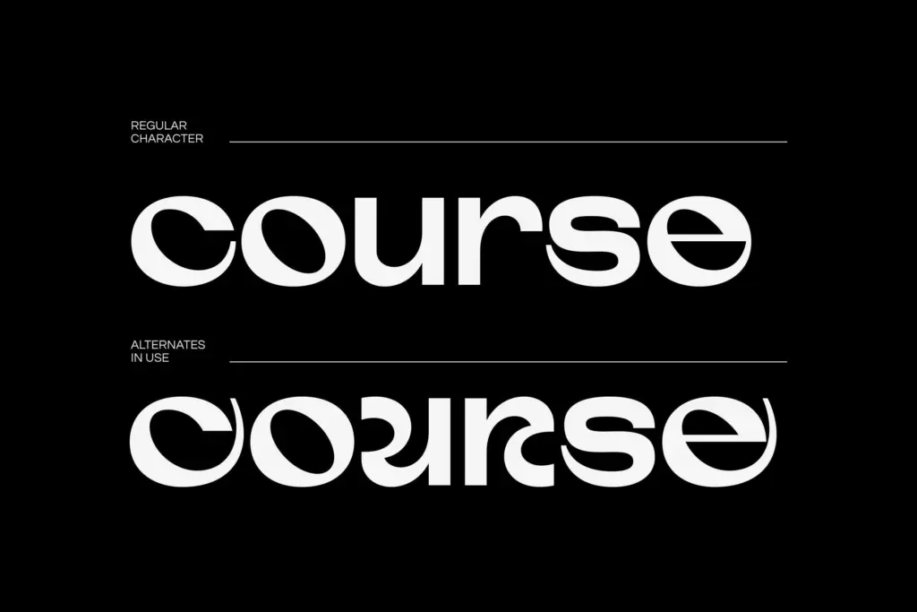
The set covers uppercase and lowercase, numerals, punctuation, and a run of alternates and ligatures accessed through PUA encoding, along with stated multilingual support. The alternates matter more here than in most display fonts, because the base characters are plain enough that a project built entirely from default glyphs can look thinner on personality than a single swapped letterform. Swapping in a looser ‘a’ or an alternate terminal on a descender changes the character of a word noticeably, which is the point of including them.
Because it’s delivered as a static display font rather than a full family with weight variation described in the brief, there’s no evidence of a text-weight companion or italic here — just the one voice, pushed through its alternates. That’s fine for what it’s built to do, but it means you’re not getting a system for body copy alongside it; this is a headline and mark-making tool, not a text face.
Use cases
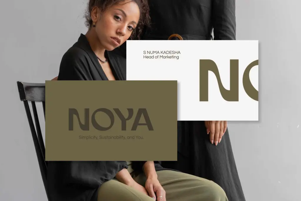
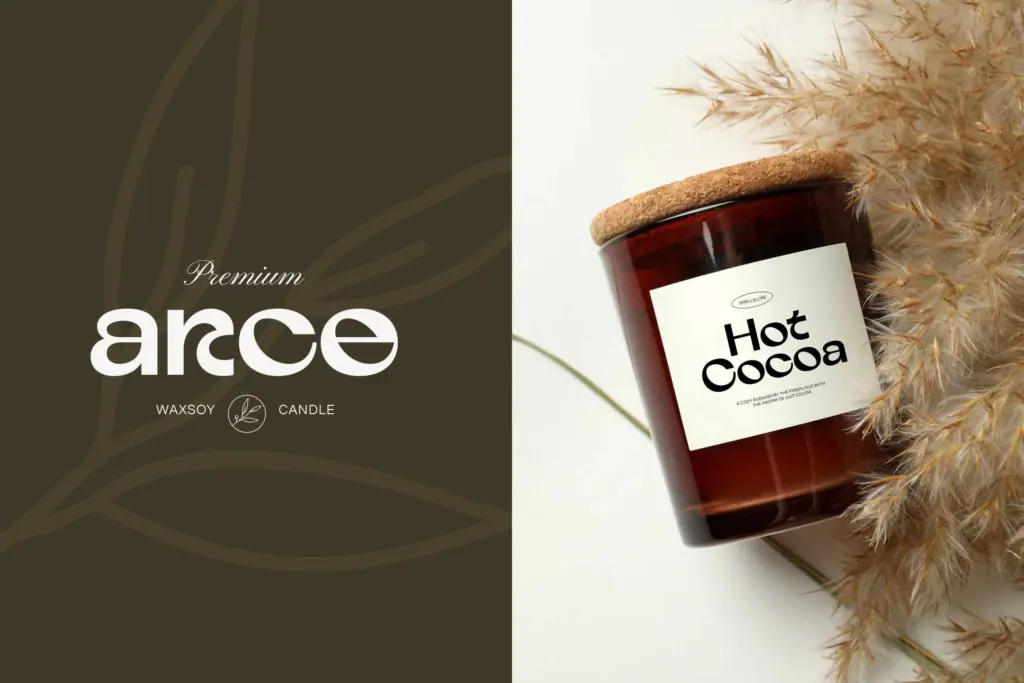
Atelier is suited to places where a word or two carries the weight of an identity: logotypes, packaging lockups, editorial mastheads, poster headlines, website headers. The geometric-but-loosened quality gives it a premium, slightly fashion-adjacent feel without tipping into anything ornate, which is why it reads naturally against beauty, lifestyle and luxury packaging contexts.
It’s less suited to long-form text or dense layouts — the letterforms are designed to be read one at a time, at size, not in paragraphs. Use it for the brand mark, the cover line, the hero headline, then hand off to a text face for everything underneath. Pairing it with a quieter sans or a workmanlike serif for body copy will let Atelier’s geometric quirks stay distinctive instead of becoming repetitive across a page.
Software compatibility across Illustrator, Photoshop, Word and Canva suggests it’s aimed at a broad range of users, including people without a type-savvy production pipeline, which fits its role as a drop-in display face rather than a deeply engineered system.
What we liked, and what we didn’t
Strengths
- The loosened terminals on letters like 'a' and 'g' give it a distinct personality beyond standard geometric sans construction
- Alternates and ligatures let single words carry more character without changing the overall voice
- Generous x-height and open counters keep it legible at the large sizes it's designed for
Trade-offs
- No text-weight companion, so it can't carry a layout beyond headline-length copy
- At smaller sizes the geometric regularity flattens out and loses the character that makes it interesting large
Atelier is a confident geometric display face with enough organic looseness in its curves to avoid feeling generic. It does one job well — short-form headline and logotype work — and doesn't pretend to be a text system. Buy it for marks and mastheads, not paragraphs.
Verdict

Tantype reviews typefaces in depth — every font is tested in real branding, editorial and screen layouts before a word gets written. 555+ fonts reviewed and counting.