
GW Primos: an ultra-bold reverse-contrast display sans for loud headlines
Design style
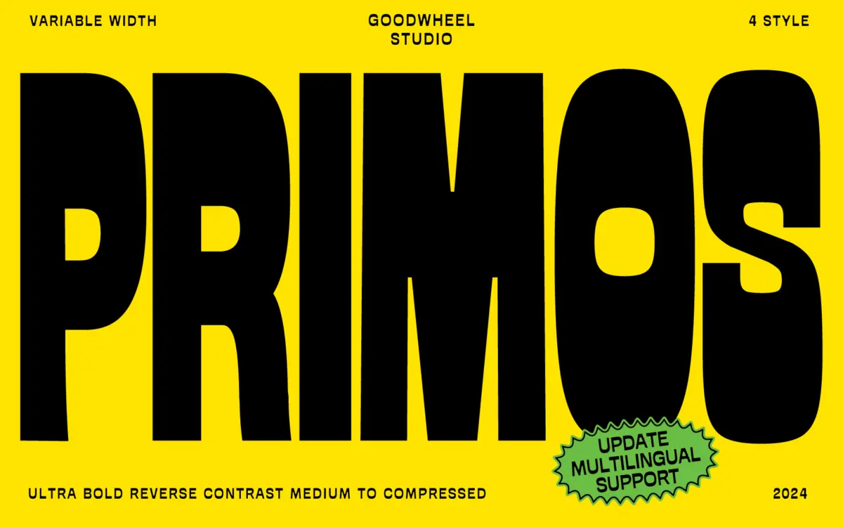
GW Primos is built around a single, blunt idea: reverse contrast taken to an ultra-bold extreme. Where most sans serifs put weight into the verticals, Primos shifts the mass into the horizontals, so crossbars and bowls swell while the stems stay comparatively thin. The result reads as a kind of inverted stencil energy — closer to a shout than a sentence. Proportions sit medium to compressed, which keeps the letters tight against each other and gives set text a dense, blocky rhythm rather than an airy one.
It’s an unapologetic display design. There’s no attempt to soften the contrast for comfort, and that’s clearly the point — this is a typeface built to be seen, not read closely. The drawing is consistent across the weight range, and the reverse-contrast logic holds up even as the width axis moves from medium to compressed, which is harder to pull off than it looks. Letters don’t just get narrower, they keep their character as they do.
Character set and features
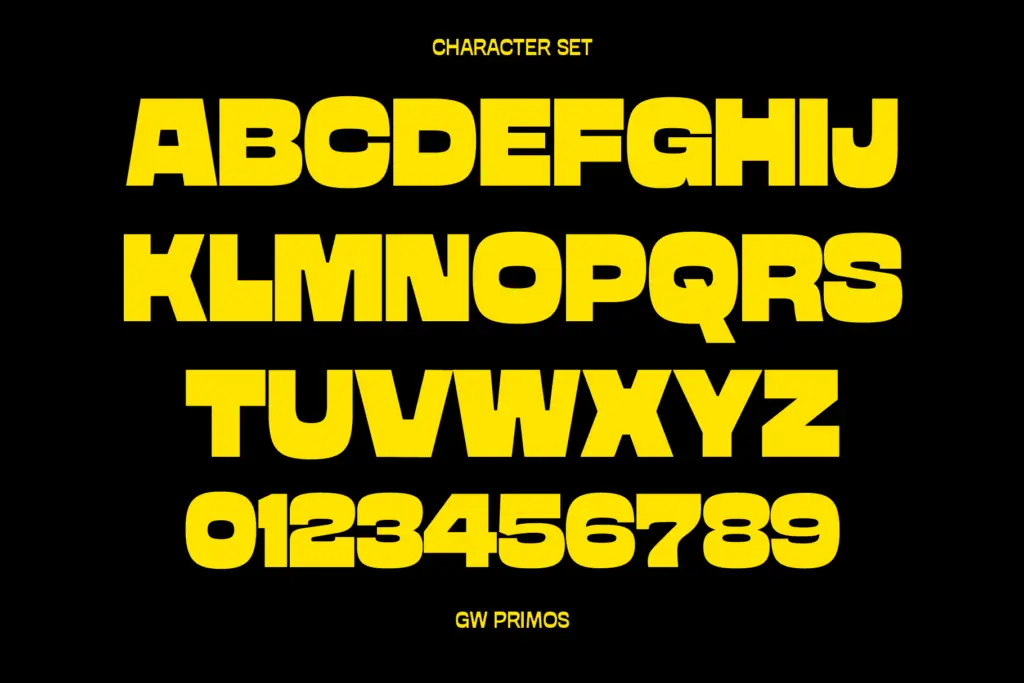
The package covers Basic Latin only, so this is not a multilingual tool out of the box — fine for English-language headlines and logotypes, less useful if you need accented characters or extended European sets without reaching out to the foundry directly. You get four static OTF files running medium to compressed, plus a variable font with a width axis, which is the more practical way to work with it: you can dial in exactly how tight you want the setting rather than jumping between four fixed stops. There’s also a companion Text weight listed as a work in progress, suggesting the family may eventually extend toward smaller-size use, but that isn’t part of what’s here now.
Because the whole family is built around one ultra-bold weight with width as the only variable, there isn’t a lighter sibling to fall back on. What you see is what you get: a single loud voice at different widths. That’s a reasonable trade for a display font, but worth knowing before you build a layout around it expecting tonal range.
Use cases
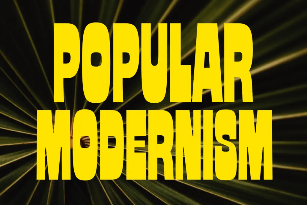
Primos is suited to the jobs display faces are supposed to do: posters, gig flyers, packaging headlines, logotypes, app icons, anything where a handful of words need to dominate a layout at a glance. The reverse-contrast treatment gives it a retro, almost print-poster quality that works well for music, streetwear, or event branding looking for some attitude rather than restraint. The compressed widths are particularly useful for squeezing a bold word into a tight horizontal space — a record sleeve spine, a product label, a social banner — without losing legibility at that scale.
It’s not a typeface for body copy, captions, or anything that needs to be read in a paragraph; the reverse contrast gets visually noisy below display sizes, and the limited character set rules out longer multilingual documents. Treat it as a headline instrument, pair it with a quieter workhorse for supporting text, and keep it to short bursts of type where its personality can actually land.

What we liked, and what we didn’t
Strengths
- Reverse-contrast drawing stays consistent and legible across all four widths
- Variable width axis gives finer control than the four static cuts alone
- Compressed widths are genuinely useful for tight horizontal spaces like spines and labels
Trade-offs
- Basic Latin only, so it's not ready for multilingual or accented-text projects
- Single ultra-bold weight means no tonal range without a Text companion, which is still unfinished
GW Primos is a confident, single-minded display face that does one loud thing well: reverse-contrast, ultra-bold headlines with a useful width axis. It won't handle body text or multilingual projects, but for posters, logotypes and packaging headlines it has real character.
Verdict

Tantype reviews typefaces in depth — every font is tested in real branding, editorial and screen layouts before a word gets written. 555+ fonts reviewed and counting.