
Classy Marisa: an all-caps display sans for compact branding marks
Design style
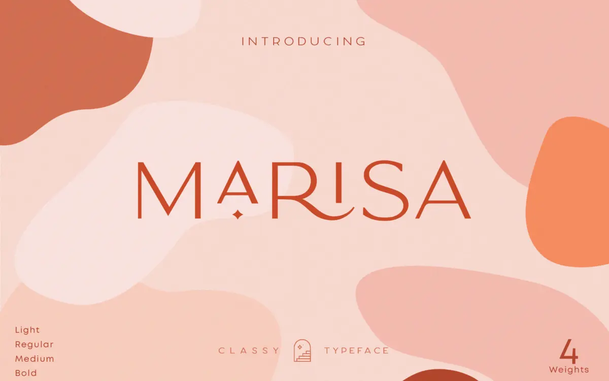
Classy Marisa is an all-capitals display sans built around narrow proportions and a restrained, minimalist feel. The letterforms are stripped of flourish in their base form — straight stems, clipped terminals, very little contrast between strokes — which is what gives it the “minimal elegant” label the seller leans on. Where it earns the “vintage” tag is in the spacing and proportions rather than in any ornamental detail: the characters sit close together, with a condensed rhythm that reads like a badge or a label typeface from an earlier era of packaging design, rather than a contemporary grotesque.
Across the four weights the construction stays consistent. Lighter weights thin the strokes down to something closer to a hairline sans, useful for overlay text on photography; the heavier end bulks up enough to anchor a logotype on its own. The family doesn’t try to be a workhorse text face, and it shouldn’t be used as one — it’s drawn for short runs of capital letters, not paragraphs.
Character set and features
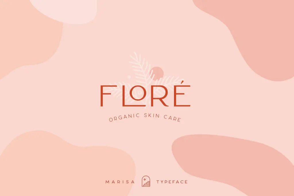
The glyph set goes beyond standard caps, numerals and punctuation: there are stylistic alternates, ligatures, and some ornamental marks that can stand in for dividers or flourishes around a wordmark. Accented characters are included, and the designer notes ongoing language support, which matters if your project needs more than basic Latin coverage — worth checking against your specific language before committing a brand asset to it.
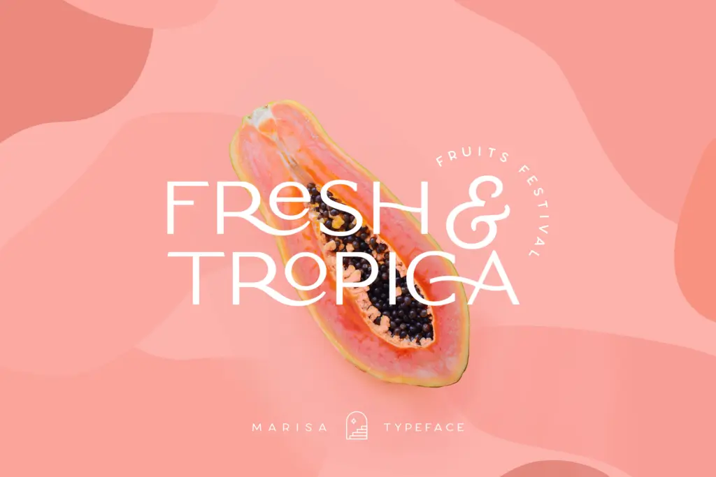
The ligatures and alternates are the part that actually changes how the font behaves. Used well, they break up the otherwise rigid, all-caps monotony — a connected pair of letters or a swapped-in alternate can give a logotype a bit of personality it wouldn’t have in its default state. But they require access through the glyphs panel; nothing swaps in automatically without OpenType-aware software, so anyone expecting instant stylistic variation from a plain text box will be disappointed. The four weights give you a working tonal range, but since there’s no lowercase, the family’s range of expression is narrower than its glyph count suggests — most of the character comes from how you combine alternates, not from the base letters themselves.
Use cases
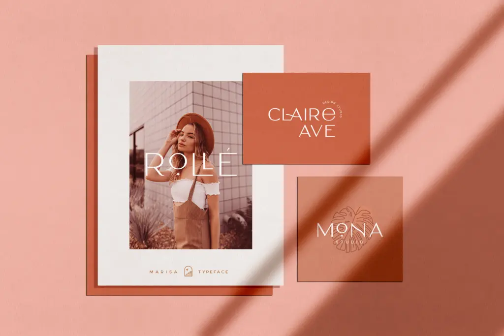
This is a font for marks, not messages. Logotypes, clothing labels, packaging headers, and short magazine headlines are the obvious fits — anywhere a handful of capital letters need to sit confidently in a small space. The condensed width is genuinely useful on narrow labels and vertical packaging panels where a wider display face would crowd the layout.
It’s a poor choice for anything requiring lowercase, for body copy of any length, or for situations where the alternates can’t be accessed and set manually — a drag-and-drop template tool, for instance, will only ever show you the default glyphs. Treat it as a finishing typeface for a wordmark or short header, pair it with a quieter text face for supporting copy, and keep an eye on letter-spacing at small sizes, since the tight default spacing can clot when the type gets much smaller than headline size.
What we liked, and what we didn’t
Strengths
- Condensed all-caps proportions work well on narrow labels and packaging panels.
- Four weights give a usable tonal range from hairline overlay text to a solid logotype mark.
- Ligatures and stylistic alternates add character that the base letterforms alone don't have.
Trade-offs
- No lowercase limits it strictly to short, capitalised settings.
- Alternates and ligatures require manual glyph-panel access, so they won't appear automatically in simpler design tools.
Classy Marisa is a tight, all-caps display sans suited to short branding marks and packaging labels, with ligatures and alternates that reward manual glyph access. It has no lowercase and no ambition to handle running text, so its usefulness is narrow but clearly defined. Buy it for logotypes and headers, not as a general-purpose family.
Verdict

Tantype reviews typefaces in depth — every font is tested in real branding, editorial and screen layouts before a word gets written. 555+ fonts reviewed and counting.