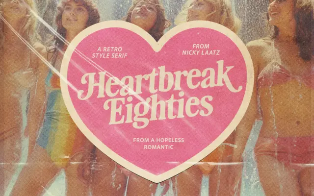
Heartbreak Eighties Retro Serif: a bold slab-serif throwback for 80s branding
Design style Heartbreak Eighties Retro Serif sits at the thicker end of the slab-serif family, with the rounded, slightly inflated…
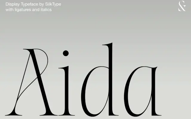
Design style Aida sits at the extreme end of the contrast scale: thick stems that thin out into hairline serifs…
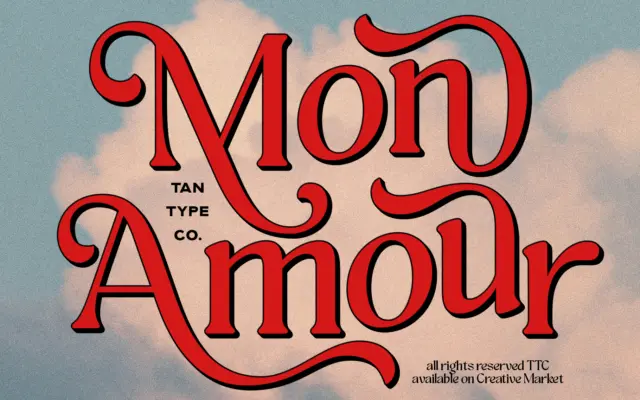
Design style Mon Amour pulls from 70s lettering — the kind of hand-lettered logotype you’d find on a record sleeve…
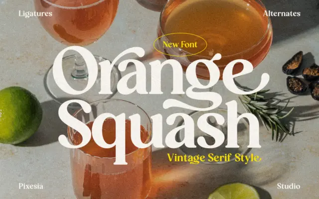
Design style Orange Squash sits in the family of bold vintage serifs that borrow from 1970s packaging and signage rather…
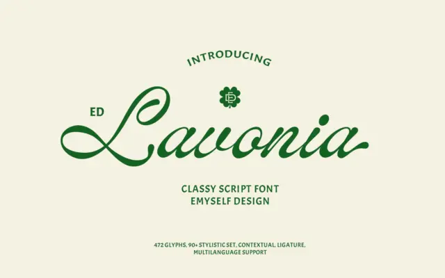
Design style ED Lavonia sits in the well-populated field of connected, classic-leaning scripts, but it avoids the overly bouncy or…
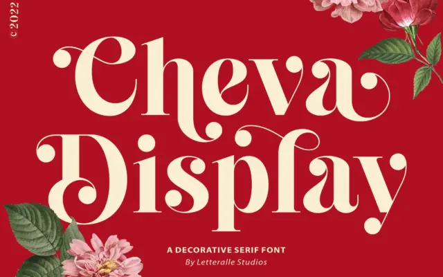
Design style Cheva Display sits somewhere between a slab and a transitional serif, with heavy strokes that carry a soft…
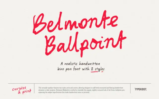
Design style Belmonte Ballpoint sets out to look like actual ballpoint ink rather than a vectorised idea of it. The…
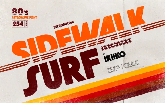
Design style Sidewalk Surf is a heavyweight display letterform built to sit inside the 1980s retrowave revival — the world…
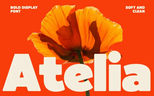
Design style Atelia is a bold, rounded display sans that leans hard into weight. The strokes are thick and consistent,…