
Atelia: a chunky rounded sans built for loud, friendly headlines
Design style
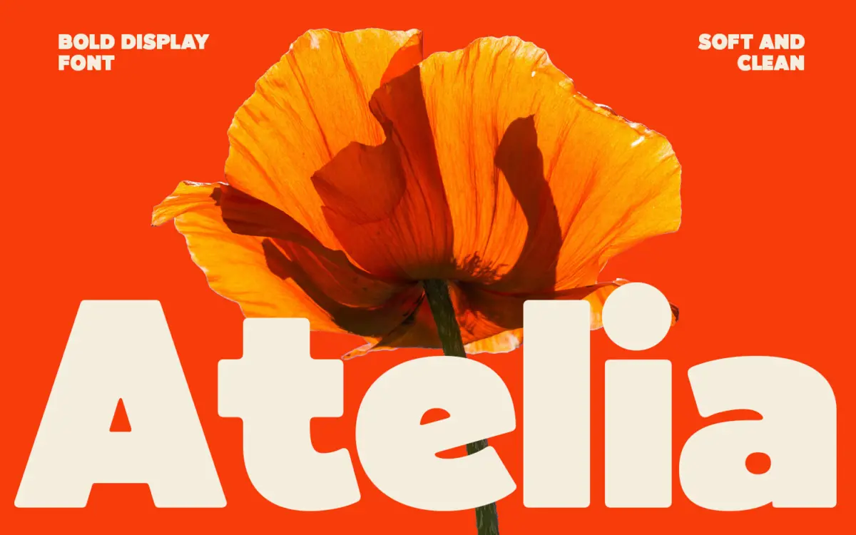
Atelia is a bold, rounded display sans that leans hard into weight. The strokes are thick and consistent, terminals are softened rather than sharp, and the overall impression is bouncy rather than aggressive. It sits in the same family as other inflated grotesque revivals doing the rounds right now — thick, friendly, a little retro — but Atelia keeps its curves smooth enough that it doesn’t tip into novelty territory.
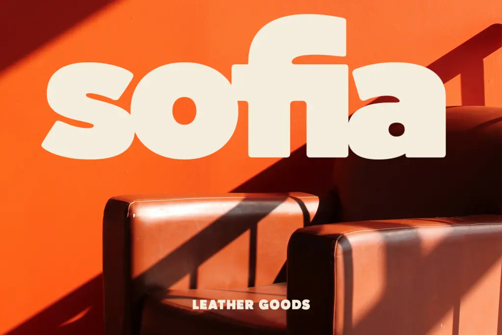
What makes it work is restraint in the joints. Many heavy rounded sans typefaces get muddy where strokes meet, especially in letters like ‘g’, ‘a’, and ‘e’, where counters can close up under that much weight. Atelia keeps its apertures open enough to breathe, so the letterforms stay legible even as they get louder. The rhythm across a word is even — no single letter feels like it’s fighting the others for attention, which is a real risk in a face this heavy.
Character set and features
As a display-oriented bold sans, Atelia is built to be set big rather than small. The x-height is generous, counters are rounded rather than geometric, and the overall stroke contrast is essentially none — this is a monoline-adjacent design where the weight does all the talking. That uniformity is a strength for cohesion but it does mean there’s little to distinguish similarly-shaped letters at a glance; at smaller sizes some characters can start to blur into their neighbours.
Numerals and basic punctuation follow the same rounded, thick treatment, keeping the set consistent if you’re using it for pricing, dates, or short callouts alongside headline text. There’s no indication of an extended language set, small caps, or alternate characters, so treat this as a single-purpose display tool rather than a full working family — it doesn’t try to be a text face, and it shouldn’t be pushed into that role.
Use cases
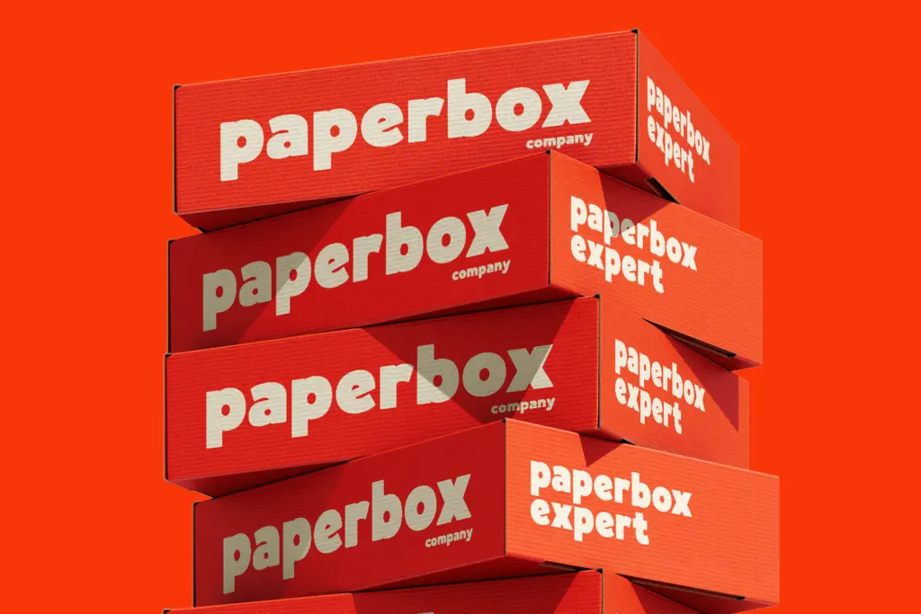
Atelia’s natural home is short-form and high-impact: packaging headlines, poster type, app icons, social graphics, and logotypes that need a friendly, approachable voice rather than a corporate one. The soft, rounded weight reads well from a distance, which is exactly what you want on a product label or a shelf-facing package where the type has to win attention in a fraction of a second.
It’s less suited to anything requiring nuance or sustained reading — body copy, dense editorial layouts, or long-form branding systems where the type needs to flex across many weights and sizes. Because the whole face lives at one heavy weight with no visible companion styles, designers will need to pair it with a separate text face for anything beyond a headline or two. Used for what it’s built for — a punchy word or short phrase that needs warmth and heft — Atelia does its job cleanly and without fuss.

What we liked, and what we didn’t
Strengths
- Open apertures keep the heavy strokes from clogging up in tight letterforms
- Consistent rhythm across words makes it easy to set clean, punchy headlines
- Rounded, friendly character suits packaging and branding without feeling juvenile
Trade-offs
- Single heavy weight with no lighter companions limits its use beyond headlines
- Letters can blur together at smaller sizes due to the uniform stroke weight
Atelia is a competent, friendly heavyweight display sans that does one job well: loud, short-form headlines with warmth instead of aggression. It's not built for body text or complex branding systems, and the single-weight nature limits how far it stretches, but for packaging, posters, and logotypes it delivers exactly what it promises.
Verdict

Tantype reviews typefaces in depth — every font is tested in real branding, editorial and screen layouts before a word gets written. 555+ fonts reviewed and counting.