Sans Serif
3.7
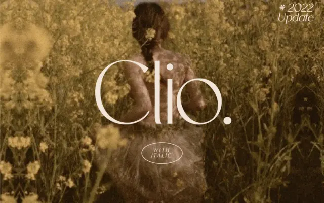
Clio: A Restrained Display Sans for Clean, Elegant Branding
Design style Clio is a display sans built around restraint. The letterforms favour low contrast, even stroke weight, and a…
 Tantype

Design style Clio is a display sans built around restraint. The letterforms favour low contrast, even stroke weight, and a…
Tantype
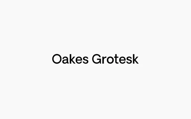
Design style Oakes Grotesk sits in the crowded field of corporate grotesques but doesn’t try to win on neutrality alone.…
Tantype
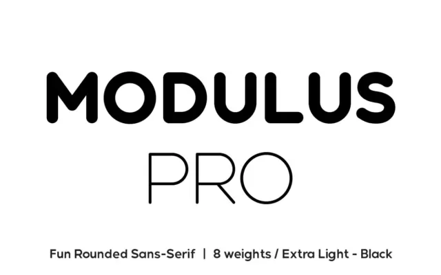
Design style Modulus Pro is a rounded sans that keeps its curves tight rather than soft. That’s the thing worth…
Tantype
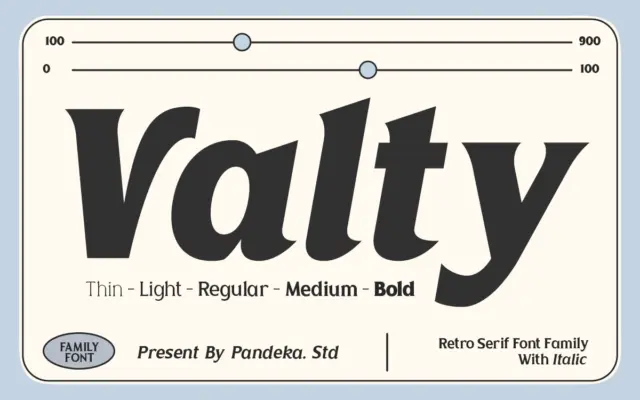
Design style Valty is a display serif that leans on the graphic vocabulary of the 1980s and 90s: bold, slightly…
Tantype
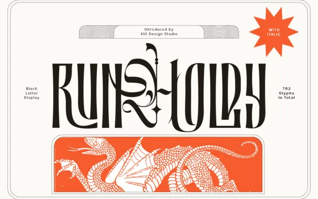
Design style Runholdy sits at the crossing of two families that rarely share a stroke chart: blackletter’s angular density and…
Tantype
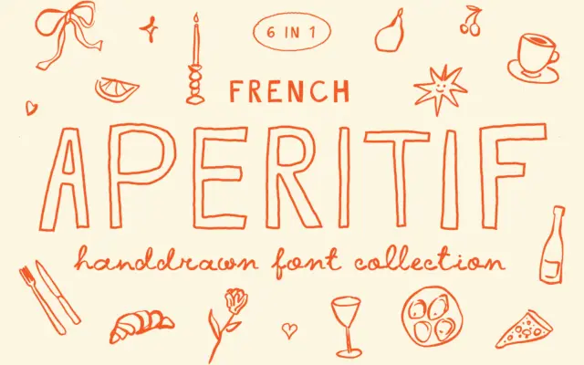
Design style French Aperitif belongs to that loose, pencil-and-marker school of hand-drawn lettering that’s built to look like it came…
Tantype
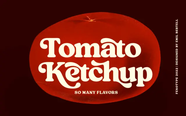
Design style Tomato Ketchup is a heavyweight serif built for nostalgia rather than neutrality. The strokes are thick and slightly…
Tantype
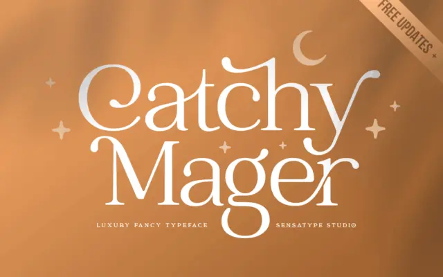
Design style Catchy Mager reads as a connected script built for short bursts of text rather than paragraphs. The letterforms…
Tantype
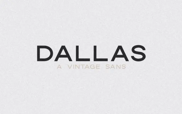
Design style Dallas is an uppercase-only sans with a dry, workmanlike character that leans on mid-century sign painting and printer’s…
Tantype