
Ecatherina: a 15-style wedding script built for layered invitation suites
Design style
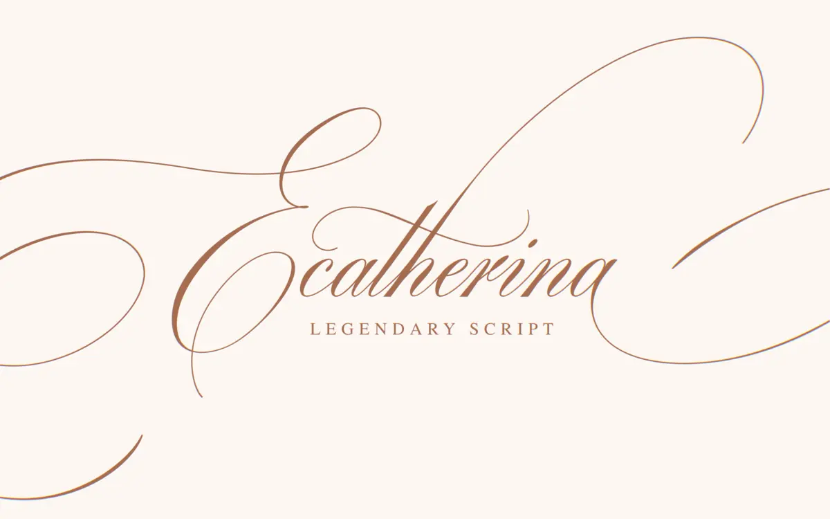
Ecatherina is a connected script built around the familiar grammar of wedding typography: long entry strokes, looping ascenders, and a gentle forward slant that keeps the baseline feeling alive rather than mechanical. It sits in the same family as most calligraphy-inspired scripts sold for invitation work, with narrow counters and a consistent diagonal stress that reads as handwritten rather than engineered. What sets it apart on paper is the sheer range built into the family: five styles across three line thicknesses, effectively giving you a thin, regular, and bold version of the same hand to choose from. That’s a practical idea — a script that can hold up as both a delicate monogram and a bolder heading without switching typefaces.
The drawing itself is competent but not groundbreaking. The joins are smooth, the swashes are generous without tipping into illegibility, and the overall tone is soft and romantic rather than brash. It won’t surprise anyone who’s shopped for a script font before, but it does what it sets out to do cleanly.
Character set and features
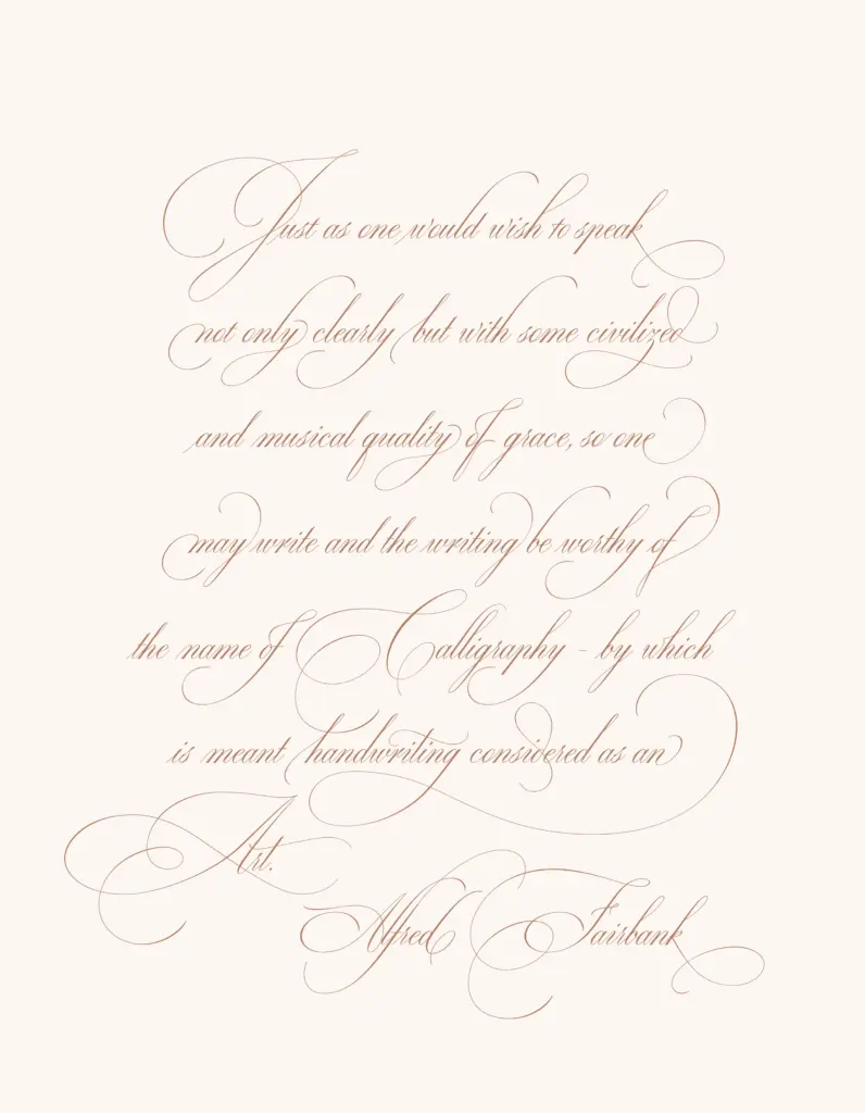
Being an OpenType family, Ecatherina presumably carries the contextual alternates and swash sets scripts rely on to avoid repetitive letter collisions across a line of text — the seller’s own alternates preview runs to dozens of pages, which suggests a reasonable depth of variation built in. Multilingual support is mentioned, which matters for a script likely to be set in names and personalised text rather than just English copy. The bundled extras — editable invitation, menu, and quote templates — point to this being sold less as a standalone display face and more as a ready-made toolkit for stationery designers who want to drop in a client’s name and go.
What’s not specified is weight range beyond the three thicknesses, or exactly how deep the swash and ligature sets run per style — multiply five styles by three weights and you get fifteen fonts, which is a lot to keep coherent, and a buyer should test the demo across a full sentence before committing, not just a single word.
Use cases
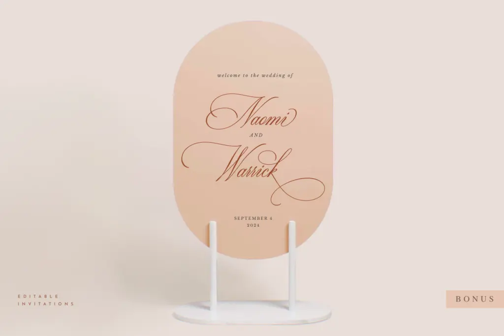
This is a script built for the wedding and events market, and it should do that job well: invitation headlines, monogram lockups, place cards, and the kind of quote-card graphics that get shared on social before the big day. The range of thicknesses means it can carry a whole suite — thin for body text or secondary lines, bold for the couple’s names — without reaching for a second typeface, which is the main selling point here.
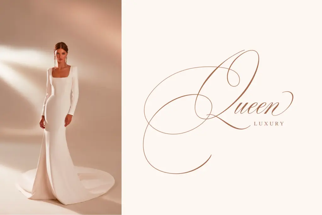
Outside that lane, treat it carefully. Scripts like this rarely hold up at small sizes or in dense paragraphs, and the romantic, looping tone will read as mismatched in corporate or editorial contexts. For logo work it could suit a boutique, florist, or bakery brand reaching for a handwritten, personal feel, but it’s not a neutral workhorse — it has one mood, and it does that mood at invitation scale, not much beyond it.
What we liked, and what we didn’t
Strengths
- Three line thicknesses across five styles give real flexibility within one invitation suite
- Bundled editable templates make it immediately usable for stationery work, not just a font file
- Smooth, legible joins without the overcrowded swash tangles some scripts fall into
Trade-offs
- The drawing style is familiar territory and won't stand out next to other wedding scripts
- Likely struggles at small sizes or in dense text given its connected, looping structure
Ecatherina is a well-populated script family aimed squarely at wedding stationery, with enough weight variation to carry a full invitation suite on its own. It doesn't break new ground in script design, and it's not built for much beyond its intended lane, but within that lane it's a sensible, usable choice.
Verdict

Tantype reviews typefaces in depth — every font is tested in real branding, editorial and screen layouts before a word gets written. 555+ fonts reviewed and counting.