
Hanley Pro: a sprawling script-and-sans bundle built for branding kits
Design style
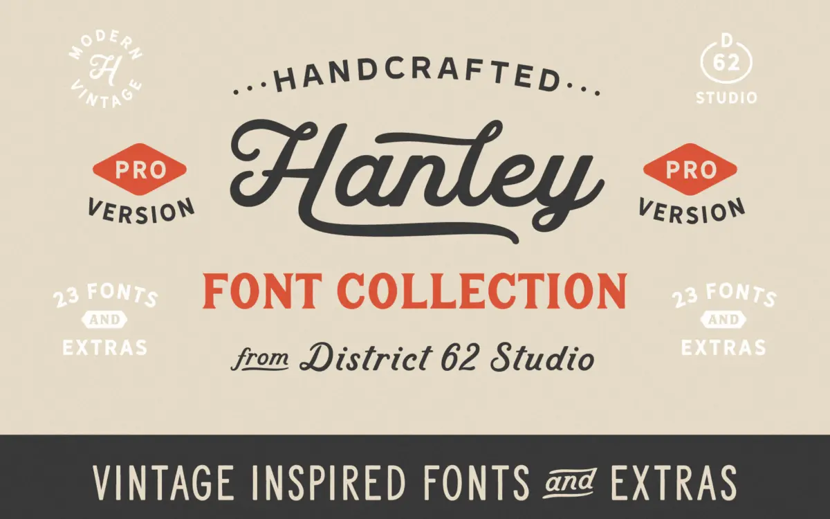
Hanley Pro is less a single typeface than a small type system sold as one product. At its centre is a casual script with a moderate slant, round joins and a slightly bouncy baseline, the kind of hand that leans on vintage packaging and letterpress rather than formal calligraphy. The new Script Alt gives that same voice a looser, more irregular rhythm, useful if the original script reads too tidy for a given job. An italic has been added as a companion rather than a true complement to the script, more upright and restrained.
Around that script sits a family of sans and slab styles: Sans Two, an inline version, Wide and Extra Wide cuts, and matching outline versions, plus a Slim Bold and a Slim Serif Bold. These are drawn with the same retro sensibility, squared-off terminals, even stroke weight, a bit of period charm rather than contemporary neutrality. None of these sans or slab styles are groundbreaking on their own, but together with the script they read as a cohesive package rather than a grab-bag of unrelated fonts, which is the main design achievement here.
Character set and features
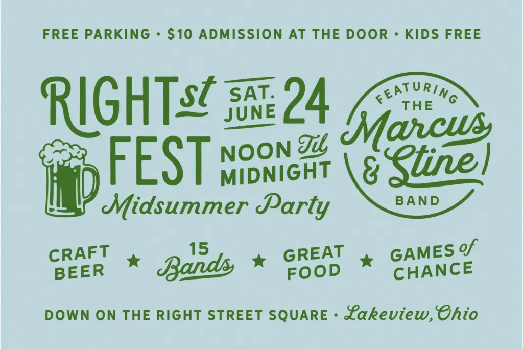
The styles are PUA-encoded, so swashes, alternates and catchwords are accessible even in software without OpenType support, with a read-me provided for exactly that purpose. The script carries the expected ligatures and alternate letterforms for avoiding awkward collisions, and the block styles now include a full set of small caps, which widens their use beyond headline duty. Additional alternate characters and catchwords have been added across the board in this Pro update, along with extended foreign-language support on every style, though exactly which languages isn’t specified.
With 21 PUA-encoded files plus two inline-only extras, this is a large character set to learn rather than a tight, opinionated pairing. That’s by design: it’s a toolkit, and the trade-off is that no single style in it is pushed as far as it might be if it were the whole product. The script itself is the strongest performer; the sans and slab styles are serviceable support acts.
Use cases
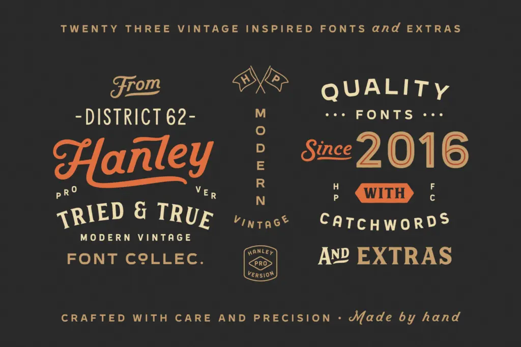
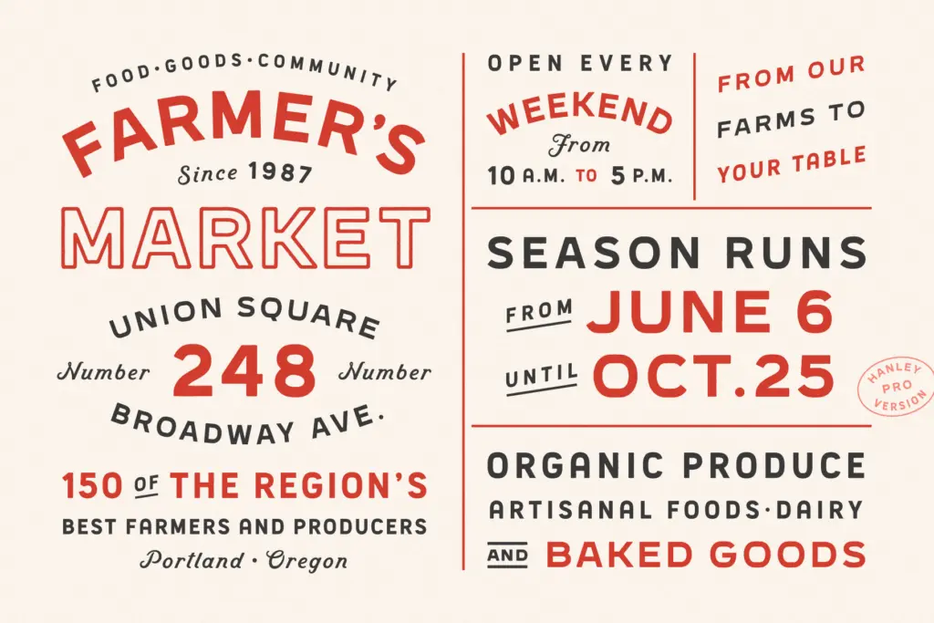
This collection is aimed squarely at people building a brand identity or a small print suite in one sitting: logo lockups, packaging, menus, invitations, social templates. The script works well as a signature mark or a short headline; it is not built for body copy or long-form setting, and the looser alternate version in particular needs generous spacing to avoid letters crowding each other. The sans and slab styles are better suited to supporting text, tags, subheads, and the sort of small-caps labelling now possible with the block set. The bundled logo templates and matching Illustrator files for the preview art suggest the seller expects buyers to lift elements wholesale rather than build everything from scratch, which is worth knowing going in. For a designer who wants one purchase to cover a retro-leaning brand’s script, sans and display needs without hunting for separate fonts, Hanley Pro does that job reasonably well. For anyone needing a single excellent script with nothing else attached, this is more than they need.
What we liked, and what we didn’t
Strengths
- The script and its alternate give two usable moods from one family without clashing.
- Small caps added to the block styles extend their use into labelling and support text.
- PUA encoding and a read-me make the alternates accessible outside OpenType-aware apps.
Trade-offs
- No single style in the bundle is pushed to a distinctive extreme; it's a toolkit, not a standout face.
- The looser script alternate needs careful manual spacing to avoid letters colliding.
Hanley Pro is a useful branding toolkit built around a likeable vintage script and a family of supporting sans and slab styles. None of the individual pieces are exceptional, but the set works coherently together, which is the real selling point. Buyers wanting one strong script alone, or highly refined display type, should look elsewhere.
Verdict

Tantype reviews typefaces in depth — every font is tested in real branding, editorial and screen layouts before a word gets written. 555+ fonts reviewed and counting.