
The Poet: A Sketch-Textured Handwriting Font for Raw, Human Branding
Design style
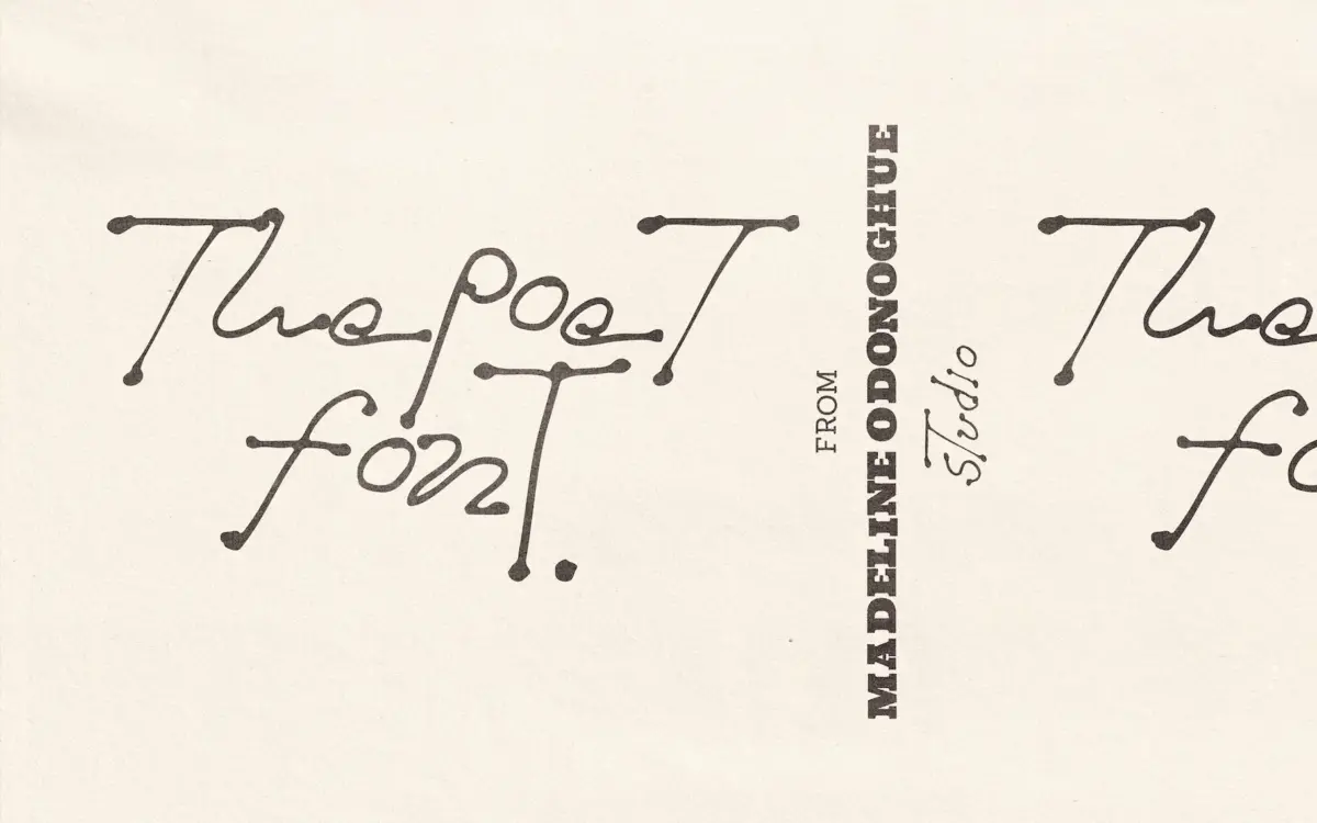
The Poet leans hard into the idea that handwriting shouldn’t be tidied up before it becomes a font. The strokes read like ballpoint pen on paper — slightly dry in places, with the kind of pressure variation you get when someone writes fast and doesn’t lift the pen much. Baselines wander, letter widths shift, and there’s a general looseness to the rhythm that separates it from the more polished, calligraphy-adjacent scripts that dominate this category.
What’s notable is the restraint in how far it pushes that imperfection. It isn’t a distressed or grunge font with heavy ink blots dragged across every letter — the texture is subtle, mostly living in the thin/thick transitions and the occasional broken stroke where the pen seems to have skipped. That keeps it closer to genuine handwriting than to a special-effects typeface, which is a harder trick to pull off convincingly.
Character set and features
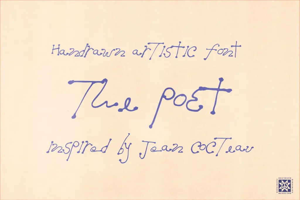
The set is lowercase-focused, with select alternate and capital forms rather than a full parallel uppercase alphabet. That’s worth flagging up front: this isn’t a font built for setting long passages of mixed-case text. It’s built around the lowercase letterforms doing the expressive work, with capitals brought in more sparingly — for an initial, a monogram, a single accented word.
Numerals 0–9 are included, which covers menu pricing and dates, but there’s no mention of extended punctuation, ligatures, or multilingual character support, so treat this as a font for short English-language phrases rather than a workhorse text face. If your project needs accented characters or a broad glyph set, you’ll want to test the specific characters you need before committing a layout to it.
The sketch-like quality means kerning pairs matter more than usual here — hand-drawn scripts like this tend to have irregular sidebearings by design, so a word that looks great in isolation might need manual tracking adjustments once it’s dropped into a logo lockup or a menu header.
Use cases
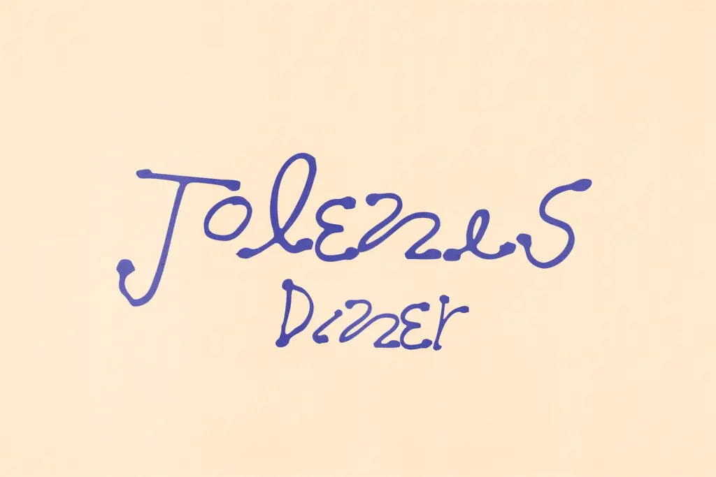
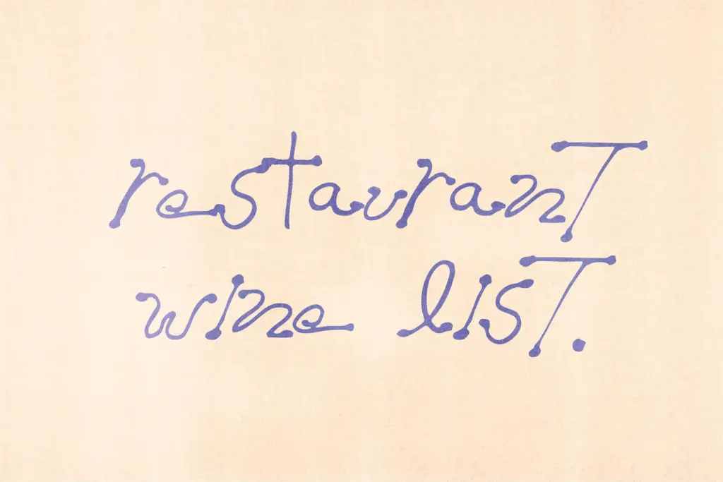
This is a font for short bursts of text where personality matters more than neutrality: a wordmark for a small bakery, a hand-lettered quote on a poster, a bar chalkboard menu, a packaging label that wants to feel made rather than manufactured. The restaurant and hospitality framing in the seller’s own pitch makes sense — this is the kind of mark that suits a place trying to signal warmth and craft over polish.
It’s less suited to anything that needs to scale into body copy or long-form editorial setting; the irregularity that gives it charm at display size becomes fatiguing and harder to read once you’re past a headline or a short line of type. Used as intended — big, brief, and given room to breathe — it does what it sets out to do. Pushed into paragraph duty, it will fight you.
What we liked, and what we didn’t
Strengths
- Subtle, controlled texture reads as genuine handwriting rather than a heavy-handed grunge effect
- Works well at large display sizes for logos, wordmarks, and single lines of lettering
- Fits hospitality and craft-branding contexts without feeling like a generic script
Trade-offs
- Lowercase-focused character set with only select capitals limits it for mixed-case or formal layouts
- No mention of multilingual or extended punctuation support, so it won't suit longer or non-English text
The Poet delivers a convincing, restrained take on handwritten texture that avoids the over-the-top distressed-script cliché. But its lowercase-heavy, limited glyph set means it's a specialist tool for short display text, not a flexible workhorse. Best suited to logos, menus, and single-line lettering rather than anything requiring sustained reading.
Verdict

Tantype reviews typefaces in depth — every font is tested in real branding, editorial and screen layouts before a word gets written. 555+ fonts reviewed and counting.