
Gunterz: a bold geometric sans built for all-caps headline work
Design style
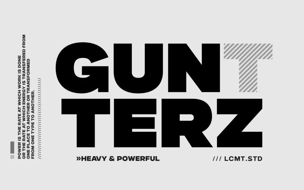
Gunterz sits squarely in the geometric-heavy sans tradition: tight, near-circular counters, blunt terminals, and a construction that reads as if it were built from a small set of interlocking shapes rather than drawn stroke by stroke. It is designed to be run in capitals — the brief leans hard on all-caps display use, and the letterforms confirm it. Lowercase exists, but the personality of the face lives in its capital forms, where the geometry is most legible and the weight does the most work.
Across the four weights, the skeleton stays consistent, which is the right call for a family meant to scale from a subhead down to a chunky poster headline. The italics are a companion set rather than a true cursive redraw — angled versions of the upright shapes, useful for a bit of contrast inside a layout but not built to carry long stretches of text on their own. There is nothing eccentric here: no swash, no quirky terminal that pulls attention to itself. That restraint is a design choice, and it means Gunterz will slot into a brand system without arguing with the rest of the page.
Character set and features
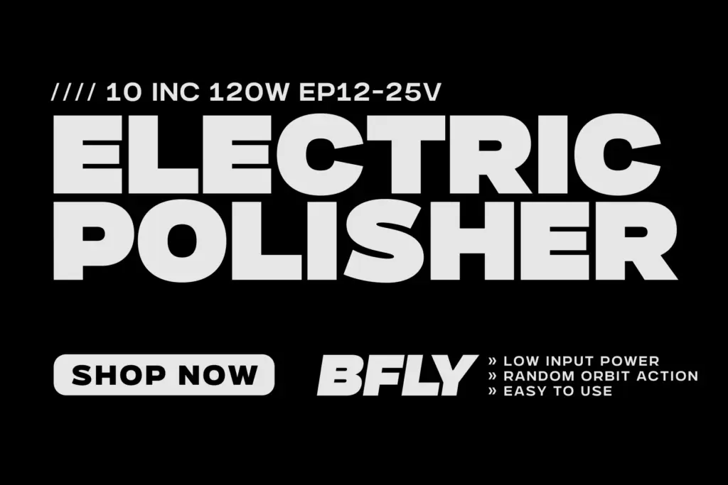
The family spans four weights plus matching italics, with an ExtraBold added in a later update alongside an experimental variable font — useful if a project needs to animate weight rather than pick a single static cut. OpenType support includes stylistic alternates and a stylistic set, giving a handful of letters (typically things like G, R, or numerals) a second personality without changing the font file. That’s a modest but genuinely useful feature for logotype work, where one alternate letterform can be the difference between generic and distinctive.
Cyrillic support is included, and the changelog notes a kerning fix specifically for Cyrillic pairs, along with a general kerning correction — worth mentioning because kerning problems in a heavy geometric sans are unforgiving; tight counters and blunt terminals make bad spacing obvious fast. The update suggests the foundry was actually listening to feedback, which is a point in its favour, though it also means early files may have shipped with rougher spacing than what’s available now.

Use cases
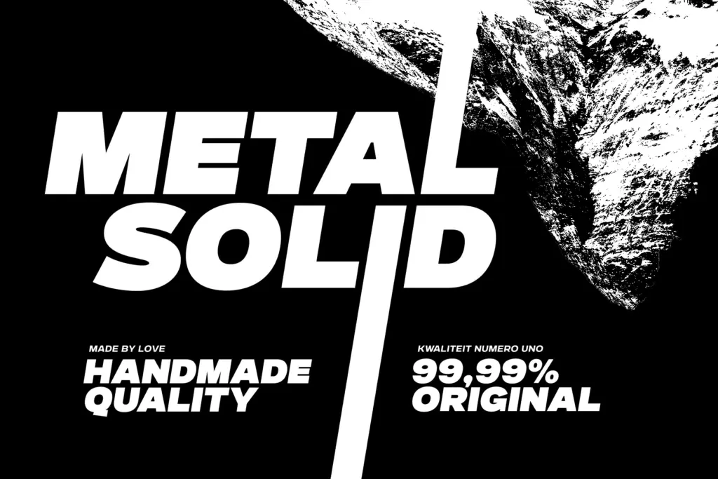
Gunterz is built for the moment a layout needs one loud word: poster titles, movie or event titling, sports branding, packaging headlines, logotypes. In the heavier weights it has the density to hold up at large scale and low resolution — motion graphics, signage, anything viewed briefly or from a distance. The lighter weights are more flexible for subheads or short editorial intros, though they still read as display type rather than body copy; nobody should be setting paragraphs in this.
Where it will strain: long lowercase-heavy text, anything requiring a warm or humanist tone, and multi-language layouts beyond Latin and Cyrillic, since nothing in the brief suggests broader script coverage. Treat Gunterz as a headline and identity tool, pair it with a quieter text face for supporting copy, and it does its job without fuss.
What we liked, and what we didn’t
Strengths
- Stylistic alternates and a stylistic set give logotype work a distinctive edge without extra files.
- Consistent geometric skeleton across four weights plus ExtraBold scales cleanly from subhead to poster.
- Cyrillic support with corrected kerning broadens its use beyond Latin-only branding work.
Trade-offs
- Italics are slanted companions rather than a redrawn cursive, limiting their expressive range.
- Not built for body text or lowercase-heavy layouts, so its usefulness stops at headline and title work.
Gunterz is a competent, no-nonsense geometric display sans that does exactly what it promises: loud, all-caps headline work with a bit of logotype flexibility via its alternates. It won't surprise anyone with originality, but the fixed kerning issues and added ExtraBold show a foundry refining a solid, if unremarkable, workhorse.
Verdict

Tantype reviews typefaces in depth — every font is tested in real branding, editorial and screen layouts before a word gets written. 555+ fonts reviewed and counting.