
New York Bakery: a wobbly handwritten script duo for playful branding
Design style
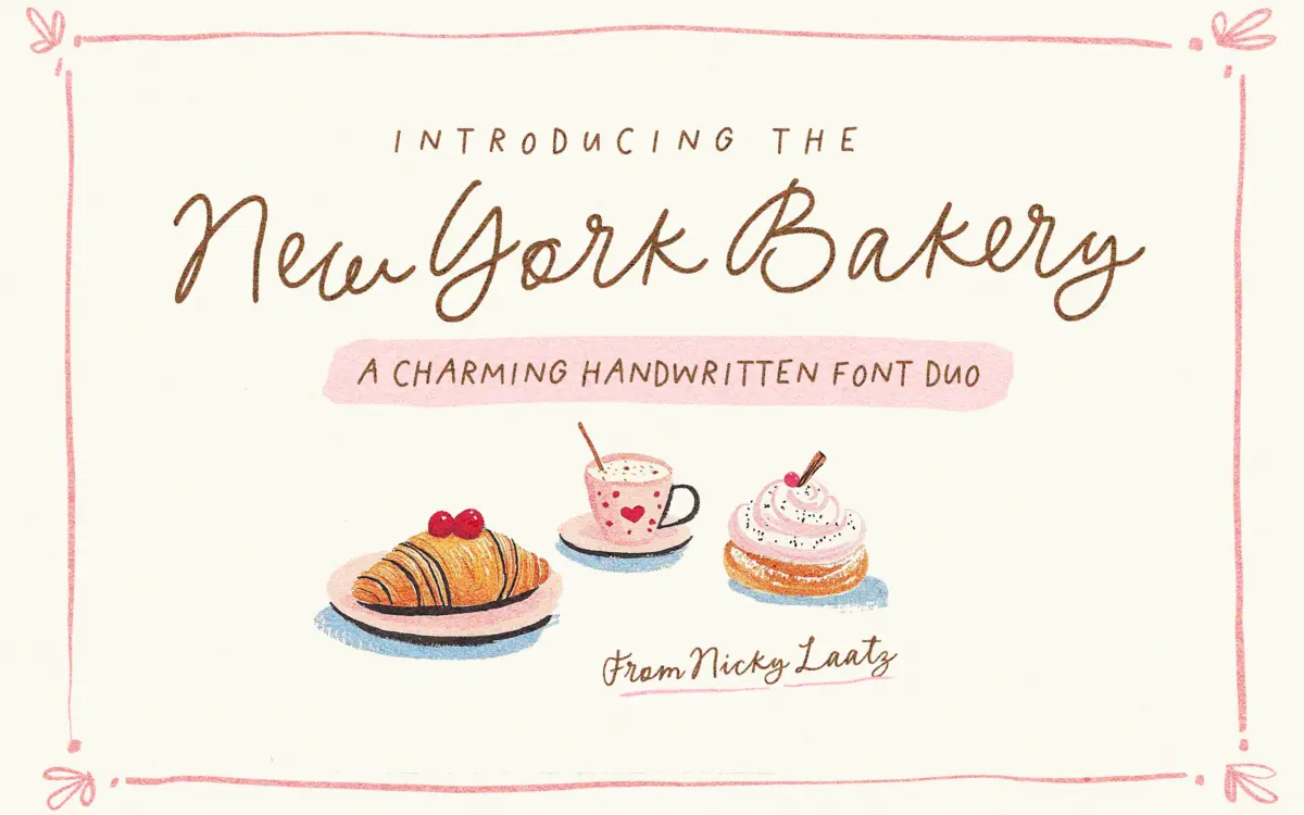
New York Bakery is a two-part set: a loose handwritten script and a companion all-caps face, both drawn with the slightly uneven baseline and inconsistent letter widths that read as “written by hand” rather than “drawn to look handwritten.” The script leans casual and a little childlike, with rounded terminals and joins that don’t always line up perfectly, which is clearly intentional rather than sloppy. The caps are boxier and more graphic, working as a visual counterweight rather than a true structural match — they read more like hand-lettered signage than a companion to the script’s calligraphy.
Both faces come in several weight variants, from a plain regular through medium and thicker “scribe” versions that pick up more visible pen pressure and a touch of calligraphic contrast. It’s a reasonable way to get tonal range out of one concept without switching typefaces entirely — the thin regular sits quietly on a label, the thick scribe pushes harder for a headline. The oblique versions of the script add a bit more energy but don’t fundamentally change the personality.
Character set and features
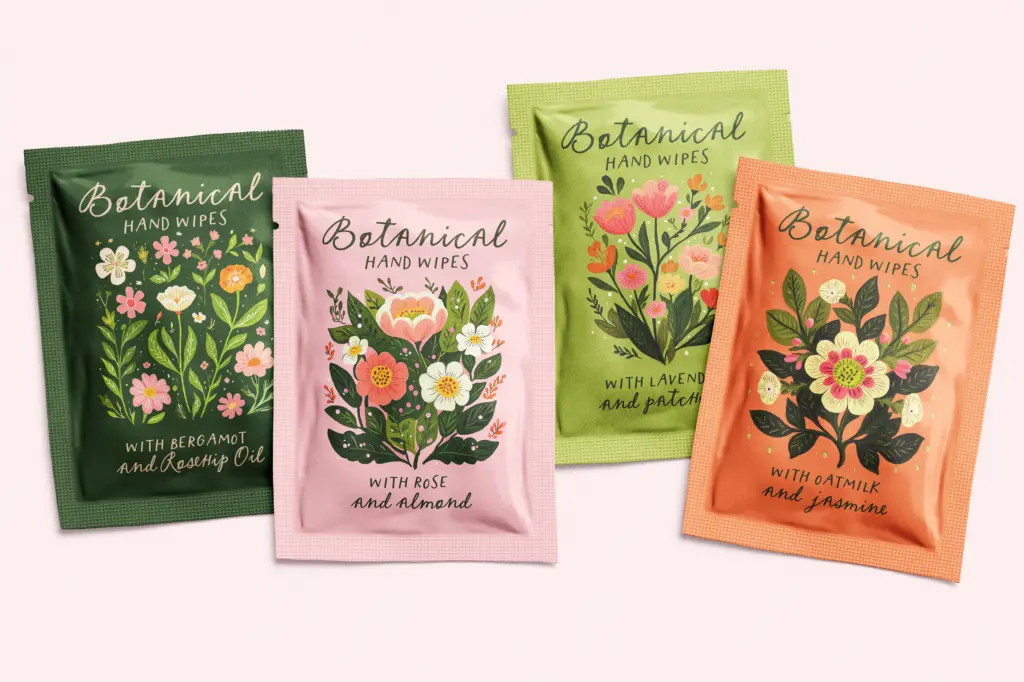
The script carries OpenType alternates and ligatures, which matter a lot here — a script this loose needs the swash variation to avoid looking mechanically repeated when the same letter shows up three times in a word. The PUA encoding is a practical touch: it means the alternates are reachable in apps like Canva that don’t support OpenType features natively, which is often where fonts like this actually get used. Language support covers a decent spread of Western European languages, so accented characters aren’t an afterthought.
The caps set, across its five weight variants, functions less as a script partner and more as a standalone display alphabet. It doesn’t try to mimic the script’s flourish, and that’s the right call — pairing two ornate faces usually backfires. Set together, script for a phrase and caps for a short label or date, they do the job the pairing implies without one shouting over the other.
Use cases
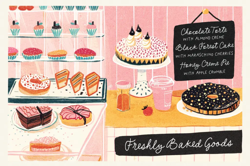
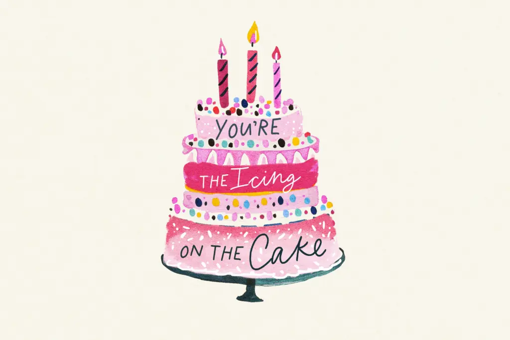
This is a font duo built for small, cheerful jobs — greeting cards, birthday and baby announcements, packaging labels for a bakery or artisanal product, storybook-style titles, quote graphics. Its wobble and warmth work against it in any context that wants precision or restraint; it is not a corporate wordmark typeface, and pushed to a large sign or a multi-line paragraph, the irregular spacing starts to feel more distracting than charming. Body-length copy in the script is a bad idea regardless of weight — it’s a display and accent face through and through.
Where it earns its keep is short-run, high-charm work: a hand-lettered
What we liked, and what we didn’t
Strengths
- Multiple weight variants let one concept cover both quiet labels and bolder headlines
- OpenType alternates and ligatures with PUA encoding keep the swash variety accessible even in apps like Canva
- The all-caps companion works as a genuine counterweight rather than a redundant match to the script
Trade-offs
- The deliberate wobble and irregular spacing make it unsuitable for anything beyond short display text
- Its childlike, playful tone limits it almost entirely to casual and craft-adjacent branding
New York Bakery is a charming, casual script-and-caps duo suited to short, playful jobs like cards, labels and quotes. It's not built for body copy or restrained branding, but within its lane — bakery packaging, birthday invites, storybook titles — the multiple weights and OpenType alternates give it real range.
Verdict

Tantype reviews typefaces in depth — every font is tested in real branding, editorial and screen layouts before a word gets written. 555+ fonts reviewed and counting.