
Whimsical Romance: a casual handwritten script for wedding and social use
Design style
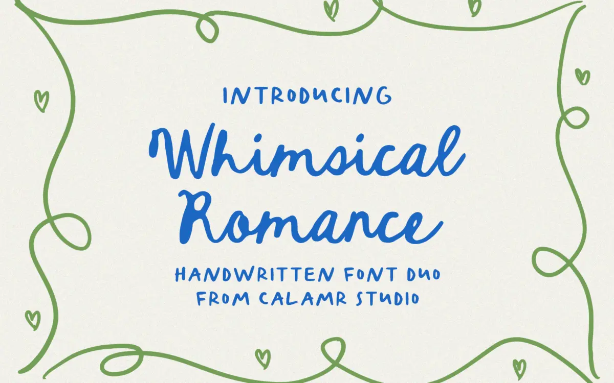
Whimsical Romance sits in the loose, unpolished corner of handwritten scripts, the kind meant to look like it was dashed off with a brush pen rather than built letter by letter in a type editor. The strokes vary in weight but not with the deliberate contrast of formal calligraphy — more the natural pressure changes of quick handwriting. Letters lean slightly, baselines wobble a touch, and the overall effect reads as personal rather than engineered.
This is a duo, so there are presumably two related styles bundled together, likely a script paired with a simpler companion for support text. That structure is common in this category and works well when the script is reserved for a few words and the companion handles the rest. Judged as a script alone, the letterforms are competent but not distinctive — there’s a familiar looseness to the joins and terminals that echoes a lot of what’s already in the whimsical-script space. It doesn’t push into anything unusual with its angle, its contrast, or its rhythm.
Character set and features
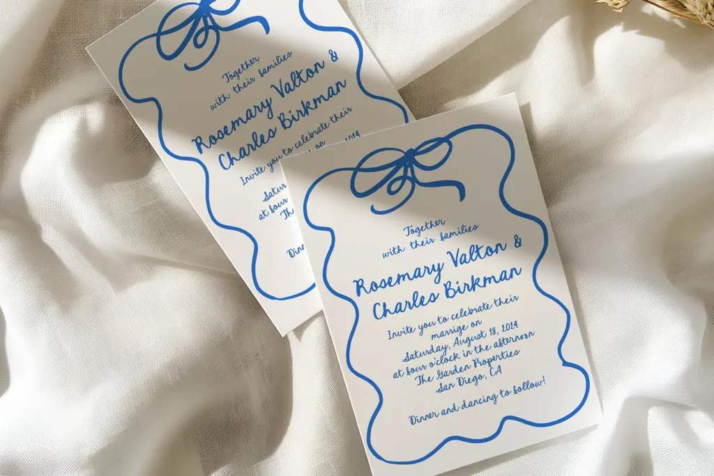
The set covers uppercase and lowercase basics, numerals, and punctuation, along with some alternate characters and ligatures. That’s enough for short-form use — names, dates, single lines of a quote — but not a deep character set. Buyers expecting extensive swash variants or contextual alternates that automatically vary repeated letters should check what’s actually included rather than assume it from the category. The alternates given will help avoid the most obvious repetition (two identical letters sitting next to each other in a name, for instance) but won’t transform the font into something with the kind of built-in randomness that higher-end script families offer.
Spacing in handwritten scripts like this lives or dies on the kerning pairs, and that’s the part hardest to judge from a distance — it needs testing with the actual words you intend to set, especially longer names or phrases where cumulative spacing errors show up. At small sizes, the thinner strokes may thin out further depending on the output format, so anyone printing this small should proof it physically rather than trust a screen preview.
Use cases
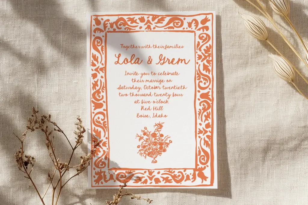
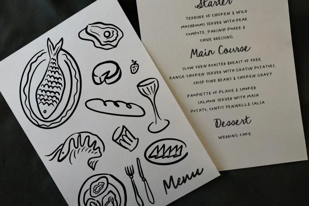
This is squarely a short-text font: invitation headers, place cards, a signature line, a logotype, an Instagram quote graphic. It is not built for paragraphs — the irregular baseline and joined letterforms make anything beyond a sentence or two tiring to read. Wedding stationery is the obvious fit, particularly the softer, hand-lettered end of that market rather than anything formal or engraved-looking. It would also suit small branding touches — a boutique logo, packaging accents, a menu heading — where the whimsical quality reads as approachable rather than sloppy.
Anyone building templates for resale or for tools like Canva should note the seller’s own caveat about licensing for editable templates — worth checking directly before committing a project to it. Otherwise, for one-off design work needing a casual, romantic handwritten feel, it does the job without asking much of the user.
What we liked, and what we didn’t
Strengths
- Natural, uneven baseline reads as genuine handwriting rather than a stiff script
- Alternates and ligatures help soften repeated letterforms in short phrases
- Well suited to the small, decorative uses it's aimed at, like invitations and logos
Trade-offs
- Character set is basic, with limited depth compared to more elaborate script families
- Not legible or comfortable enough for anything longer than a line or two
Whimsical Romance is a competent, unremarkable handwritten script suited to short bursts of text like invitation headers and logos. It doesn't distinguish itself within a crowded category, but it delivers the casual, natural handwriting look it promises.
Verdict

Tantype reviews typefaces in depth — every font is tested in real branding, editorial and screen layouts before a word gets written. 555+ fonts reviewed and counting.