
You’re Darling: a warm, childlike script for gentle, everyday messages
Design style
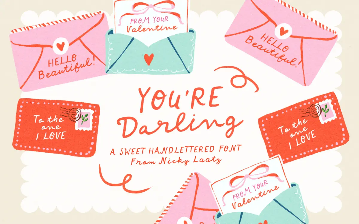
You’re Darling is a loose, penned script that leans hard into imperfection. The strokes have the slightly uneven pressure of a felt-tip marker rather than the smooth taper of a formal calligraphy pen. Letters wobble a little, baselines drift, and joins between characters are informal rather than continuous. This is not a script built to imitate copperplate discipline — it reads more like a friend’s handwriting on a birthday card than a wedding invitation.
The uppercase set is where the design puts its energy. The brief for the font was that capitals should stand alone, and you can see that intention in how self-contained and slightly larger-than-expected they feel next to the lowercase. That gives designers a way to mix a printed-looking headline word with a scripted phrase underneath, without needing a second typeface. It’s a sensible bit of construction for a script this casual, since scripts that only work as full connected sentences can be limiting.
Where the design shows its trade-offs is in consistency. The charm depends on irregularity, but that same irregularity means the rhythm across a long line of text can feel bumpy rather than flowing. This is by design, not a flaw exactly, but it’s worth knowing before you set a full paragraph in it.
Character set and features
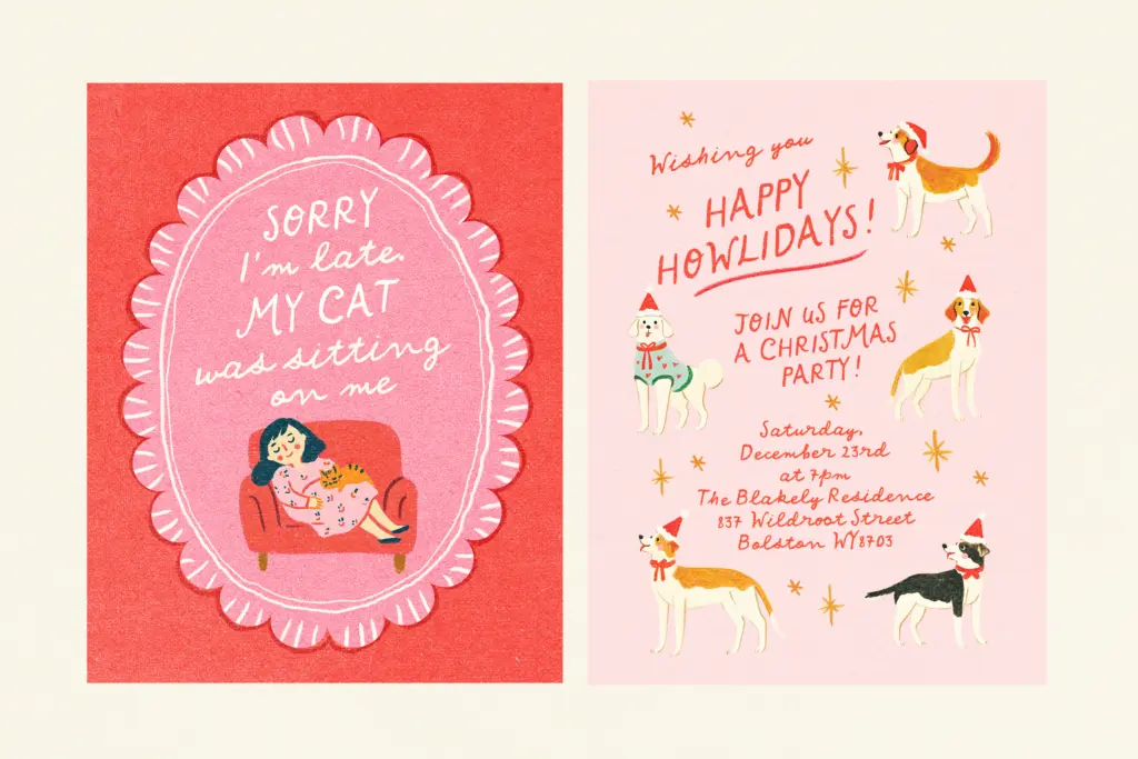
The letterforms carry visible texture — rounded terminals, slight ink traps at some joins, and a general softness that suits its intended childlike, affectionate tone. Ascenders and descenders loop generously, which adds personality but also means tight leading will cause collisions, particularly with words that stack a descender-heavy line over an ascender-heavy one.
The uppercase alphabet, as noted, is drawn to function independently — useful for monograms, initials, or a single capitalised word set apart from the script body. Spacing between characters is generous enough to keep the loose strokes from clashing, which helps legibility at small sizes more than the wobbly baseline might suggest.
This is squarely a display script rather than a text face. It’s not built for paragraphs of body copy, and pushing it there will fight the letterforms’ natural informality.
Use cases
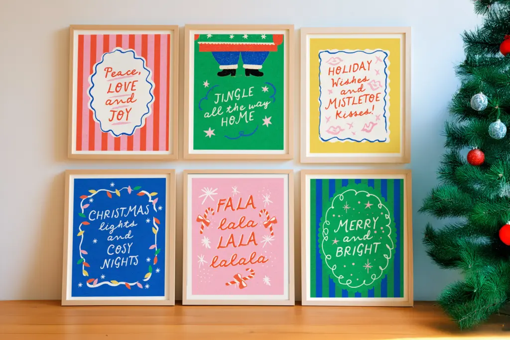
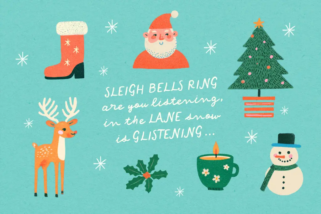
You’re Darling suits short, warm messages: greeting cards, gift tags, baby announcements, journal covers, social graphics aimed at a young or playful audience. It has an obvious home in Valentine’s Day material and children’s products, where the childlike wobble reads as sweet rather than sloppy. It could work in a casual wedding suite — think a backyard celebration rather than a formal ballroom — paired with a cleaner sans or serif for supporting details like names, dates and addresses.
It’s less suited to anything that needs to project polish or restraint: corporate branding, editorial headlines, or luxury packaging will find its casualness works against the tone. Used at the right scale, in short bursts, on the right kind of project, it does the job it was drawn for.
What we liked, and what we didn’t
Strengths
- Standalone uppercase alphabet gives flexibility for headline-and-script pairings
- Generous character spacing keeps the loose strokes legible at small sizes
- Genuinely warm, childlike tone that suits greeting cards and gift-related work
Trade-offs
- Uneven rhythm makes it unsuited to long lines or paragraph-length text
- Generous ascenders and descenders require careful leading to avoid collisions
You're Darling is a charming, informal script best kept to short phrases on cards, tags and playful social graphics. Its wobble is the whole point, but that same wobble limits it to display-length use and casual, warm-toned projects. Not a font for anything needing polish or restraint.
Verdict

Tantype reviews typefaces in depth — every font is tested in real branding, editorial and screen layouts before a word gets written. 555+ fonts reviewed and counting.