
Basal: a bold, bottle-inspired sans for rugged, stripped-back branding
Design style
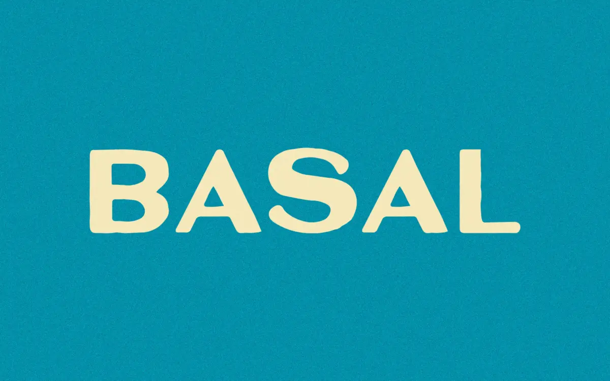
Basal is a bold sans with a blunt, condensed-adjacent posture that reads more like a stencil-plate mark than a text face. The seller traces it to lettering pulled off an old bottle label from around 1910, and that origin shows: the letterforms have the slightly irregular weight distribution and squared-off terminals you get from hand-cut signage or embossed glass rather than a drafted grid. Curves are kept minimal — bowls on letters like B, R, and P are flattened toward the straight strokes, and junctions are handled with hard angles rather than soft transitions.
This gives Basal a sturdy, almost industrial character. It doesn’t try to be elegant or refined; it’s built for weight and presence at large sizes. The stroke contrast is low to none, which keeps the letters feeling solid and unfussy rather than calligraphic. If you’re after warmth or handwriting charm, this isn’t that — it’s closer to a stamped mark than a script.
Character set and features
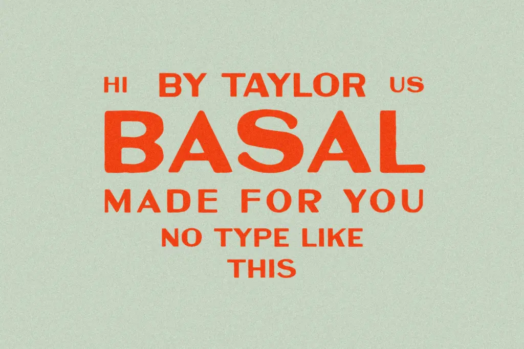
The font covers basic Latin characters plus a limited set of accented glyphs, so it’s built for English-language and a handful of Western European setting jobs rather than broad multilingual work. There’s no mention of alternates, ligatures, or a lowercase/uppercase pairing system in the brief, so treat this as a single-style bold weight rather than a flexible family with swappable characters.
Given its vintage-label origin, the glyph shapes are likely to carry small inconsistencies between letters — a deliberate part of the look rather than a flaw to fix. Designers who need a font with pixel-perfect uniform stroke widths across every character should look elsewhere; Basal’s appeal is exactly in that slight roughness, the sense that each letter was cut by hand rather than generated by a formula.
Use cases
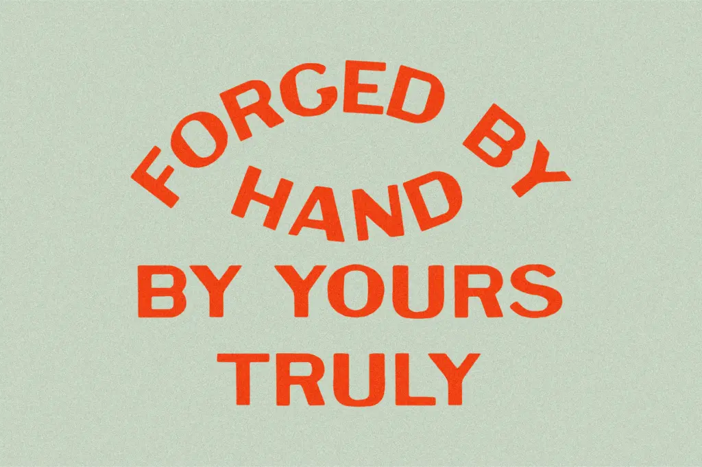
Basal is suited to short-form, high-impact use: logotypes, badges, packaging labels, headline type on posters, and branding that wants to signal heritage, ruggedness, or craft without leaning into full vintage script territory. Think small-batch goods — bottled drinks, hardware, workwear, anything that wants to claim a founding date and a no-nonsense attitude.
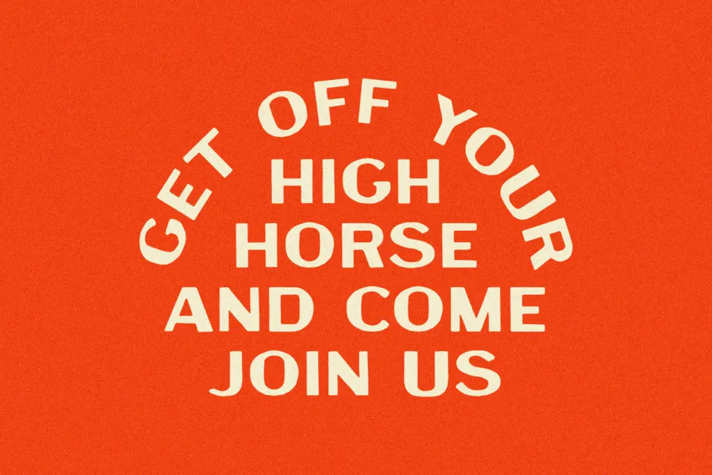
It’s not a font for body copy or long-form reading; the low contrast and blunt terminals that make it strong at large sizes will start to blur and clump at small sizes, especially in tight paragraph settings. Use it for headlines, wordmarks, and short label copy, and pair it with a plainer, more neutral sans or serif for supporting text where legibility at small sizes actually matters. Where it earns its keep is in situations where a single bold word or short phrase needs to carry visual weight on its own — packaging fronts, stamped badges, single-word signage — rather than in dense information design.
What we liked, and what we didn’t
Strengths
- Distinctive, blunt terminal shapes that read as hand-cut rather than templated
- Strong presence at large sizes for logotypes and badge marks
- Suits heritage or industrial branding without leaning into full vintage script cliché
Trade-offs
- Limited character set restricts it mostly to basic Latin and a few accented characters
- Low contrast and blunt joins make it unreliable at small or body-copy sizes
Basal is a single bold weight with a clear point of view: blunt, sturdy, and rooted in old bottle-label lettering. It does one job well — short, heavy headline and logo work — but its limited character set and lack of scale flexibility mean it won't stretch far beyond that.
Verdict

Tantype reviews typefaces in depth — every font is tested in real branding, editorial and screen layouts before a word gets written. 555+ fonts reviewed and counting.