
Dear Maison: a casual cursive script for wedding and lifestyle branding
Design style
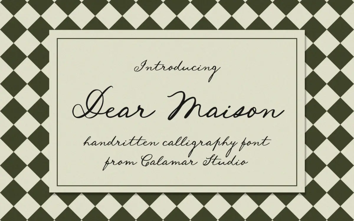
Dear Maison sits in the well-populated field of handwritten cursive scripts built to look like a fluid pen sketch rather than formal calligraphy. The letters lean forward at a moderate angle, joins are loose rather than tight, and the baseline dips and rises slightly from letter to letter, which is what gives it that hand-drawn rather than vectorised feel. It doesn’t try to look like brush lettering or pointed-pen calligraphy — there’s no dramatic thick-thin contrast here. Instead the stroke stays fairly even in weight, closer to a felt-tip or fine marker than a nib, which keeps it readable at smaller sizes but also means it lacks the drama of higher-contrast script faces.
The character comes from small irregularities: a slightly wobbly curve here, an extended entry stroke there. It reads as personal rather than manufactured, which is presumably the intent, but it also means the face won’t have the polished uniformity of a more engineered script. That’s a trade-off, not a flaw — it’s the difference between a note written by hand and one set in metal type.
Character set and features
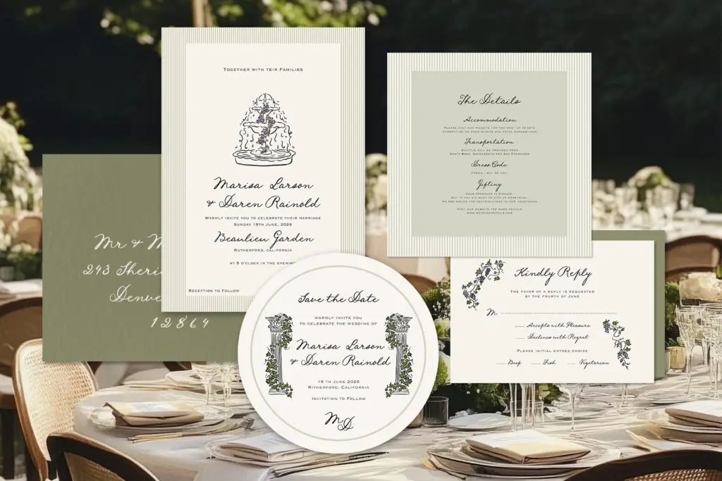
The font covers uppercase and lowercase basic characters, numerals, and standard punctuation, along with a set of ligatures and alternate letterforms. The alternates matter more than they might seem to on a spec sheet: in a script this loose, having a second or third option for awkward letters like capital Q or a lowercase g gives you a way to fix collisions without redrawing anything by hand. The ligatures help smooth over common letter pairs that would otherwise look like two separate words glued together.
What’s not specified is language support beyond the basic Latin set, so anyone working outside English-language copy should check character coverage before committing a project to it. Weight options aren’t part of the package either — this is a single-weight face, so any hierarchy in a layout has to come from pairing it with something else, size changes, or colour, not from a bolder or lighter cut of Dear Maison itself.
Use cases
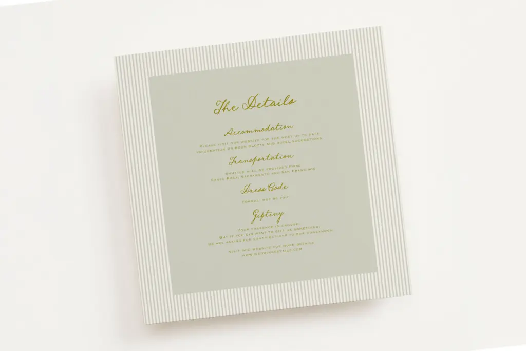
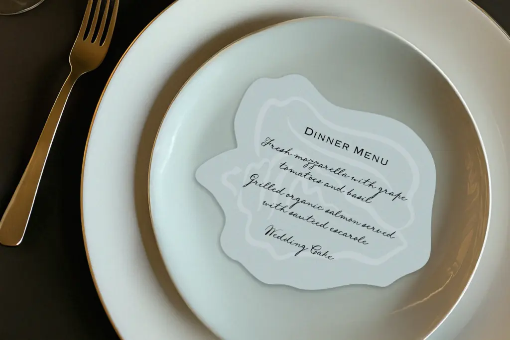
This is a font built for short, expressive lines rather than paragraphs. Wedding invitations are the obvious home — names, dates,
What we liked, and what we didn’t
Strengths
- Ligatures and alternate letterforms give real flexibility for fixing awkward letter combinations
- Even stroke weight keeps it legible at moderate sizes rather than just decorative
- Loose, irregular joins give it a genuinely handwritten feel rather than a templated script look
Trade-offs
- Single weight only, so any typographic hierarchy has to come from pairing or size rather than the font itself
- Low stroke contrast means it lacks the visual drama of higher-contrast calligraphic scripts
Dear Maison is a solid, unfussy handwritten script that does what casual wedding and lifestyle branding needs without trying to be anything more dramatic. It won't stand out in a crowded script-font market, but the alternates and ligatures make it easier to work with than many single-style scripts. Best used sparingly, at larger sizes, alongside a plain-set companion typeface.
Verdict

Tantype reviews typefaces in depth — every font is tested in real branding, editorial and screen layouts before a word gets written. 555+ fonts reviewed and counting.