
Wayside Colorado: a rough-edged sans and script duo for western branding
Design style
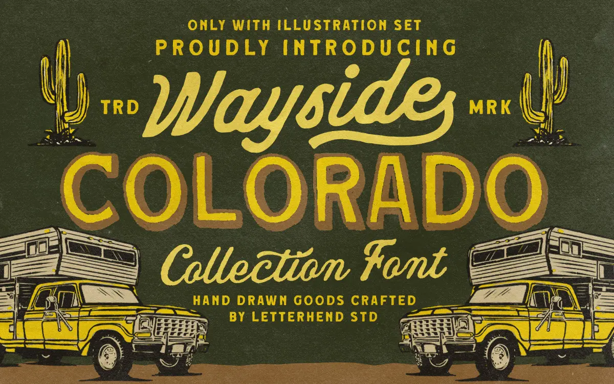
Wayside Colorado is built around a distressed, hand-drawn sans that leans hard into the worn-signage look — the kind of lettering you’d find repainted on a diner wall or a rusted gas station sign. The strokes are irregular by design: edges chip, corners round unevenly, and the overall texture reads as sun-faded rather than digitally clean. It’s paired with a classic script and a lighter monoline script, both of which soften the collection and give it a bit of range beyond the blocky main sans.
The rough-stroke treatment is the whole point here, and it’s executed with some care — the texture doesn’t feel like a single filter dropped over every letter, and there’s enough variation between characters that repeated letters don’t look identical. That said, this is a font built for a mood, not for neutrality. If you don’t want the worn, retro-Americana vibe, there’s nothing else on offer.
Character set and features
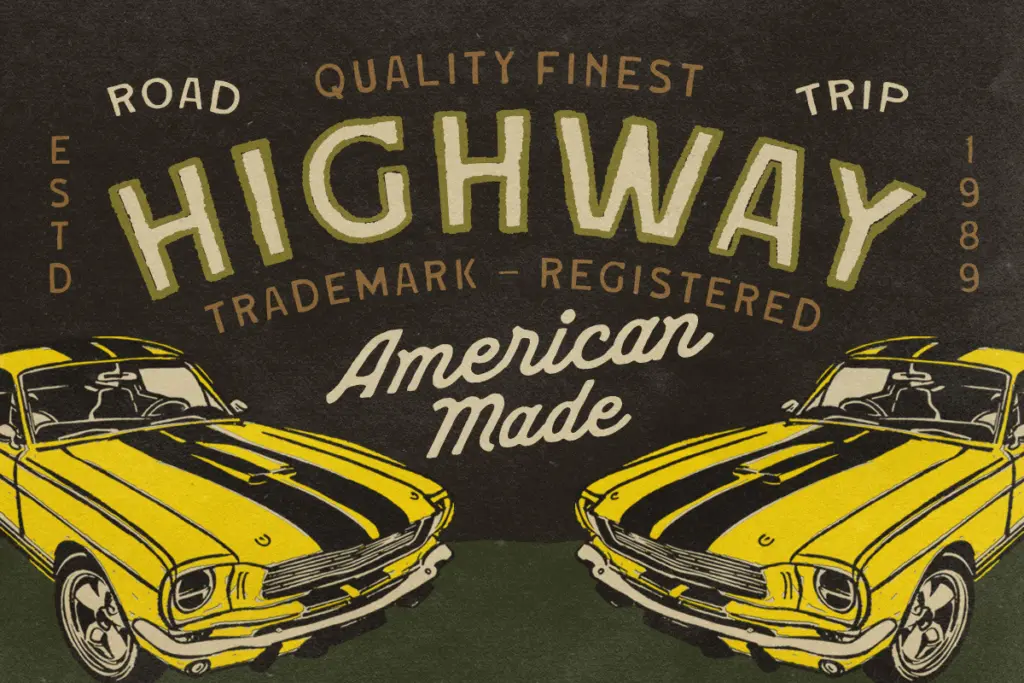
The collection covers uppercase and lowercase, numerals, and punctuation across its various styles, plus alternate characters for the sans and scripts — useful for breaking up repetition in short lines of display type. The package also throws in an outdoor-trip illustration set, which reads as a bonus rather than a core typographic feature, but it fits the western/road-trip framing and saves a separate stock-illustration search for some buyers.
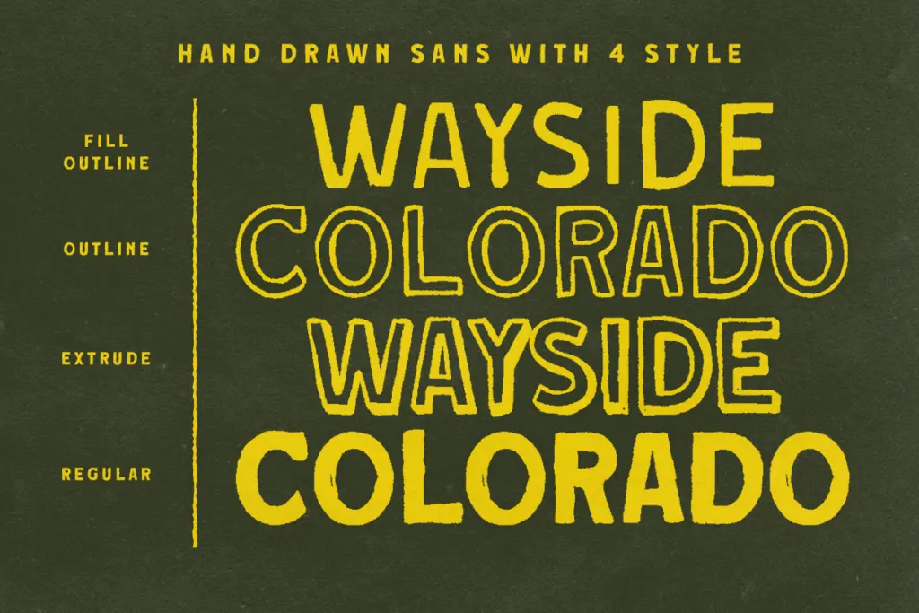
Multilingual support and PUA encoding mean the alternates and extras are accessible through glyph panels even in software that doesn’t handle OpenType features gracefully. The regular sans comes in fill, outline, and extrude versions, which is a practical touch for anyone building layered signage or dimensional-looking lockups without redrawing the letterforms from scratch.
Legibility is where the honesty has to come in: this is not a font for body copy, or even for anything longer than a few words. The distressing works against clarity at small sizes, and the script styles, while more legible than the sans, still carry enough texture that they need generous size and spacing to read comfortably. This is a display family through and through, and it knows it.
Use cases
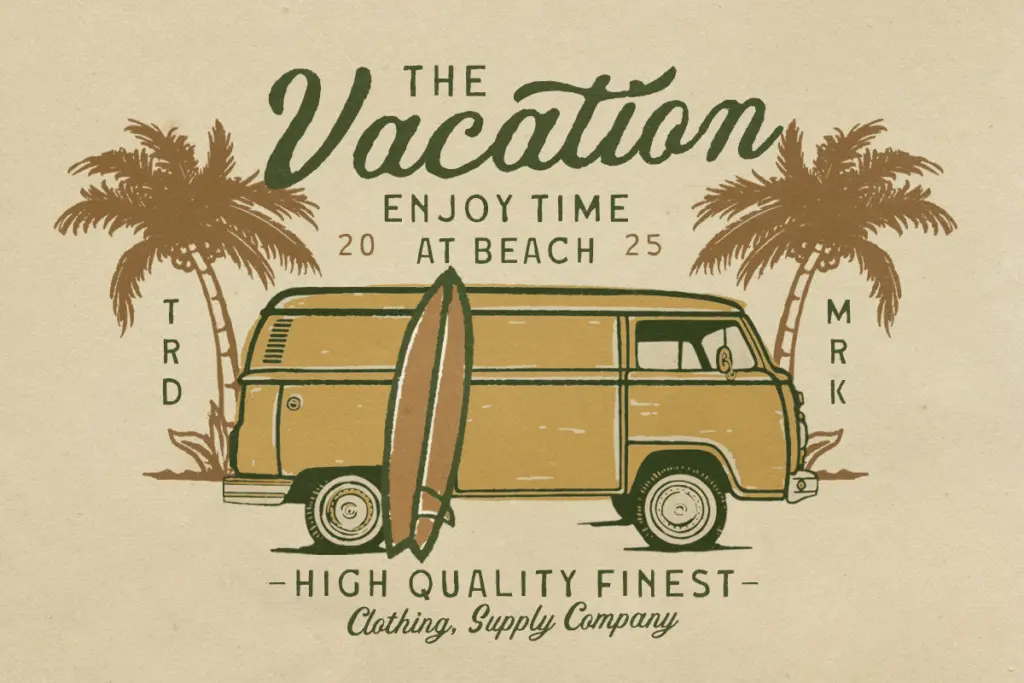
Wayside Colorado is aimed squarely at branding that wants to signal ruggedness, nostalgia, or outdoor adventure — think craft breweries, camping gear, western-themed restaurants, or vintage-inspired apparel. The three complementary styles (sans, classic script, monoline script) give enough variety to build a logotype with a primary mark and a secondary flourish without reaching for an unrelated typeface.
The illustration set extends its use into packaging and poster work where a hand-drawn adventure motif is wanted alongside the type. It’s less suited to anything requiring restraint or a contemporary finish — this collection commits fully to a retro-western identity, and that commitment is both its strength and its ceiling.
What we liked, and what we didn’t
Strengths
- Fill, outline, and extrude versions of the sans make layered signage-style logos easy to build without redrawing letterforms.
- Three complementary styles — rough sans, classic script, monoline script — give enough range for a primary and secondary mark.
- Alternate characters and PUA encoding help break up repetition in short display lines.
Trade-offs
- The heavy distressing limits legibility at small sizes and rules out body text entirely.
- The retro-western mood is baked in throughout, so it won't suit brands wanting a cleaner or more neutral sans.
Wayside Colorado is a committed, well-textured display collection for anyone building a western or road-trip brand identity. It does one mood convincingly, with useful extras like fill/outline/extrude variants and a bonus illustration set, but it's not a font for small text or restrained design work.
Verdict

Tantype reviews typefaces in depth — every font is tested in real branding, editorial and screen layouts before a word gets written. 555+ fonts reviewed and counting.