
Naterium Font Free Download
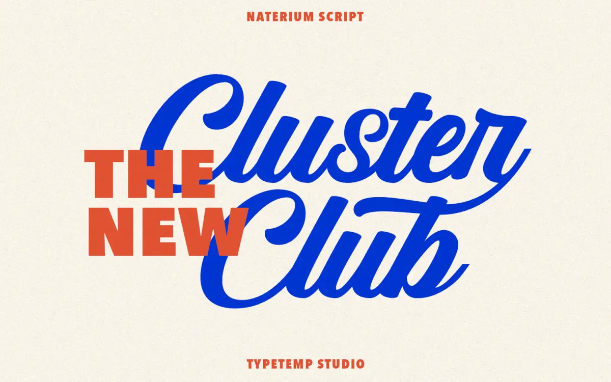
Is Naterium free to download?
Naterium is a commercial font sold on Creative Market, so the full version needs a paid license. Get it from the official listing: Naterium font download.
Need something free? These script fonts from Google Fonts are free for personal and commercial use:
Design style
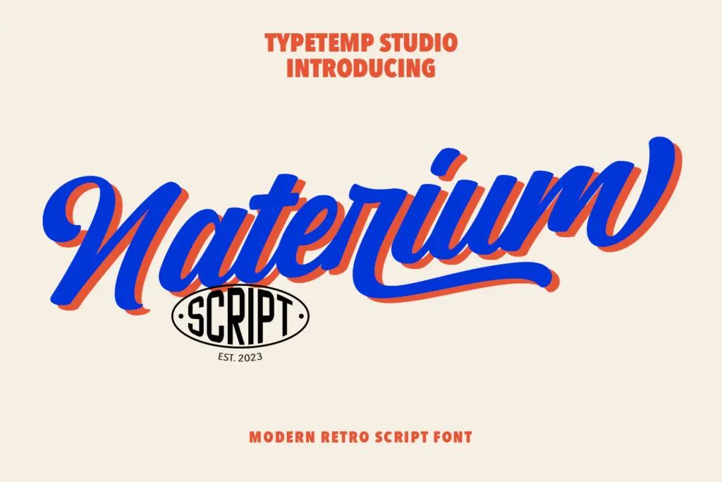
Naterium sits in the well-populated space between brush script and formal copperplate, leaning more toward the casual side. The letters connect with a loose, confident slant rather than a rigid calligraphic structure, which gives it the “retro-modern” tag the seller uses — there’s a nod to mid-century signage lettering, but the strokes are cleaner and less textured than a true vintage brush script. Contrast between thick and thin strokes is moderate, not dramatic, which keeps the overall colour of a line of text fairly even rather than spiky.
The slant is consistent and the baseline has a gentle, hand-set waver to it rather than sitting dead straight, which is the main thing selling the hand-lettered feel. It’s a script that reads as friendly and approachable rather than formal or luxury — closer to a greeting card or a boutique label than a black-tie invitation.
Character set and features
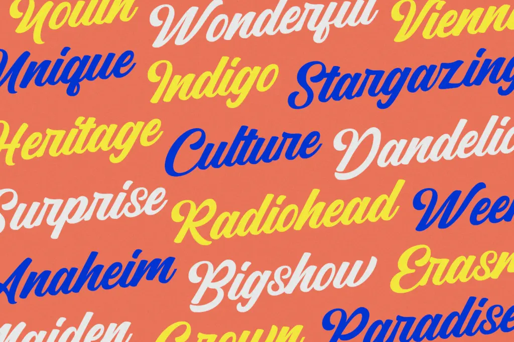
The font includes alternate letterforms and ligatures, which matter a great deal with a connecting script — without them, repeated letters or certain pairings produce awkward collisions. The alternates let you swap in a different capital or a swash-heavy lowercase where the default collides or reads too plainly. Used well, this is what separates a script font from a script font that actually works in a finished layout; it requires the user to go hunting for the right glyph rather than just typing and hoping.
Where Naterium is more ordinary is in the extras beyond the core set. There’s no mention of extended language support, small caps, or a companion sans for setting body copy alongside the script — so this is a display face to pair with something else you already own, not a self-contained family. Numerals and punctuation exist but aren’t the headline feature here; the alternates are.
Use cases
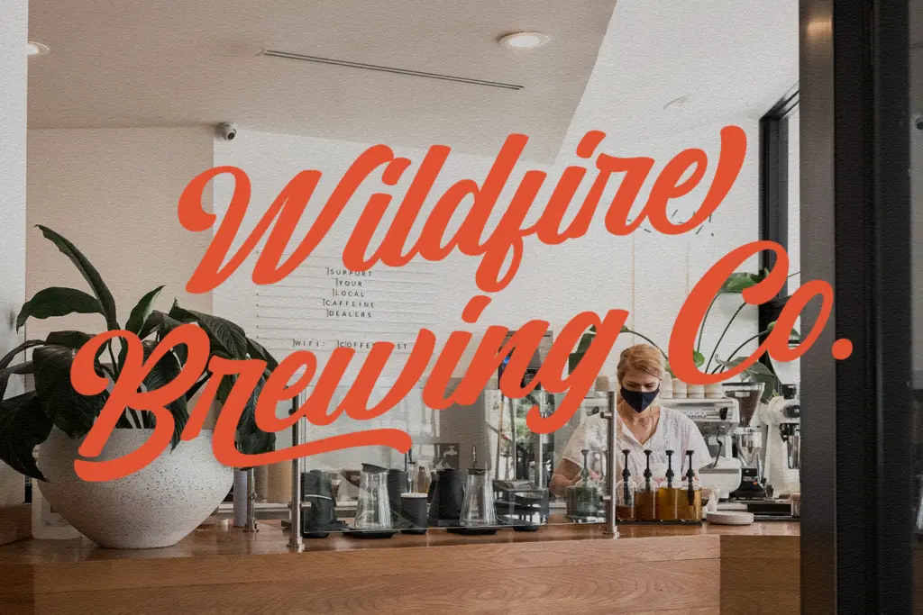
Naterium’s natural habitat is short-form: logotypes, a product name on packaging, a pull quote in a blog post, the headline on a wedding invitation or save-the-date. At those lengths its looseness and alternates read as intentional and personal. Push it into a full paragraph and the connecting strokes start working against you — scripts like this are drawn to be looked at a few words at a time, not read continuously, and legibility drops accordingly at small sizes or in dense body text.
It’ll suit small branding projects, café and boutique signage, social media graphics, and stationery where a handwritten, slightly nostalgic voice is wanted without going fully rustic or fully elegant. Pair it with a plain sans or slab for any supporting text, since Naterium isn’t built to carry that job itself. Designers working on high-end luxury branding may find it a touch too casual; it’s better suited to work that wants warmth over polish.
For a far more ornate, engraved take on script lettering for wedding work, see our guide to Burgues Script, Alejandro Paul’s tribute to the penman Louis Madarasz.
Another script made for logos and labels is Amoresa, with alternate capitals and eight lengths of end-swash.
What we liked, and what we didn’t
Strengths
- Alternate letterforms and ligatures solve the usual script collision problems
- Moderate contrast keeps it readable at display sizes without excessive flourish
- Works well for short, branding-style text like logotypes and product names
Trade-offs
- Legibility drops quickly once it's set in anything longer than a line or two
- No companion family or extended character support, so you'll need to pair it yourself
Naterium is a competent casual script that does its best work in short bursts — logos, headlines, invitation lines. The alternates and ligatures are genuinely useful, but this is a single display face without a built-in pairing, so plan to supply your own supporting type.

Tantype writes independent reviews of typefaces: what each font does well, where it falls short, what it suits, and where it is sold.