
The Native Record Font Trio Free Download
Is The Native Record Font Trio free to download?
The Native Record Font Trio is a commercial font sold on Creative Market, so the full version needs a paid license. Get it from the official listing: The Native Record Font Trio download.
Need something free? These script fonts from Google Fonts are free for personal and commercial use:
Design style
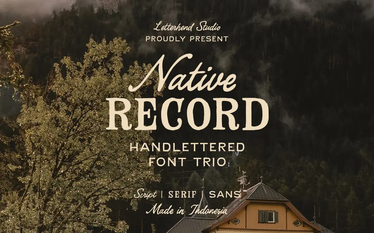
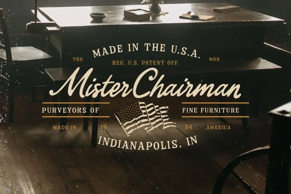
The Native Record Font Trio leans hard into a Western-farmhouse mood: a rough-edged script paired with a slab-ish serif and a plain companion sans. The script carries the personality of the set. Strokes wobble slightly as if cut with a worn brush, baseline shifts give it a hand-lettered bounce, and the joins between letters are loose rather than fluid, which reads as handcrafted rather than sloppy. The serif is the heavier anchor — thick, slightly uneven slabs with a worn ink-stamp quality that suggests old general-store signage or a record label stencil. The sans is the quiet one, a blocky grotesque-adjacent face with little ornamentation, there mainly to hold text together when the other two get too busy to read.
None of the three is refined in the way a contemporary script or serif revival would be. That’s the point. The roughness is deliberate, and it’s consistent across the trio — the same worn, hand-cut sensibility shows up whether you’re looking at the script’s swashes or the serif’s slab terminals. It won’t suit anything that needs polish or restraint.
Character set and features
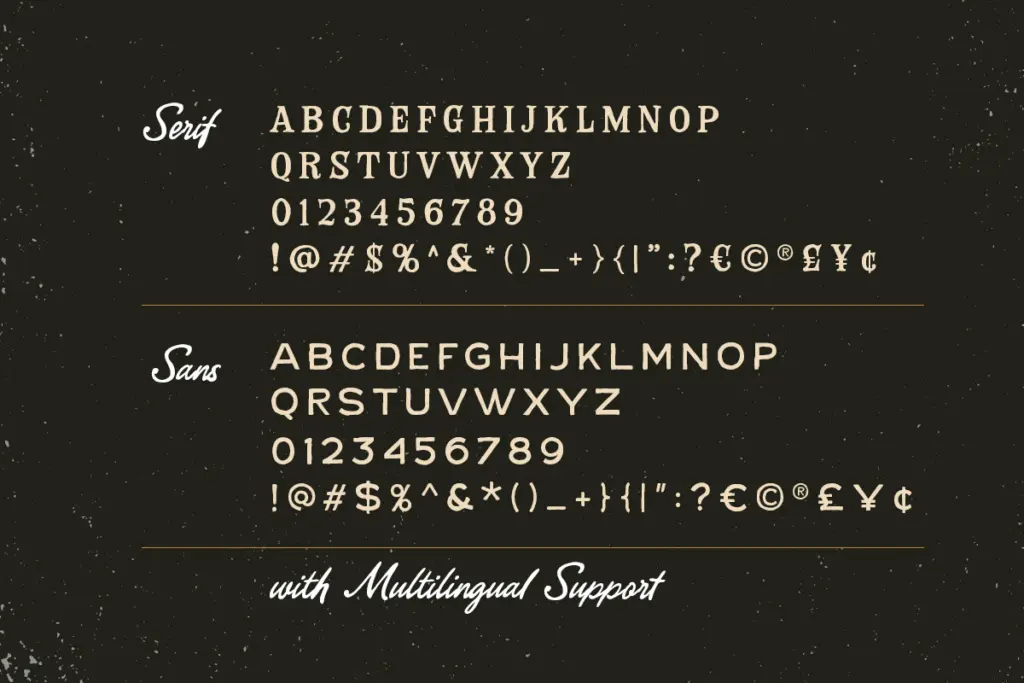
Each style covers uppercase and lowercase, numerals and punctuation, with alternate letterforms and ligatures available in the script to vary repeated letters and avoid the stamped-out look that plain scripts tend to fall into. Multilingual support and PUA encoding mean the accented and special characters are reachable, which matters if your layout needs more than basic English. The alternates are worth digging into via a glyph panel or OpenType-aware app — without applying them, the script can look repetitive in short phrases, especially where the same letter recurs.
The serif and sans are more straightforward sets, built to be legible companions rather than showpieces. They don’t have the same density of alternates, which is appropriate — their job is to support, not compete with, the script’s texture.
Use cases
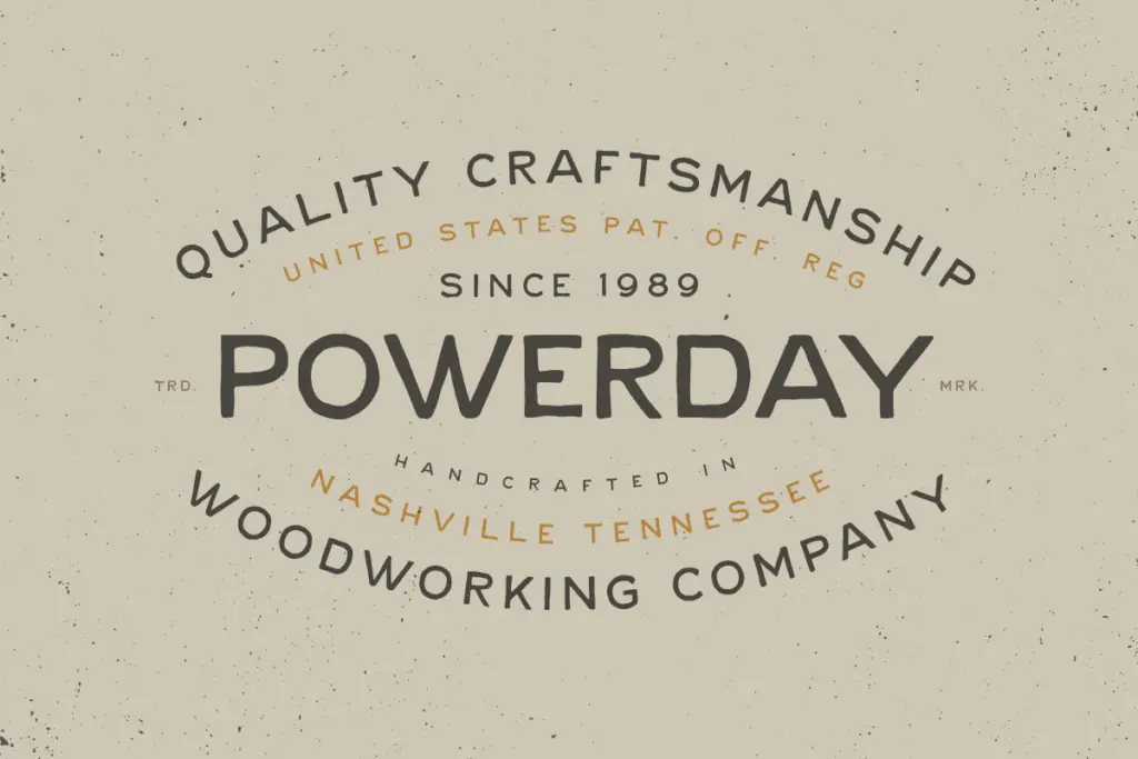
This trio is built for country, western and rustic-Americana branding: album covers, record labels, farm and ranch logos, craft beverage labels, market signage, rustic wedding stationery. The script handles the emotional heavy lifting — logotypes, headlines, the word that needs to feel handmade. The serif works well for supporting type at medium sizes: a tagline under a logo, a product name on packaging, a subheading on a poster. The sans is there for the fine print, addresses, ingredient lists, anything that needs to stay quiet and out of the way.
Where it struggles is in contexts that need neutrality or a lighter touch. The script’s texture and baseline variation will fight against clean, minimal layouts, and at small sizes the rougher edges of all three faces start to blur rather than read as charm. This isn’t a trio for corporate decks or editorial body text — it’s a themed set, and it performs well specifically inside that theme. Step outside the rustic-country lane and the charm becomes a mismatch rather than an asset.
What we liked, and what we didn’t
Strengths
- The script's alternates and ligatures genuinely vary repeated letters instead of looking stamped
- The three styles share a consistent worn, hand-cut character so they pair without clashing
- The plain sans gives you a legible fallback for fine print and long copy
Trade-offs
- The rough texture loses clarity at small sizes, especially in the script
- The styling is narrowly themed and won't translate to projects outside country or rustic branding
A themed trio that does rustic-Americana convincingly, with a script that carries real handmade texture and two supporting faces that know their place. It's not built for neutrality or small-size body text, and the charm only works if your project genuinely calls for a country or western mood.

Tantype writes independent reviews of typefaces: what each font does well, where it falls short, what it suits, and where it is sold.