
Organic Hand: a semi-script for brands that want to sound unpolished on purpose
Design style
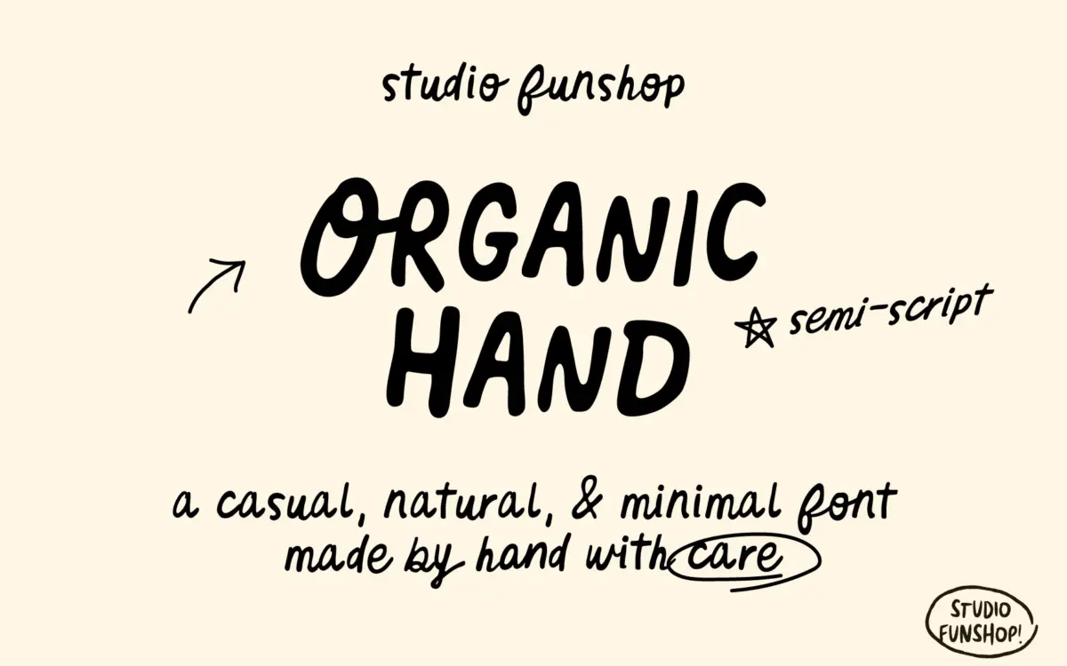
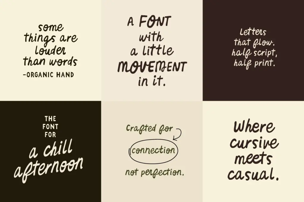
Organic Hand sits in the gap between print and script — lowercase letters keep the upright, disconnected structure of handwriting rather than joining into a continuous cursive line, but the strokes carry the loose pressure and slight wobble of a pen moving quickly. Curves aren’t perfectly even, entry and exit strokes vary a little from letter to letter, and the baseline drifts just enough to read as hand-drawn rather than templated. It’s a controlled kind of casual: nothing here looks accidental, but nothing looks ruled either.
The x-height is generous and the letterforms are fairly open, which keeps the semi-script quality from tipping into illegibility. Compare it to a full connected script and Organic Hand reads calmer — it’s closer to a note scrawled by someone with decent handwriting than a flourished invitation script. That restraint is the point: it’s meant to feel personal without demanding attention.
Character set and features
The set covers uppercase and lowercase A–Z, numerals, punctuation and symbols, which is the baseline you’d expect from any working font but worth confirming here since semi-scripts sometimes ship thin. More useful are the alternates, which let you swap out repeated letters within a word so headlines don’t look stamped from the same mould twice. The ligature list is reasonably long for a font this size — OO, EE, PP, LL, ll, dd, oo, ci, ee, og, um, an, er, la, he, tt — and these do real work smoothing over the awkward collisions that happen when handwriting-style letters sit next to each other without connecting.
None of this turns Organic Hand into an OpenType showcase; there’s no stylistic-set complexity or contextual alternates chaining letters together automatically. It’s a practical, single-weight tool: draw a line of type, swap a few repeated letters by hand if you’re fussy, and move on.
Use cases
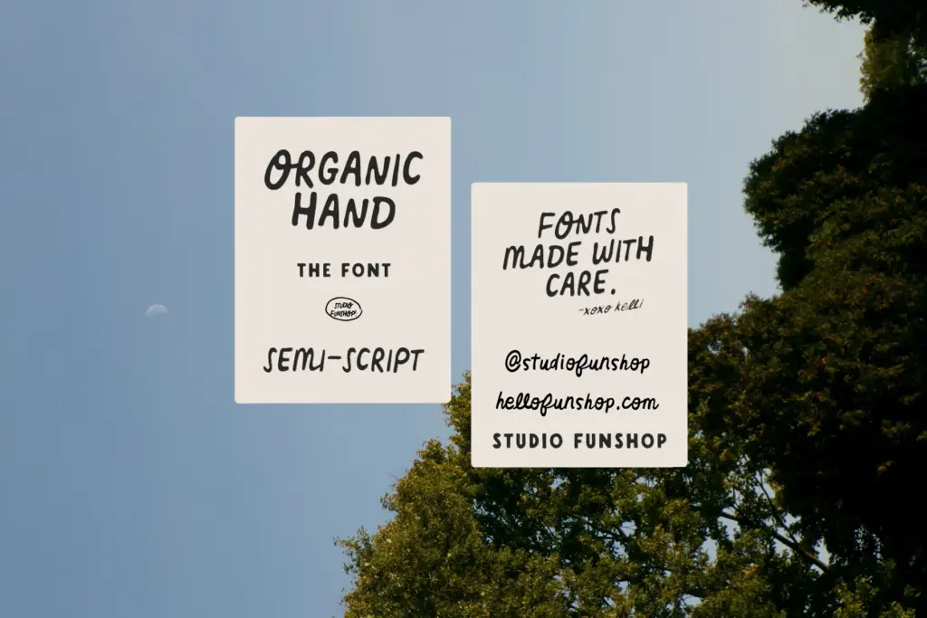
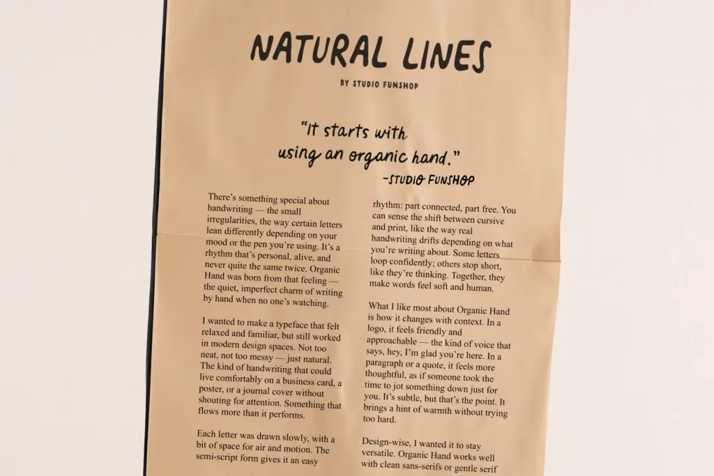
This is a font built for short bursts of text rather than paragraphs — a product label, a logotype, a greeting card line, a social graphic caption. At small sizes the wobble and varied stroke weight start to blur the letterforms together, so it’s not a candidate for body copy or anything set below display size. Where it earns its keep is in packaging and branding work that wants warmth without going fully decorative: think a small-batch food label, a handmade goods shop, a wellness or lifestyle brand trying to signal
What we liked, and what we didn’t
Strengths
- Alternates and a solid ligature set help repeated letters avoid looking stamped
- Open, generous x-height keeps the wobble legible rather than messy
- Restrained semi-script structure reads as handwritten without tipping into illegible flourish
Trade-offs
- Legibility drops fast below display sizes, so it's unsuitable for body text
- Single weight and no connecting script option limit how far it stretches across a brand system
Organic Hand is a competent, single-weight semi-script that does one job well: short, warm, handwritten-feeling text for branding and packaging. It won't hold up as body copy or in a formal setting, but for logos, labels and social graphics it delivers exactly the casual, human tone it promises.
Verdict

Tantype reviews typefaces in depth — every font is tested in real branding, editorial and screen layouts before a word gets written. 555+ fonts reviewed and counting.